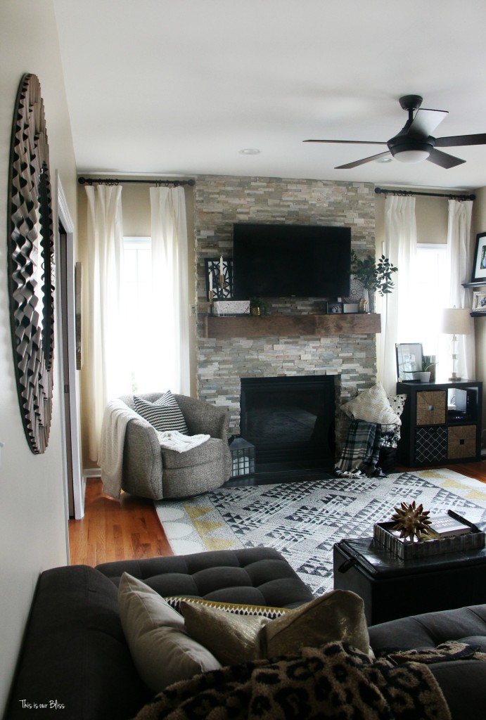
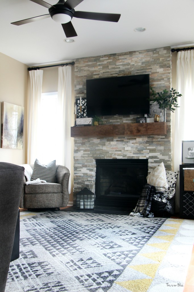
So, I’m probably doing this all wrong…completely backwards, but today I am sharing my newly styled mantel! If you are coming over from Iris Nacole, then welcome! If you’ve been hanging around here for awhile, then you’re probably wondering why I’ve been talking about this “new” mantel (and not just the styling) without every showing the old one!
1 | Lean back.
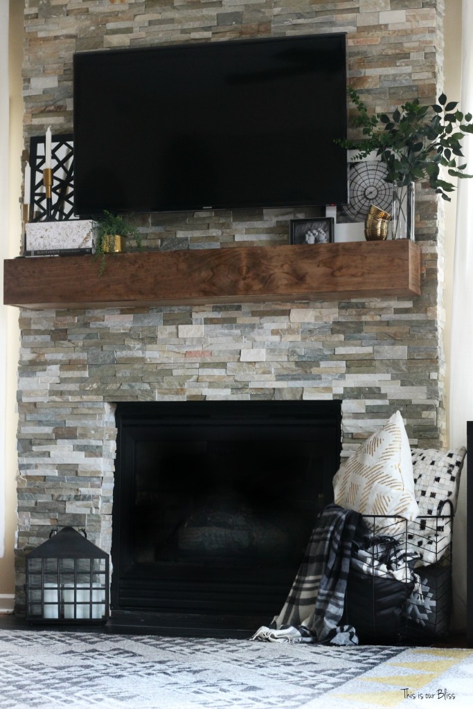
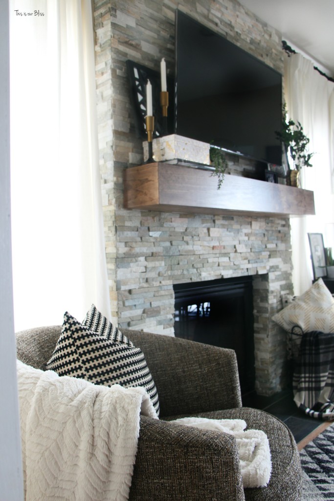
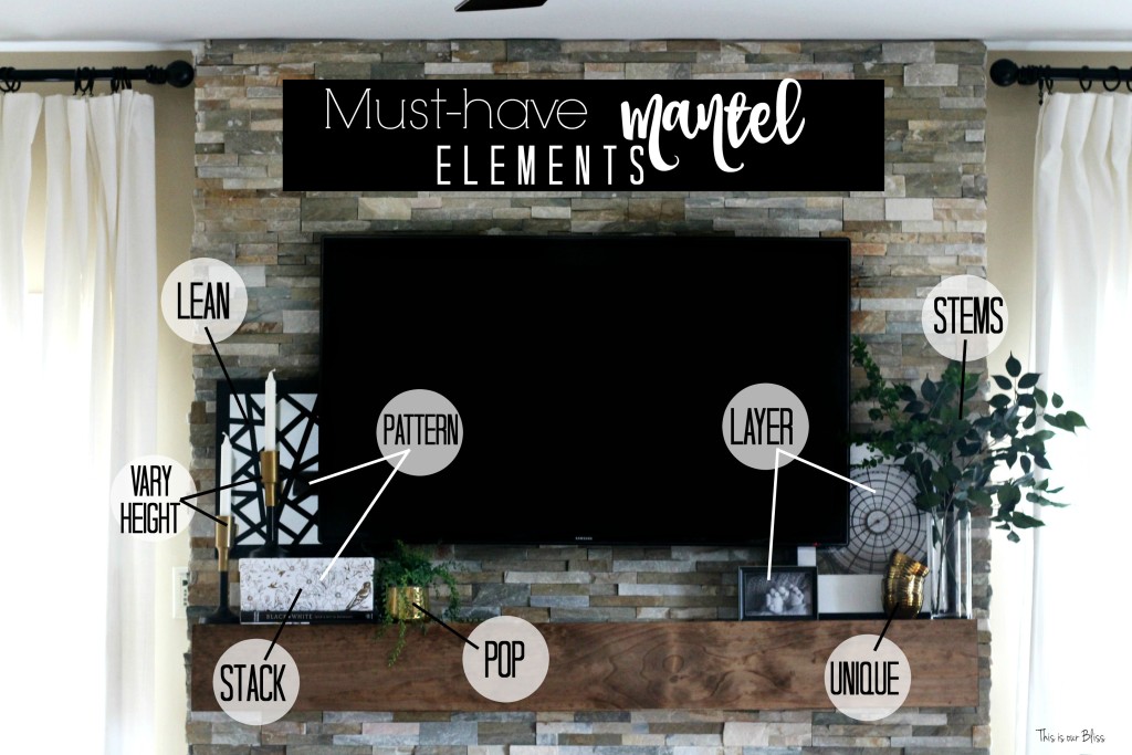
Place a piece of art, a funky mirror or a beautifully framed family portrait at a slight angle and rest it against the wall.
2 | Stack it up.
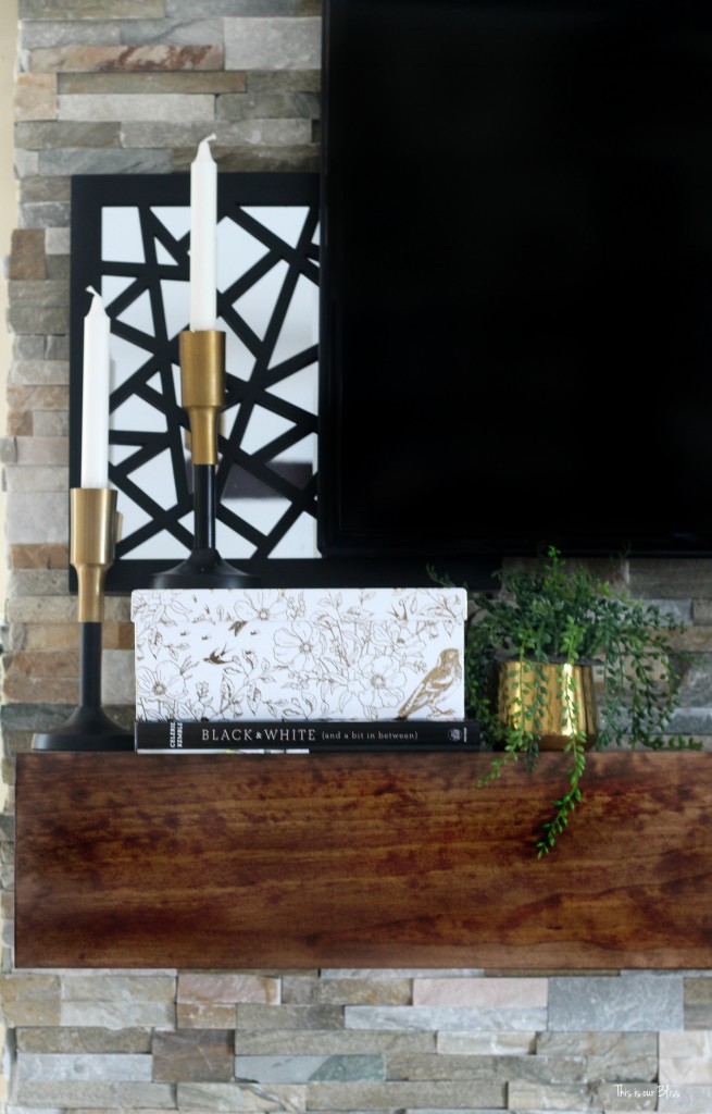
Grab a few books from your bookcase and stick them here. You could lay them down and also place 1 or 2 of them upright next to the stack. Here, I used one book and one decorative storage box. I wanted to add some height, as well as an itty bit of typography (in the spine of the book + it reads my mantra).
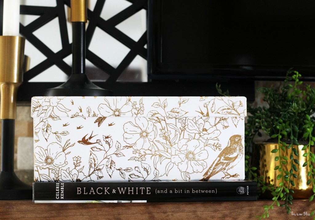
Just be careful that your mantel is deep enough to house your stack. You don’t want them to hang off the front. Mine do just a teensy weensy bit, but you can hardly tell. Use your best judgement here.
3 | Vary the height.
I had this pair of candlesticks that I used on my Christmas Table, but I wanted them slightly staggered, so I placed one on the far left side of the mantel and the other one on top of my “stack”. You can purposely vary the height of like items or use various sized items. Either option is great!
4 | Pattern play.
The bold black lines of the mirror contrast nicely with the soft white and metallic gold floral print + one random bird?! on the box.
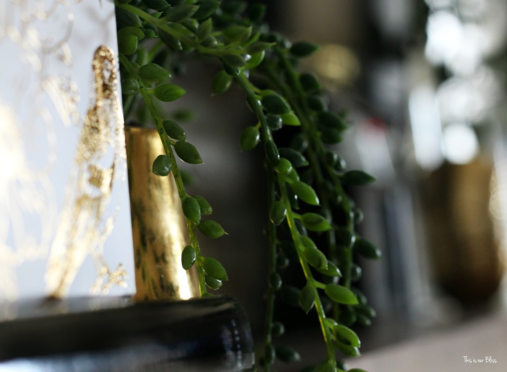

I love mixing prints. seriously. love. So why not on the mantel?
5 | Make it pop.
A cohesive color scheme is a good idea here since it is one long surface. Carrying similar colors across the entire length of the mantel helps achieve balance and demonstrates a well-thought out styling vision. I’m using classic black and white with pops of gold and green. Its super neutral so any color can be added in for seasons, holidays and my ever-changing moods. Right now, pretty pink tulips would look pretty fab up here.
6 | Stems down, greens up.
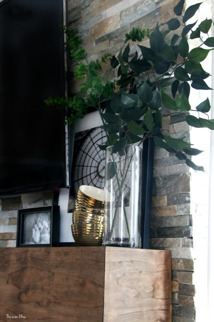
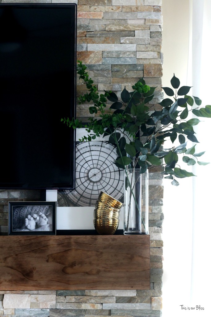
Freshly cut stems or a vase of flowers are lovely, but I also adore the look of a couple of faux greens sticking out of a simple cylinder vase. They add height, freshness, texture and dimension to your styled surface.
7 | Double “u” – unique & unexpected.
I placed the mini gold planter with faux greens on the left side and wanted a touch of gold on the right to balance it out like I mentioned in #6, so I grabbed the stack of 4 mini dishes out of my kitchen cupboard and set them next to the clear vase. They sort of naturally tipped to the right and I decided it was meant to be.
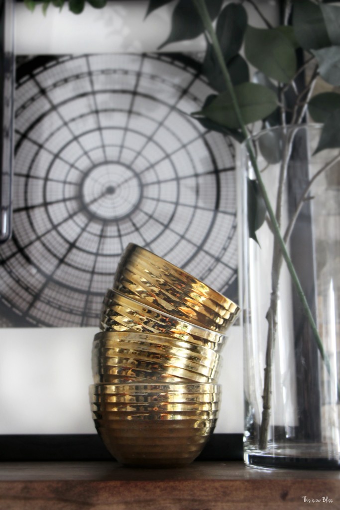
They dishes are textured, and also a different look and shape than anything else on the mantel. My eye is instantly drawn to that second “stack”… just because its something subtly unique, while bold and blingy at the same time!
8 | Layer away.
Again, more leaning pieces, but this time I layered a smaller framed photo in front of a larger framed piece of art. Both in black and white with the back piece intentionally covered up by the various accessories in front.

So….my styling suffers because of it. Half kidding. The styling doesn’t necessarily suffer, but it does limit the possibilities for size and shape of objects to use around it. The biggest drawback is you can’t have anything covering the little red light. Otherwise, the remote doesn’t work. #heavenforbid
If you are just waking up to my post or maybe reading while you’re winding down after a long day, be sure to pop over to the start of the hop, which was yesterday, Day 1 and then work your way through Day 2 until you end up right back here! The looks are so beautiful and are gushing with inspiration!
More on the mantel, circling back on the master bedroom and so much more still coming your way!! Thanks for reading!









Staci
February 16, 2016 at 9:37 AMBeautiful mantle. I have a question regarding the installation of your tv and components. Do you have DVD, gaming stations, other hookups connected to your tv? If so, where are they housed? I’m wanting to move our tv above our mantle as well but where do you house all the components that go with it? Any advice or suggestions would be awesome.
Rachael @ This is our Bliss
February 25, 2016 at 7:38 PMHi Staci – thanks for stopping by! We have a cable box and our router / modem devices down and off to the right resting on a shelving unit. We had the TV mounted on the wires concealed before we decided to add the stone tile. The ends of the cords come out near the outlet at the bottom of the wall to the right. We had it professionally mounted which I highly recommend for the most visually appealing outcome 😉 Unless you or someone you know is particularly handy. I just didn’t want a huge mess of cords or unnecessary holes in the wall from “trying” to conceal them ha! I hope this helps! Let me know if you have any more questions and thanks again for reading!! -Rachael
Sara
February 12, 2016 at 8:32 AMRachel, excellent tutorial!!!! Such great pieces, love the stacked bowls. Your living room is so cozy and I’m totally digging’ your area rug!!! #LOVE I’m totally with ya on the TV being the focal point. Our living room is SO odd shaped and annoying. But, how do you have a fireplace and TV? Two focal points? Our fireplace is a HUGE double sided one, its like a huge car parked in-between our living room and kitchen! I totally dislike it! So, know, I’d love to have your layout! 🙂
Rachael @ This is our Bliss
February 12, 2016 at 2:28 PMThanks, Sara! I was going for a more cozy look in there, so I’m glad you think it looks that way! and it is – we have an abundance of throws and pillows everywhere!! TV’s are TOUGH! ugghh I don’t have a solution other than to try to put pretty things around it ha!
Brittany
February 11, 2016 at 10:04 PMI love your tips–they are so true! I especially like “pop” and “unique.” I definitely sympathize with the TV on the mantle troubles, but you do a great job working with and around it!
Rachael @ This is our Bliss
February 12, 2016 at 2:26 PMThanks, Brittany! Yes, those dang TV’s! At least we can TRY to put pretty things around and below them 😉
Stephanie @ Casa Watkins
February 11, 2016 at 10:01 AMGorgeousness!!!! You have a beautiful fireplace and your styling is spot on. Love the gold touches.
Rachael @ This is our Bliss
February 12, 2016 at 2:25 PMThank you! It was fun to finally style this spot since I didn’t like our old mantel, I never decorated it or showed anyone!!
Monica Benavidez (@MonicaBenavidez)
February 10, 2016 at 7:12 PMWhat a beautiful mantle! It’s nice to see someone else who loves black, white and gold as much as I do. 🙂
Rachael @ This is our Bliss
February 12, 2016 at 2:24 PMThanks, Monica!! you just can’t go wrong!