Have you ever seen something so amazingly awesome and you know if you buy it, it would look soooo good in your home? It just screams YOU! You just have to have it, until you flip it over to look at the sticker or scroll down and read that number after the $ sign…and well, your dreams have been crushed. Yeah, me too.
This is the case so often with high end designer home decor pieces. I want them so badly, but just can’t justify it sometimes. Ok, a lot of the time. I mean, if it were only my birthday a few more days outside of the entire month of February. Yes, I pretty much celebrate for a month. ok, at least a week! [Yesterday was my birthday, so I’m hoping to get a couple bday related posts out this week!]
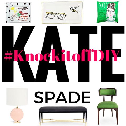
When Jess from Domicille 37 invited a group of bloggers to participate in a monthly challenge titled “Knock it Off DIY” – I knew I had to say yes. So, today kicks off the very first challenge and what are we knocking off? Any coveted Kate Spade home decor piece! The stuff could not be any prettier – classy, sassy and usually with a lot of bling. However, these items also come with a pretty price tag…or, not so much.
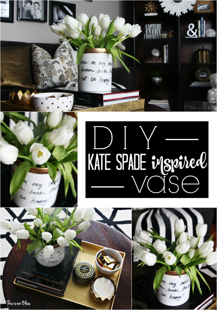
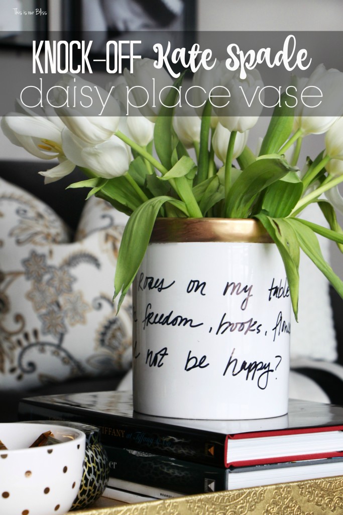
So today, I am sharing my version of the Kate Spade Daisy Place Vase!
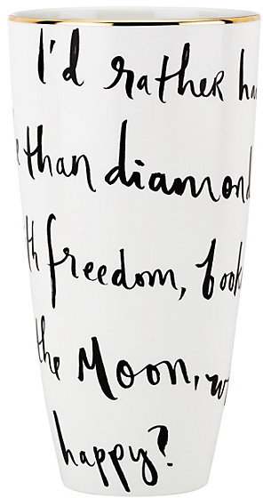
Keep reading on to see how how I created my own version of this vase for less than $10!
Let’s start with supplies.
Supplies
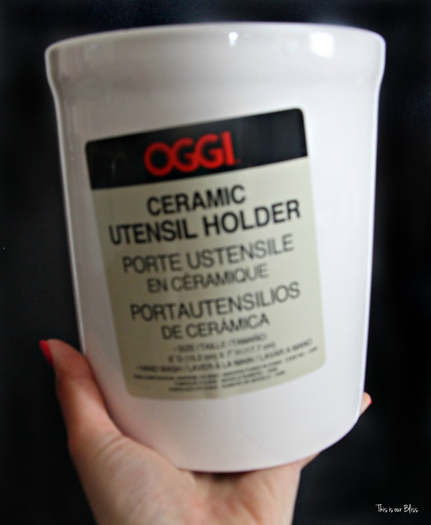
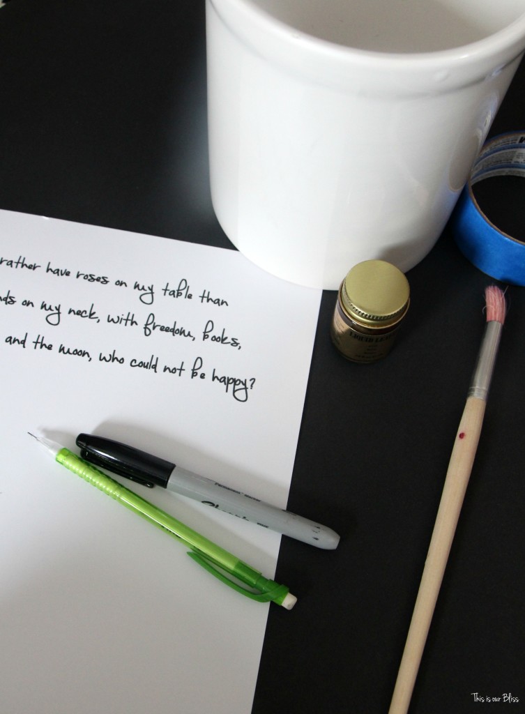
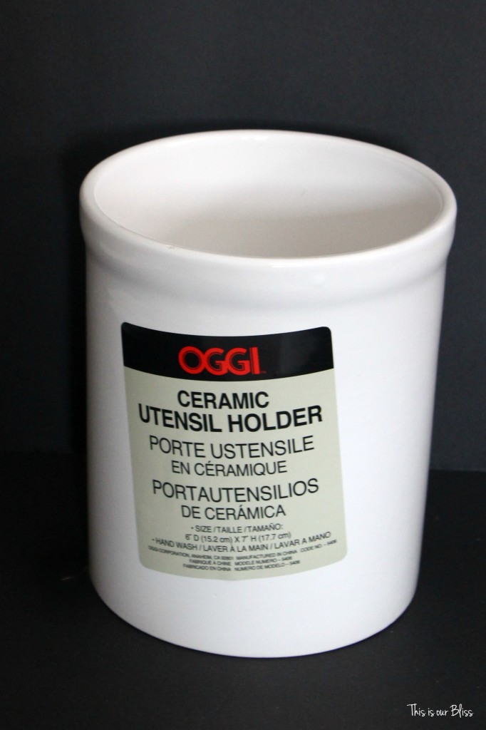
white ceramic vase [mine is a $7.99 untensil holder from HomeGoods – so anything will work]
black Sharpie
pencil
liquid gold leaf
paint brush
painters tape
I had everything, but the vase at home which is why the project was so inexpensive. Even if you bought everything on this list, you’re still saving if you DIY vs. buy!
INSTRUCTIONS:
1 | Select your vase
Step 2 | Print your font sample
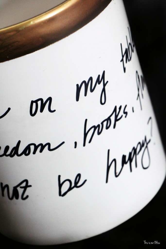
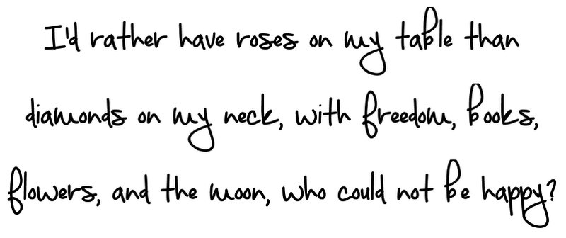
After you select your vase, decide on your saying and font. I stuck with the classic quote on the original Daisy Place Vase.
I then opened up a MS Word document and scrolled through my list of fonts – everything outside of the standard Microsoft fonts were downloaded from dafont.com. I chose “September Mornings“, typed out the quote and printed it off as a guide.
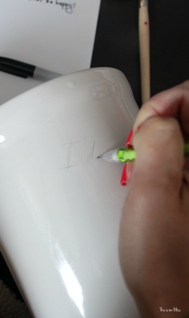
Step 4 | Start lettering on the vase with your pencil.
I didn’t trace or transfer the text over in some fancy way…I just eyeballed it. I wanted to take the quote down and around at a slight angle and make the words big enough to wrap around the vase with about 3 lines of text.
*Note: I did erase A LOT. I probably rewrote the text, or at least started writing the first few words out 5 or 6 times and then erased because I didn’t like how it looked. After this went on for a little while, I decided to just go with it. My lettering doesn’t look exactly like the script on the daisy place vase and it doesn’t really look like my sample, but I realized that the lettering on the real vase wasn’t consistent, either. The “d’s” weren’t written the same each time, etc. So, I started to slightly modify my normal handwriting and then just rolled with it.
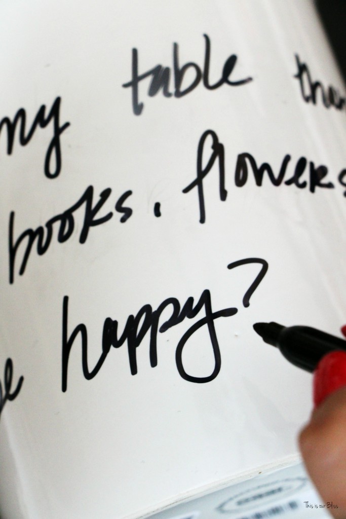
Step 5 | Trace over letters with a Sharpie
After I was happy with the pencil lettering, spacing, etc., I traced over my pencil marks with a black Sharpie. Be careful to not smudge as you go around the vase, although it does dry pretty quickly.
*If I were to try this again, I might consider baking the ceramic piece after the lettering. I know people do that to seal dishes and serving pieces, but I didn’t go that route this time. I’ll update this post and let you know how the shapie holds up.
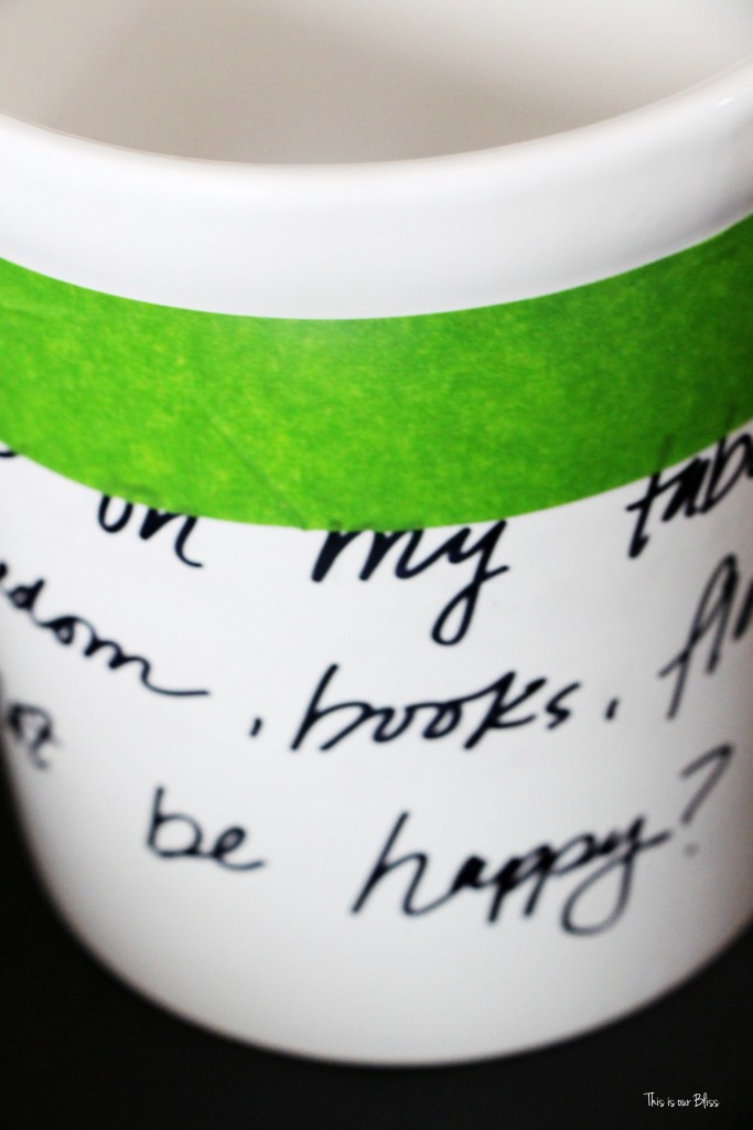
Step 5 | Tape off the top rim.
I took my frog tape [blue painter’s tape is pictured above, but when I found my frog tape I was thrilled because I think it really does work the best for getting smooth clean lines with any painting or leafing project] and taped just under the indent at the top of the “vase”.
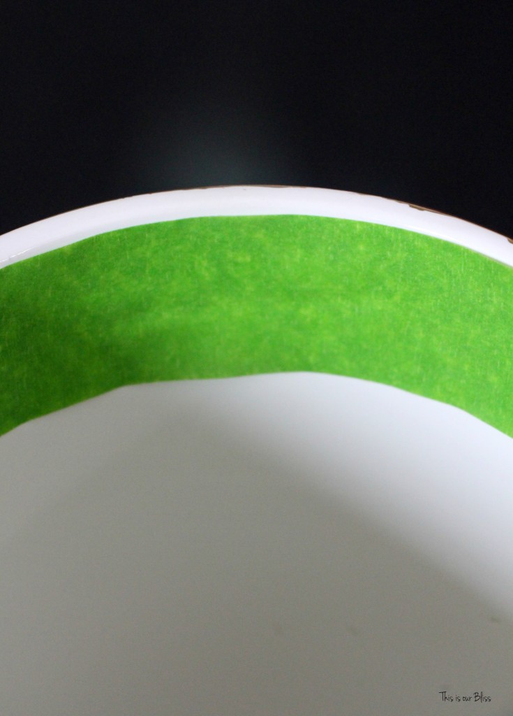
Step 6 | Apply liquid gold leaf
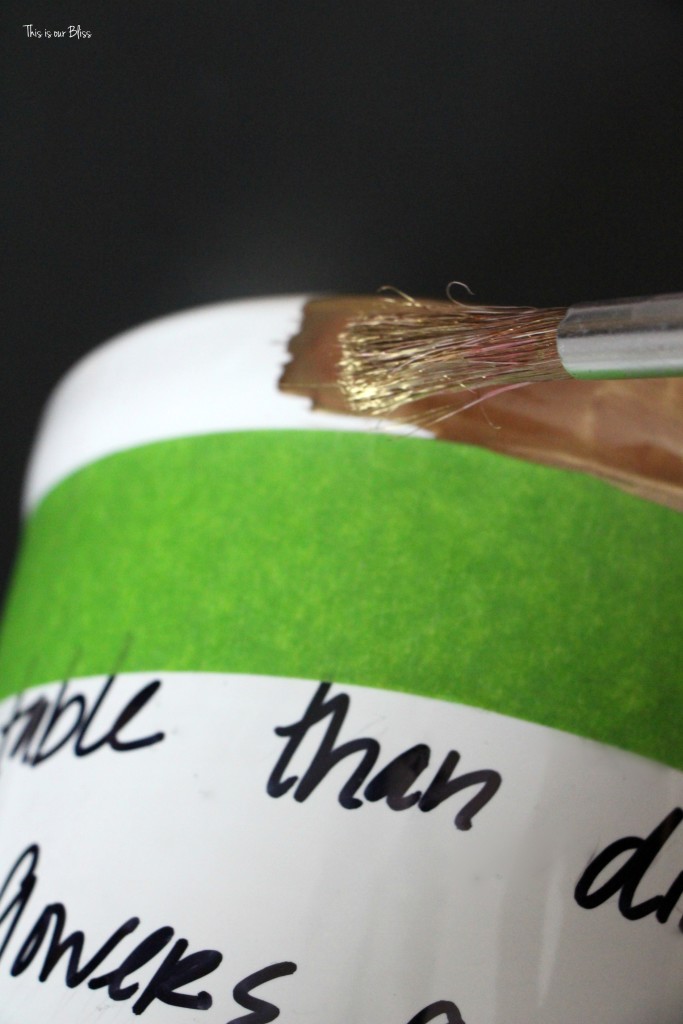
Step 7 | Let dry and remove tape.
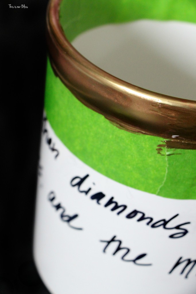
*Note: I did have a few spots with an unclean edge, but luckily, once it was dry I was able to gently scrape the gold leaf off with my fingernail. A razor would work well, too.
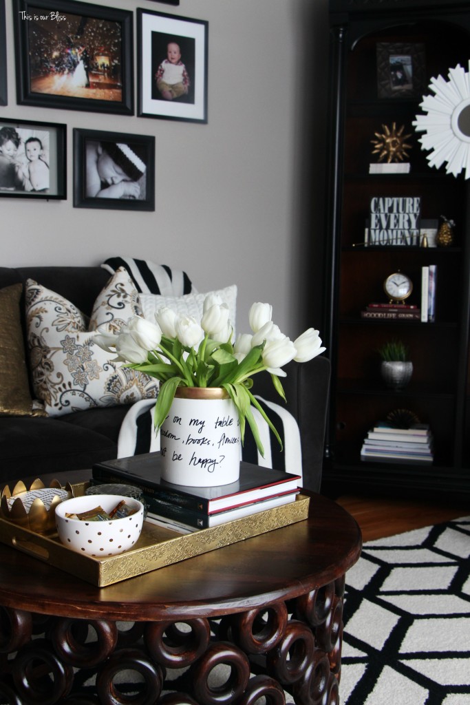
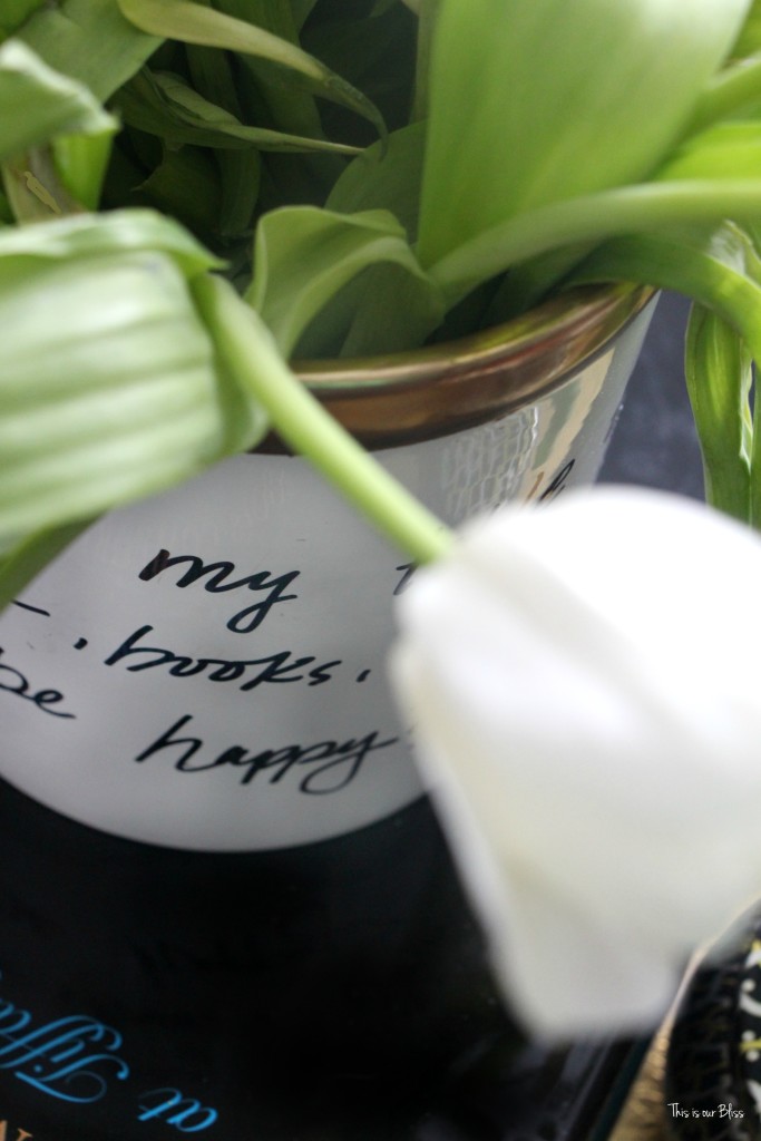
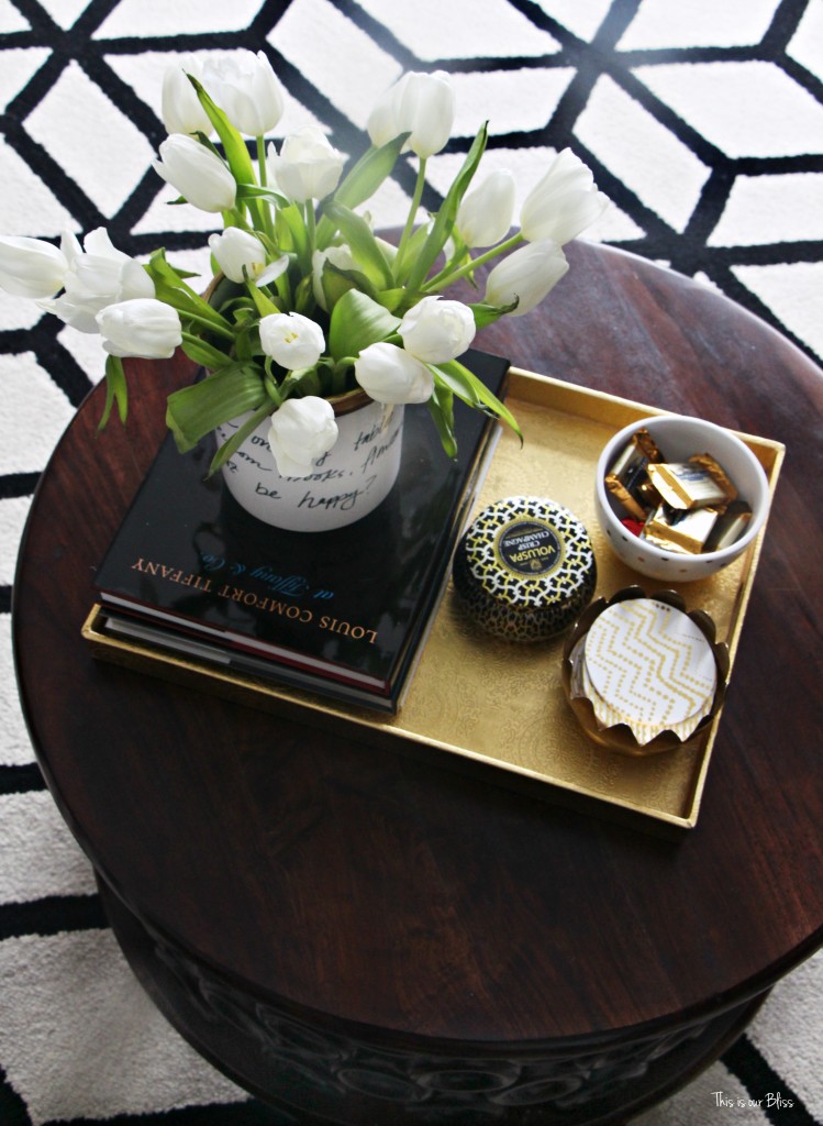
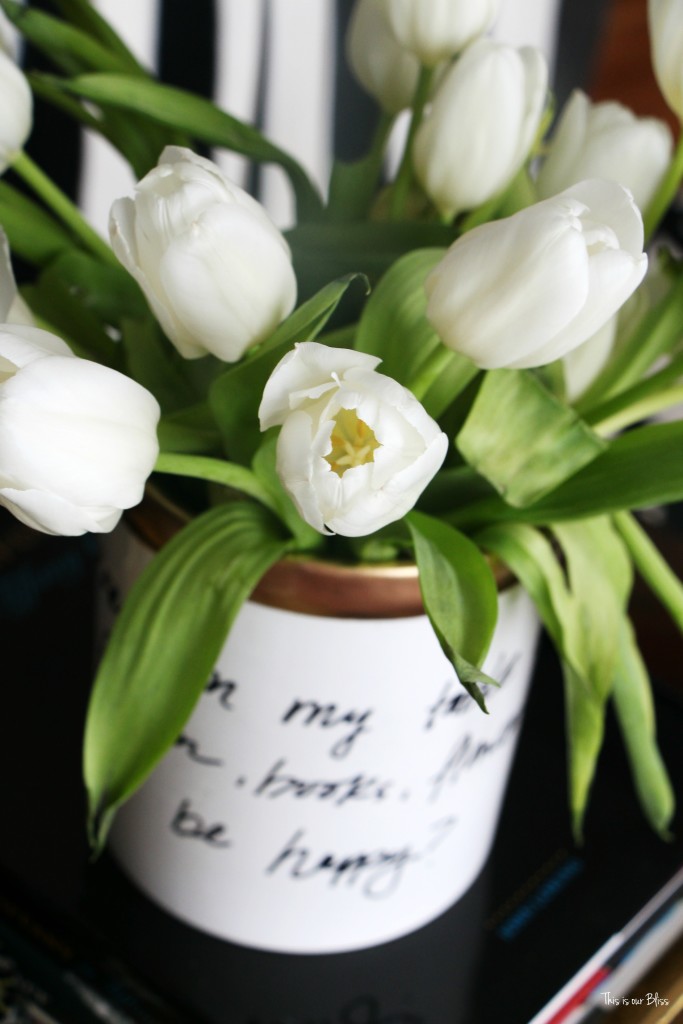
I added white tulips [I know, should’ve been roses, right?!] and placed it on the coffee table in our formal living room. She fits right in!
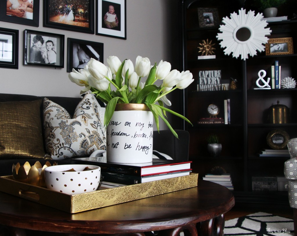
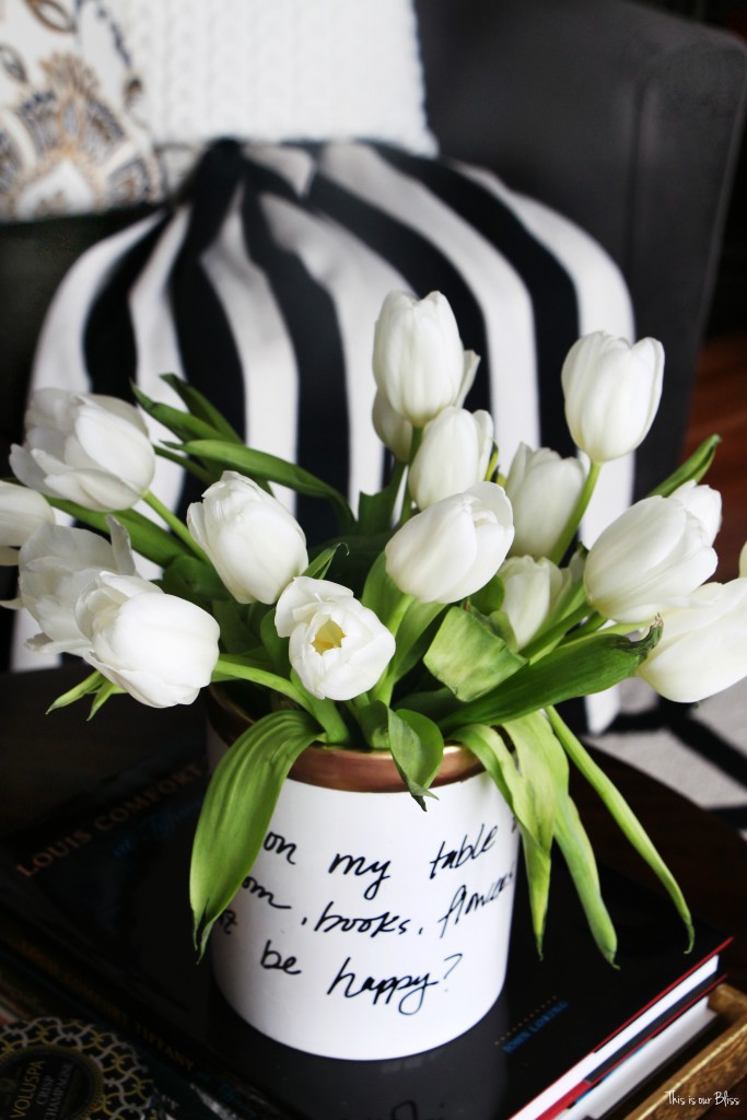
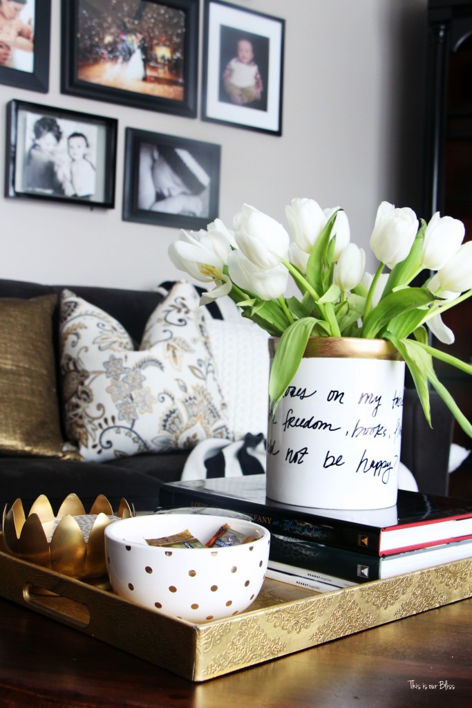
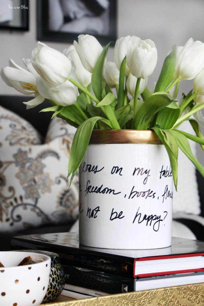
It’s not perfect, but that’s what makes it unique!
You get to see even MORE Kate Spade knock-offs today just by clicking over to these next few stops! I can’t wait to see what everyone has been up to – no doubt they are gonna be GOOD!
Feeling inspired? Have you already knocked-off a Kate Spade piece before?
Have a lovely Tuesday! Thanks for hanging out here today!
*Affiliate links were used in this post.







Vintage4YourHome
April 19, 2016 at 8:30 PMI absolutely love this knockoff. . Great job. .I think I’ll make one. .thanks for sharing the tutorial
Rachael @ This is our Bliss
April 25, 2016 at 8:49 PMThank you! Yes—give it a shot!! It was so quick and easy, plus has a unique look to it with my handwriting 😉
Weekly Link RoundUp | KP FUSION
April 5, 2016 at 10:25 AM[…] Knock it Off DIY | Kate Spade Inspired Vase (This Is Our Bliss) […]
Stephanie @ Casa Watkins
February 19, 2016 at 9:07 AMAdore it!!! You were so smart to write it in pencil before the marker! I would have just gone for it and definitely would have messed it up haha. Love the vase and your styling!!!
Sue
February 18, 2016 at 6:53 AMLove love love the vase! It looks perfect in the formal!
Rachael @ This is our Bliss
February 19, 2016 at 9:15 AMThanks, Mom! xoxo
britt kingery
February 17, 2016 at 9:17 PMAwesome! This looks totally store bought and every bit as good as the original! Smart move writing with the pencil first. I could see myself ending up with life 5 or 6 “oops” vases, LOL.
Vel
February 17, 2016 at 9:35 AMFabulous!!!!!! I wouldn’t be able to tell that it’s not KS if you didn’t share the tutorial Rachael!
Sara
February 16, 2016 at 8:16 PMI’m not gonna lie, I want this! Please sent it to me now!!! This is fantastic Rachael! The letters looks awesome! Great pictures too!!
Rachael @ This is our Bliss
February 17, 2016 at 11:58 AMIt’s on its way!! ha! Thanks so much, Sara!!
prettypracticalhome
February 16, 2016 at 3:24 PMThis turned out gorgeous! I’m impressed with your lettering skills and love how you styled the vase–just perfect!
Rachael @ This is our Bliss
February 17, 2016 at 11:59 AMAhhh I was so NERVOUS to start the lettering part… eeek! Phwew – its over. Thanks so much 😉
Pat
February 16, 2016 at 9:52 AMLOVE!! I think you did a wonderful job with your writing! Looks perfect with your other coffee table items.
xo
Pat
Rachael @ This is our Bliss
February 17, 2016 at 12:00 PMThanks, Pat! I was dreading the sharpie part haha! It definitely has a home for awhile!
Iris Nacole, IrisNacole.com
February 16, 2016 at 9:08 AMI love it! I’d never have a steady enough hand to write that well, even tracing, so I’m in awe of your skills!
Rachael @ This is our Bliss
February 17, 2016 at 12:00 PMThank you! I was pretty ancy about busting out the sharpie to actually start the lettering part!
jessica
February 16, 2016 at 8:42 AMThis looks great and y’all with these sharpie tutorials are making me wish I tackled one. Love it and I too love a good B&W with gold and some typography. Love!
Rachael @ This is our Bliss
February 17, 2016 at 12:01 PMThank you! Are you kidding me?! Your rug is so AWESOME!! Love love!