151It’s done! After a remarkably fast 4 weeks, the playroom has been significantly “refreshed” and I’m happy to report we’re all in love with it! I say we, because the space went from a catchall toy room that you could barely step foot in [the boys, included!]…to a freshly organized, bold and fun, family hangout space! I am still in shock by the level of transformation we were able to accomplish in such a short time frame. In case you missed week 1, week 2 or week 3 of the challenge, let me give you a quick run-down of the past month! The 4 week long New Year, New Room Refresh Challenge is the brain child of the amazingly talented and creative Stephanie of Casa Watkins Living and a group of us teamed up for the 2nd year in a row to spruce up a room in our home. You can see the master bedroom refresh I completed last year for the NYNR challenge in our old house. I even used the curtains from there in the playroom.
It’s an excellent way to start off the new year by setting a deadline and working your tail off! Next time you hear me complain about the 6 week duration of the One Room Challenge, give me a nudge and remind me that I should be grateful for the extra 2 weeks!
BOLD & MODERN PLAYROOM
Today, I’m going to walk you through what we did to create the new and improved playroom and then share sources at the end. Be sure to also stop by the other gal’s blogs and check out their rockin’ room reveals! I can’t wait to head over and ooh and ahh over the marvelous spaces, myself!
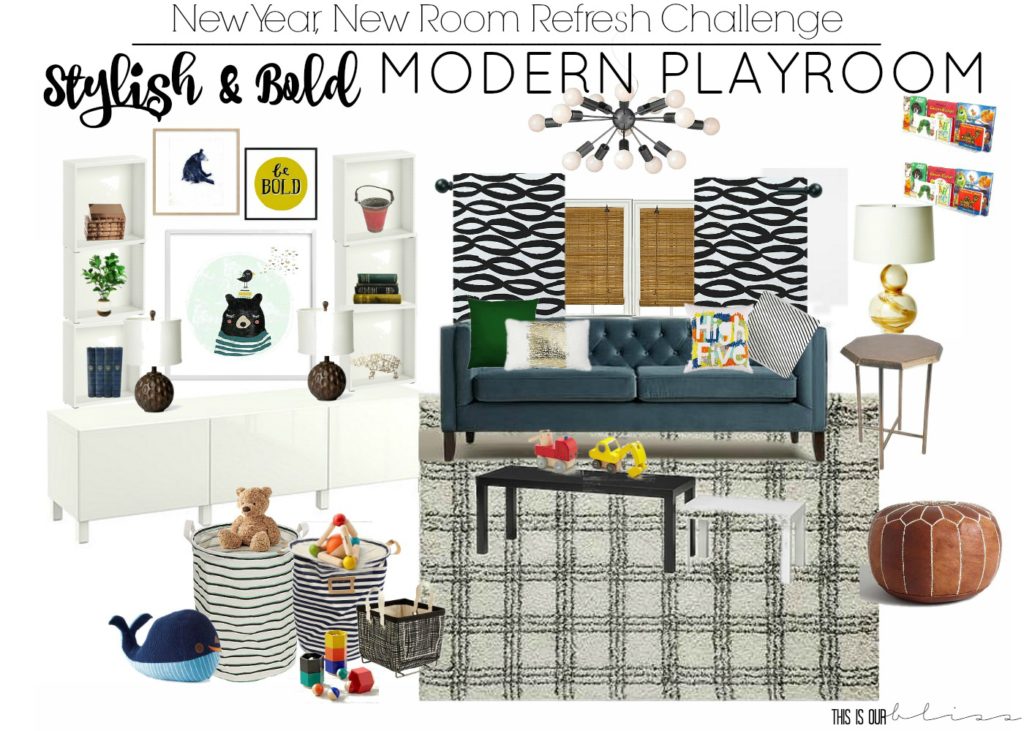
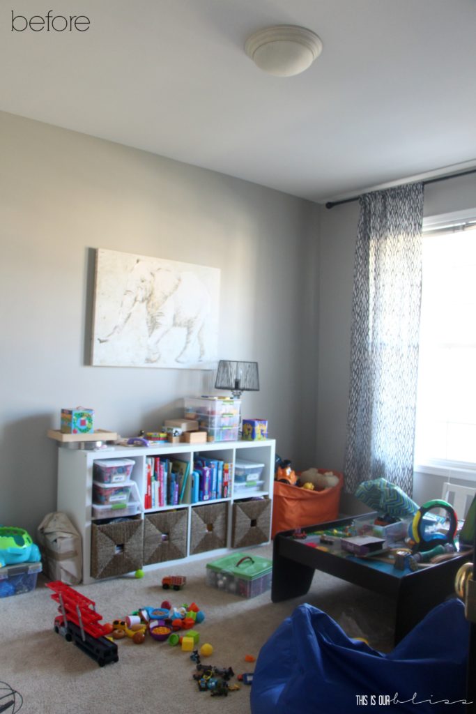
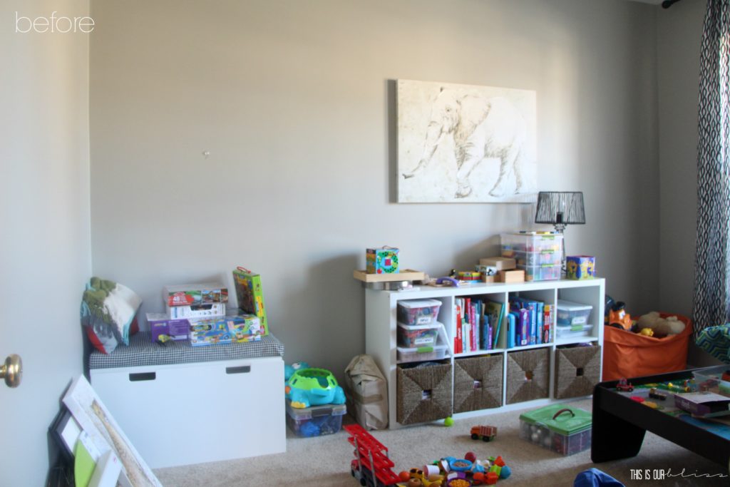
I’ll quickly rewind back to week 1 of the challenge when I shared my vision for the space and of course it wouldn’t be a true reveal without some before and after action, so here it is in case you already forgot!
BOLD & MODERN PLAYROOM BEFORE
Enough before’s, right?! I’m sure you’re ready for the “AFTERS” of this stylish and bold modern playroom!
Here we go—Come on in!
BOLD & MODERN PLAYROOM REVEAL
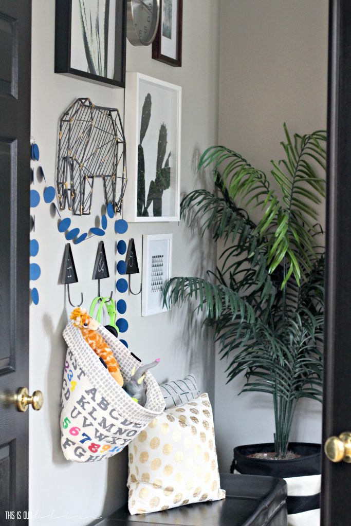
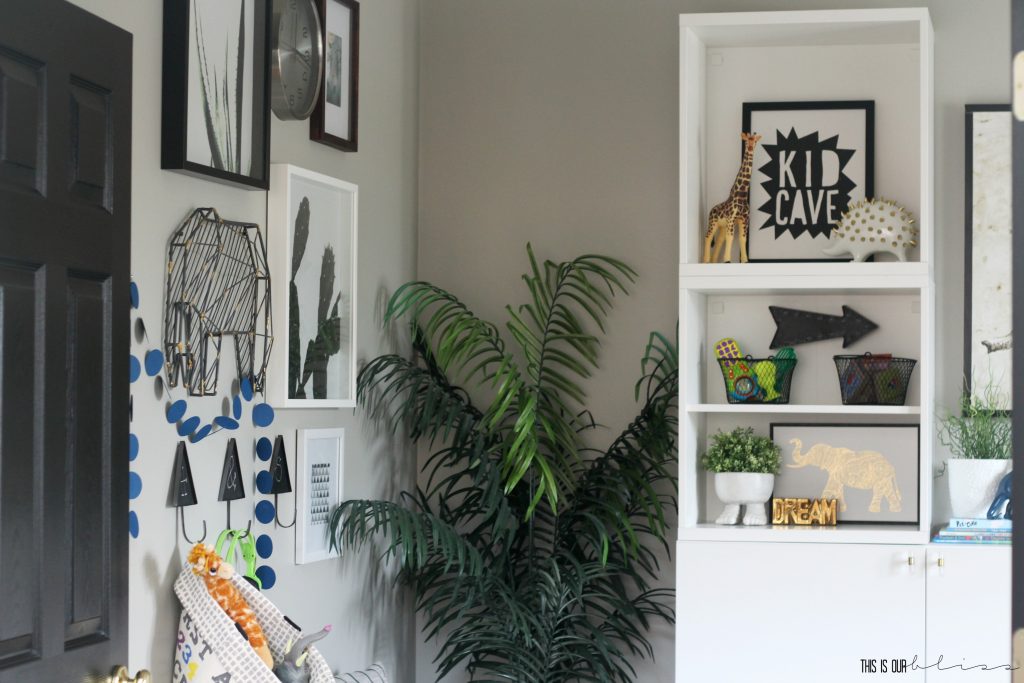
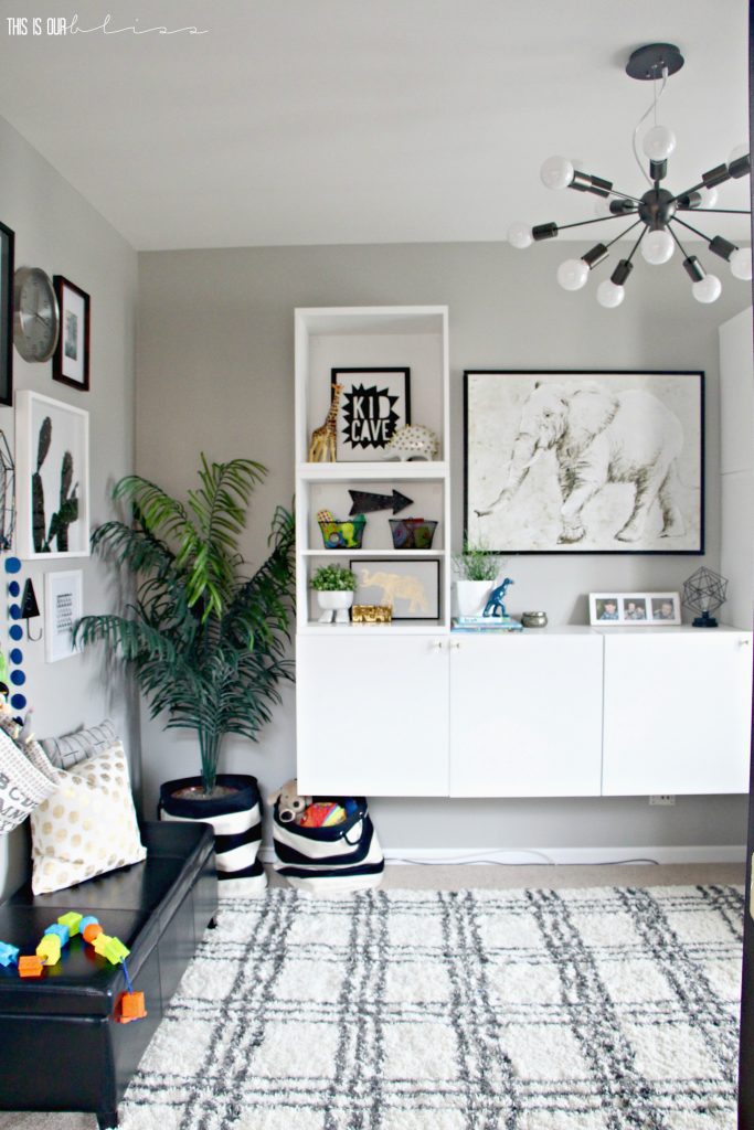
Over the course of January, the space sort of morphed into a modern safari theme. Jungle animals, lots of greens and a few wood accents. I kept the accessories fairly neutral, so you’ll see lots of black and white, with pops of blue, green and gold.
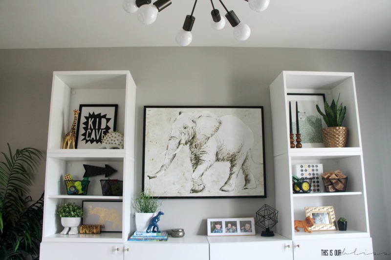
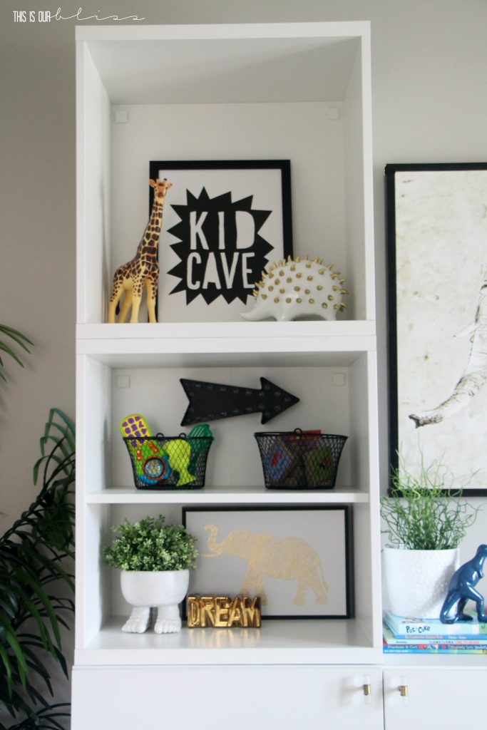
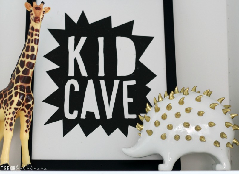
Many of the animal accessories and art we already had, but I was able to bring in some new stylish accessories as well! I love this “Kid Cave” sign I found – totally fitting for a space that houses the belongings of my two little animals.
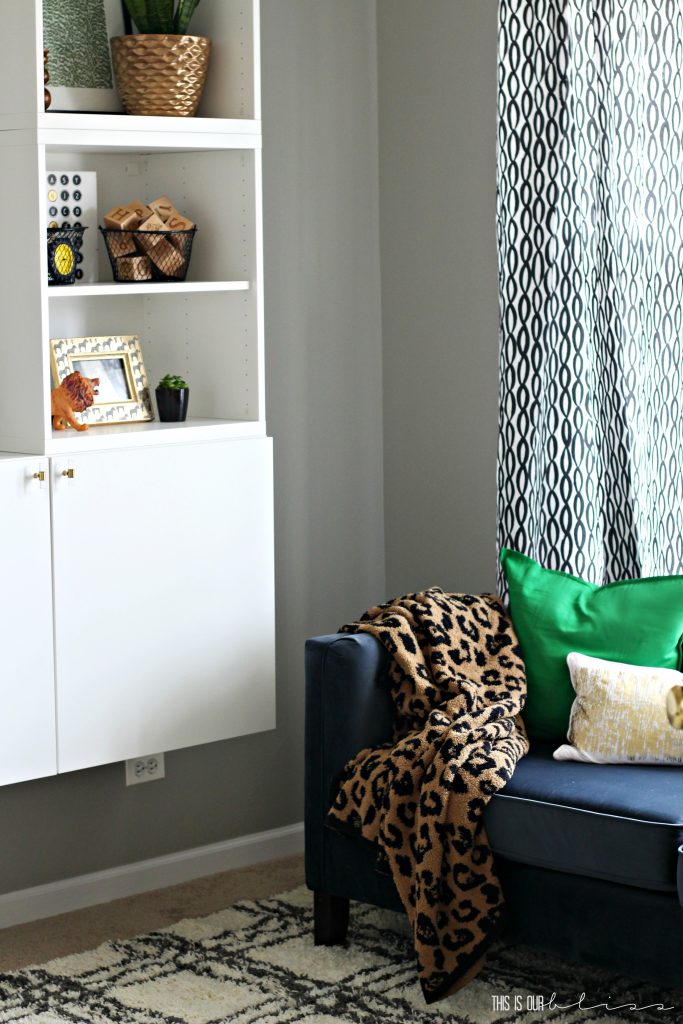
PLAYROOM COUCH
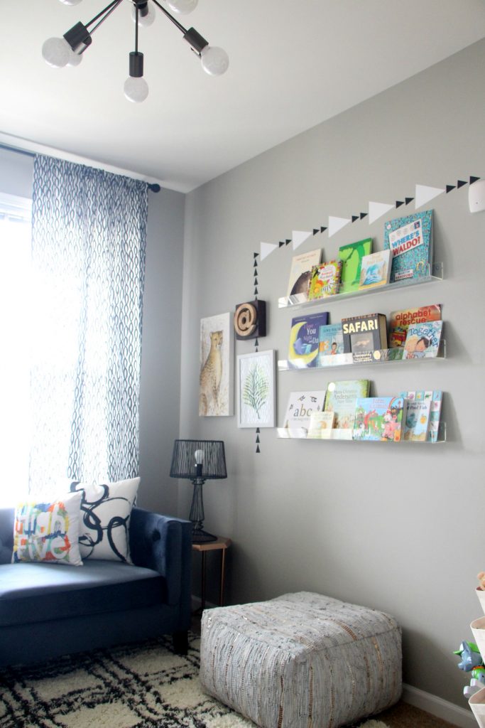
The blue couch is gorgeous, but truthfully, I had a hard time capturing a good photo of it since it sits right in front of a large window. I think you can still see the rich blue color and the awesome tufted detail.
I still can’t believe we were able to add 2-3 times the amount of furniture in here and miraculously have MORE room!
One of the main reasons we have so much more play space on the floor, even after adding a sofa in the room, is how we utilized the walls. Like floor to ceiling wall utilization!
PLAYROOM ACCESSORIES
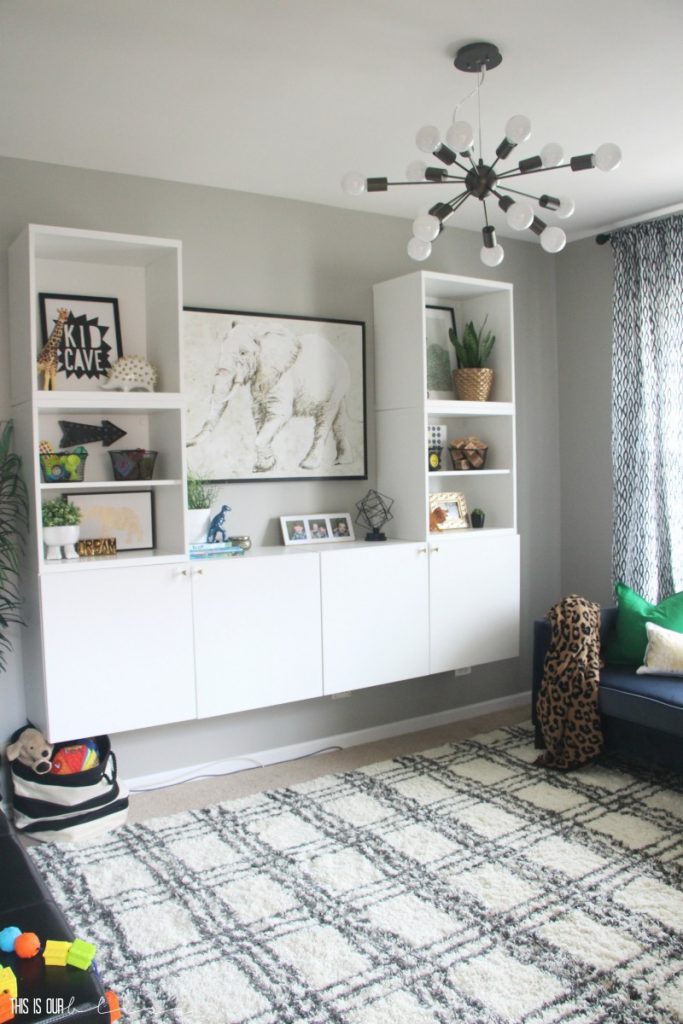
We now have a large, mounted wall unit to house aaaaallll the toys, games, puzzles, etc., with open shelving above for decor and accessories. We hung floating shelves to store and display books on the wall across from the large wall unit….
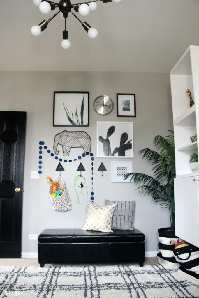
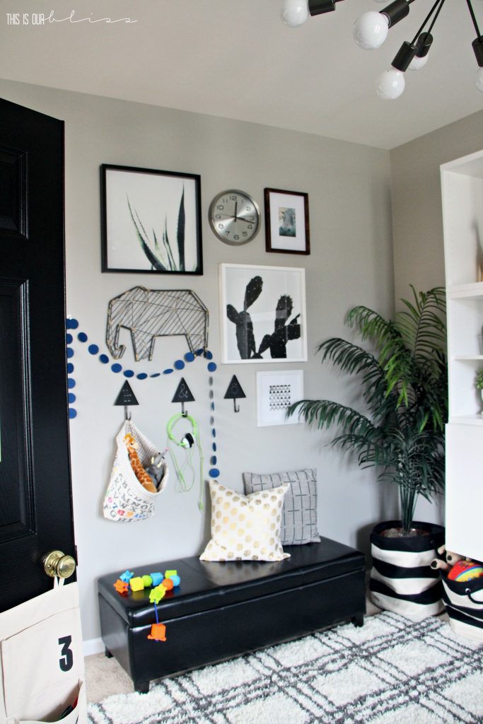
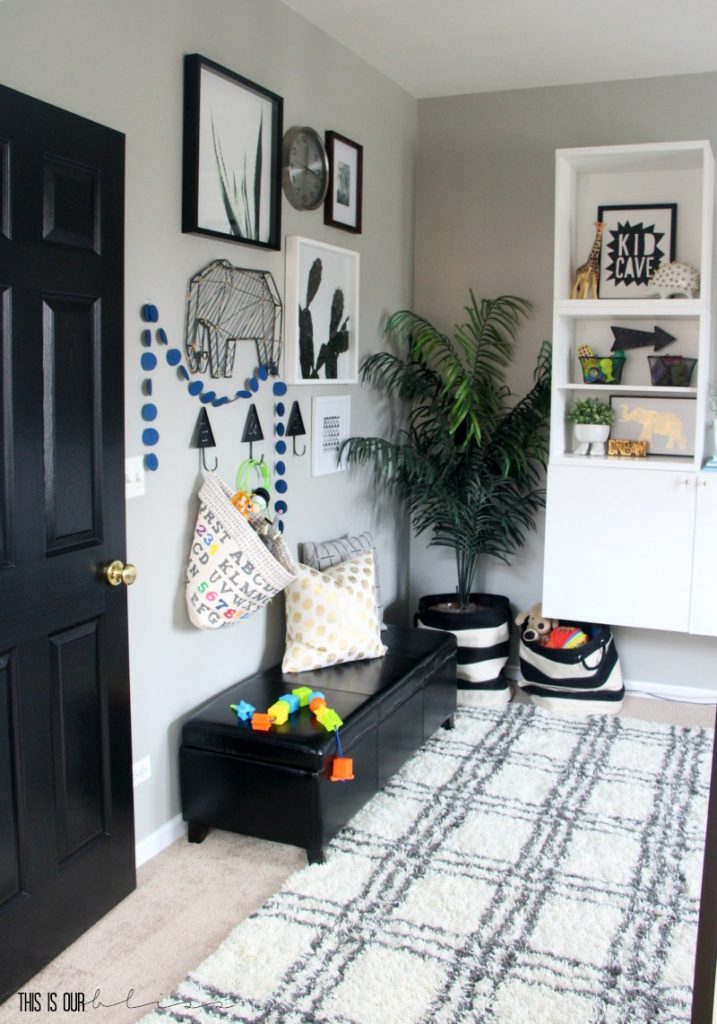
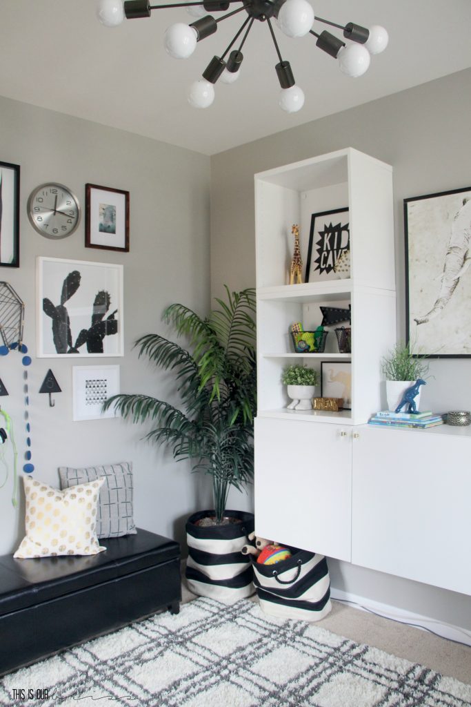
And on the wall opposite of the couch, we hung wall hooks and created a gallery wall of art and frames above a bench that holds…can you guess?!…more toys!
PLAYROOM BUILT-INS & STORAGE
The wall-mounted storage unit is the IKEA BESTA system. We had our eyes on a few of the pieces in the collection, but were completely sold on this particular set-up after seeing a similar set-up on display in the store. After having an 8 cube KALLAX storage unit in the room previously, I absolutely fell in love with the idea of having doors in the new unit to conceal all of the bins and baskets. Although I do try to keep everything stacked neatly and did have labels on the bins, it can still look super messy.
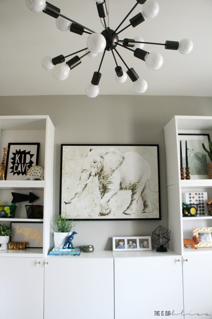
So, now their play things are kept in their own little cabinets, where behind each door is one shelf that divides the space in 2.
PLAYROOM SHELF STYLING
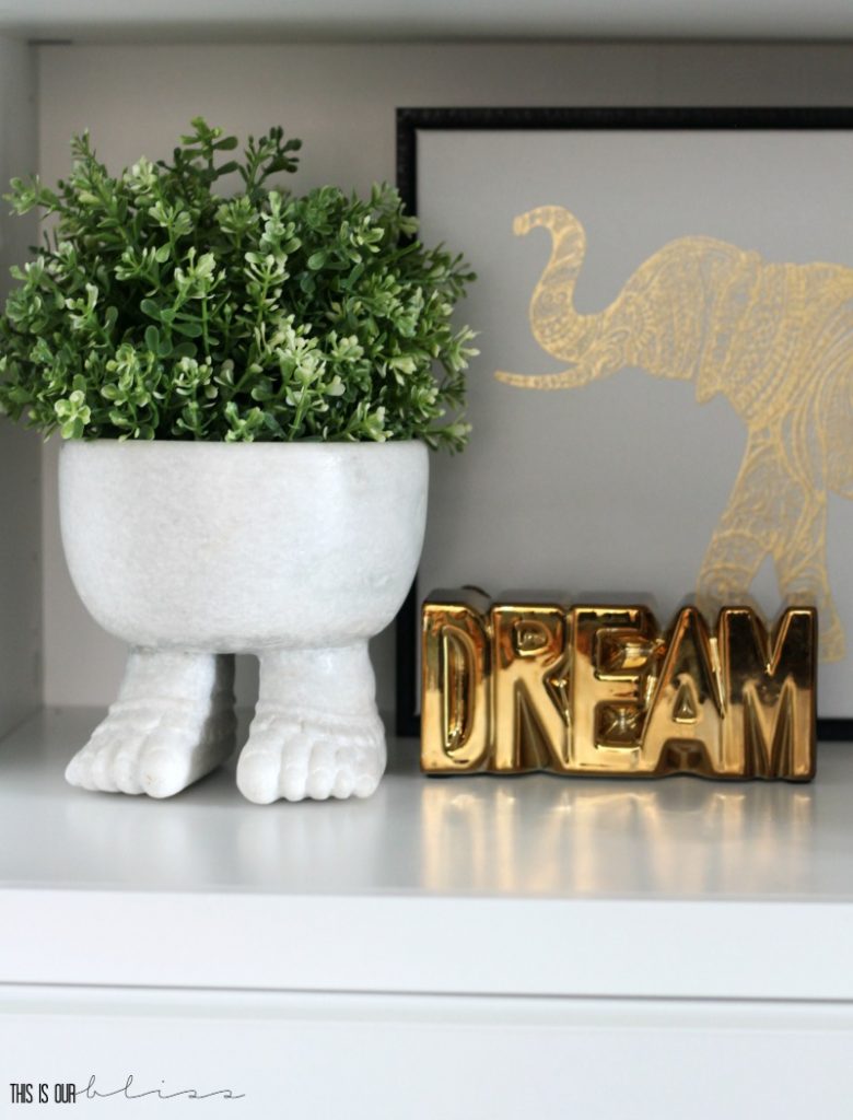
Styling these shelves was so much fun! Animals [some with brass spikes!]…art prints…plants and a few dollar tree wire baskets to hold smaller toys and blocks. A few of my thrifted finds were even able to make their way to the shelves, like that cute planter with feet and the wooden candlesticks on the far right side of the shelving unit.
I promise I’ll show you inside the cabinets in another post very soon, but I didn’t quite have enough time to get everything ready behind the doors. I came up with a new labeling method for in here and even bought the supplies, but I ran out of time! The month of February is going to be a catch-up month where I revisit all the DIY tutorials I owe you from the Curious Little Gentleman Big Boy Room and the ORC Dining Room.
Now, we can add this room to the list for follow-up projects. Oops – sorry guys!
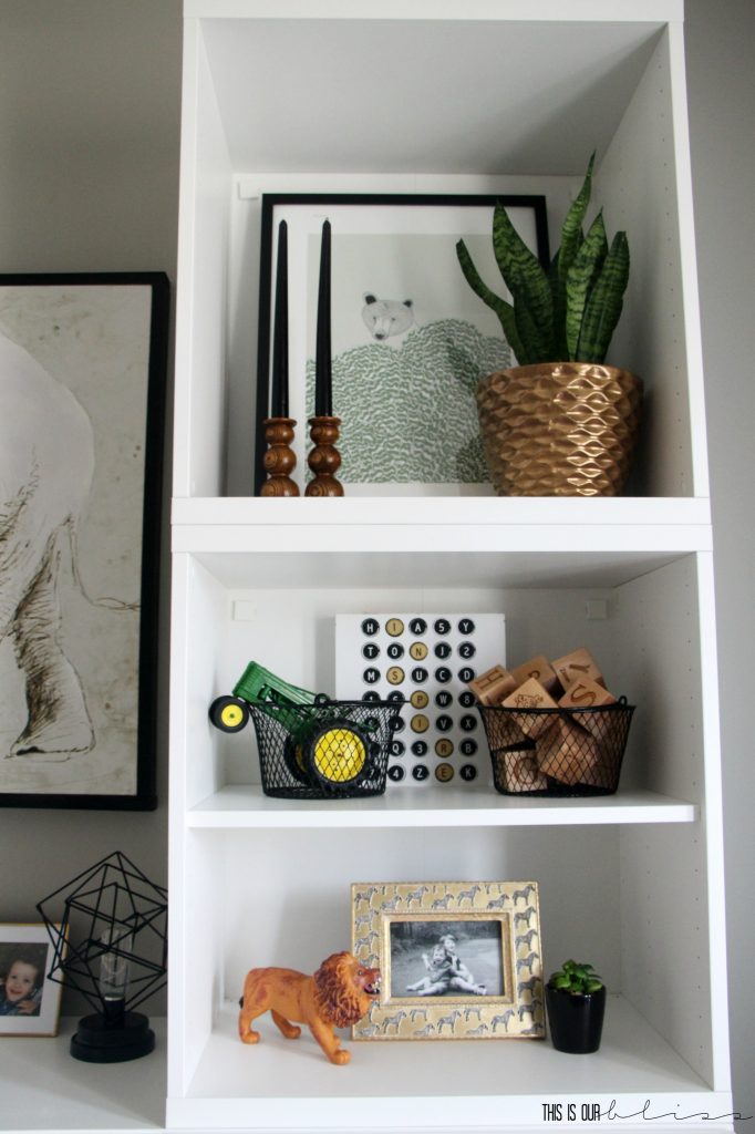
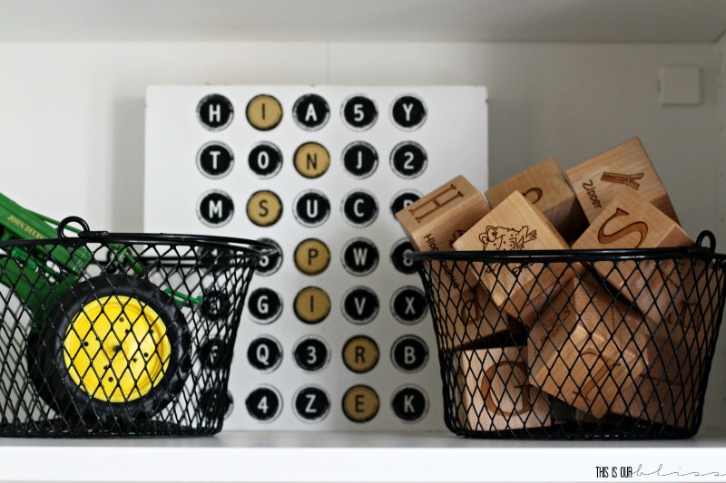
You won’t believe me, but I found the black, white and gold “INSPIRE” piece for 70 cents at TJ Maxx. The original plan was for it to go in the Curious Little Gentleman Big Boy Room since the biggest is infatuated with all things numbers, letters, reading and writing, but it didn’t make the cut…because, well…I forgot where I stashed it! I think it’s new home in the playroom suits it just fine 😉
PLAYROOM BOOKSHELVES
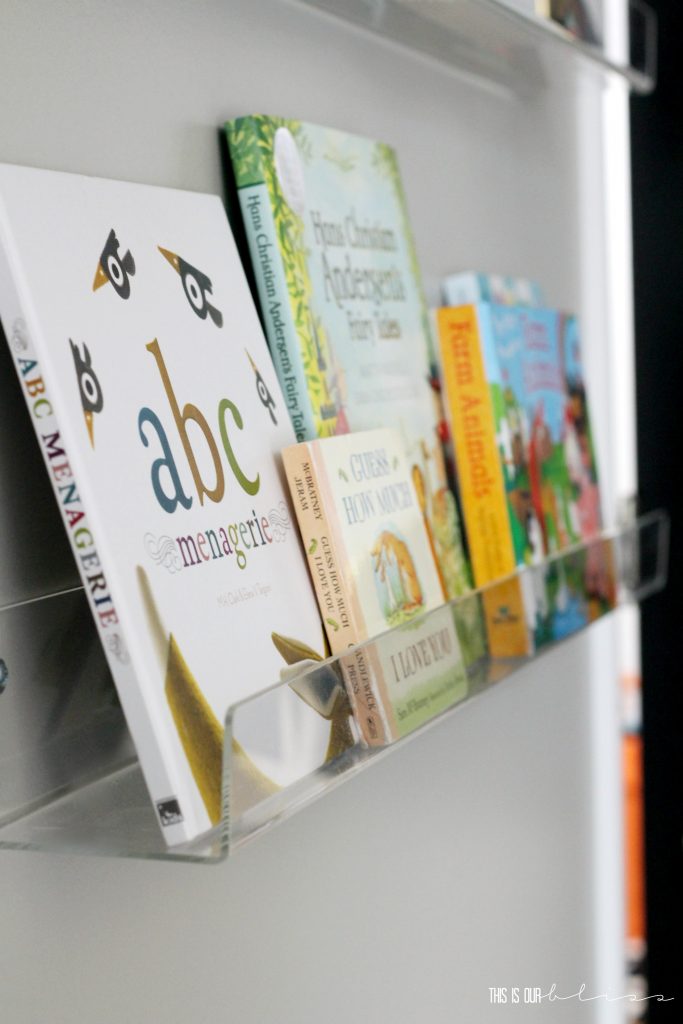
The acrylic bookshelves we hung in this corner are the sames ones as in the biggest’s big boy room, but we opted for the 36″ versus the 24″ ones we used upstairs in his bedroom.
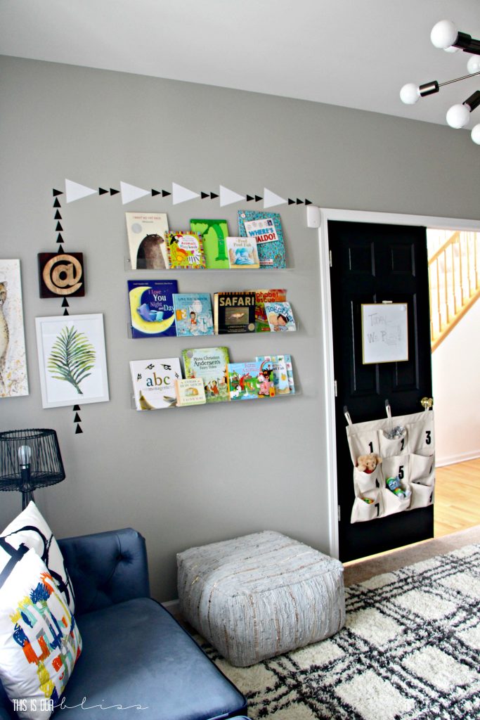
They are simple, sturdy and allow the books to be the stars of the show!
You might say I went a little cray cray on the walls, but I typically can’t help myself from adding more fun elements of art, frames, metal accents, canvases, you name it. On this wall, I experimented with some triangle decals and placed them throughout the pieces next to and above the bookshelves.
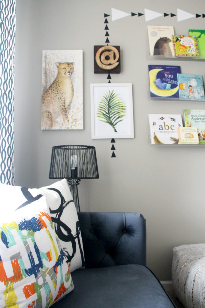
Sort of fun, right?!
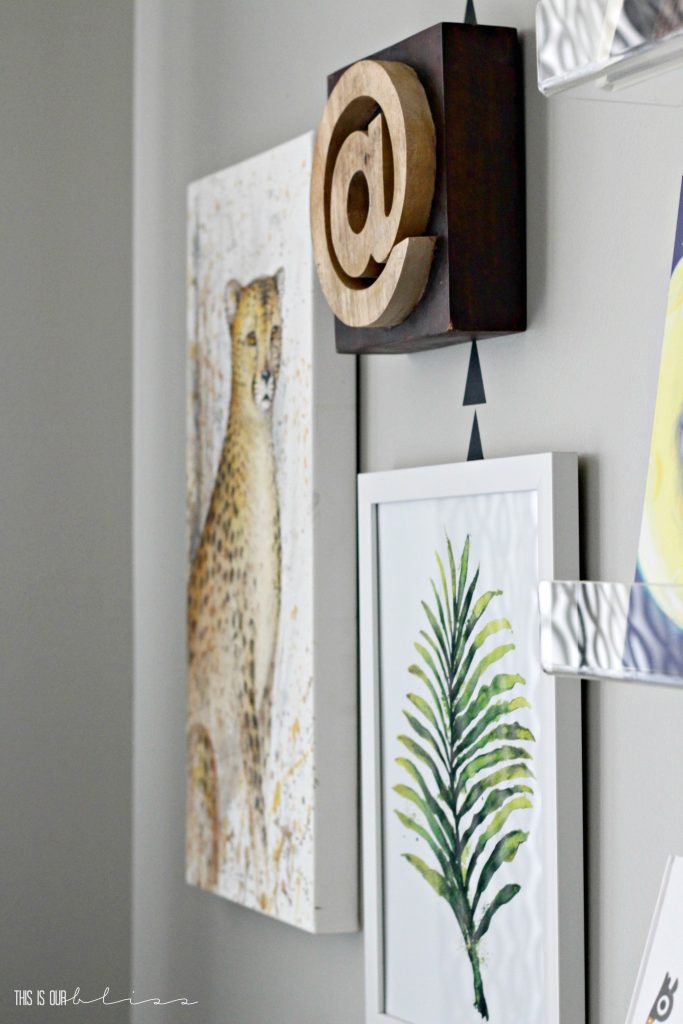
That awesome cheetah canvas is an original piece by my dad. He’s a wildlife artist and when I have a special request, he always comes through! You can check out the amazing mural he painted for Simon’s 1st Birthday Safari Soiree here!
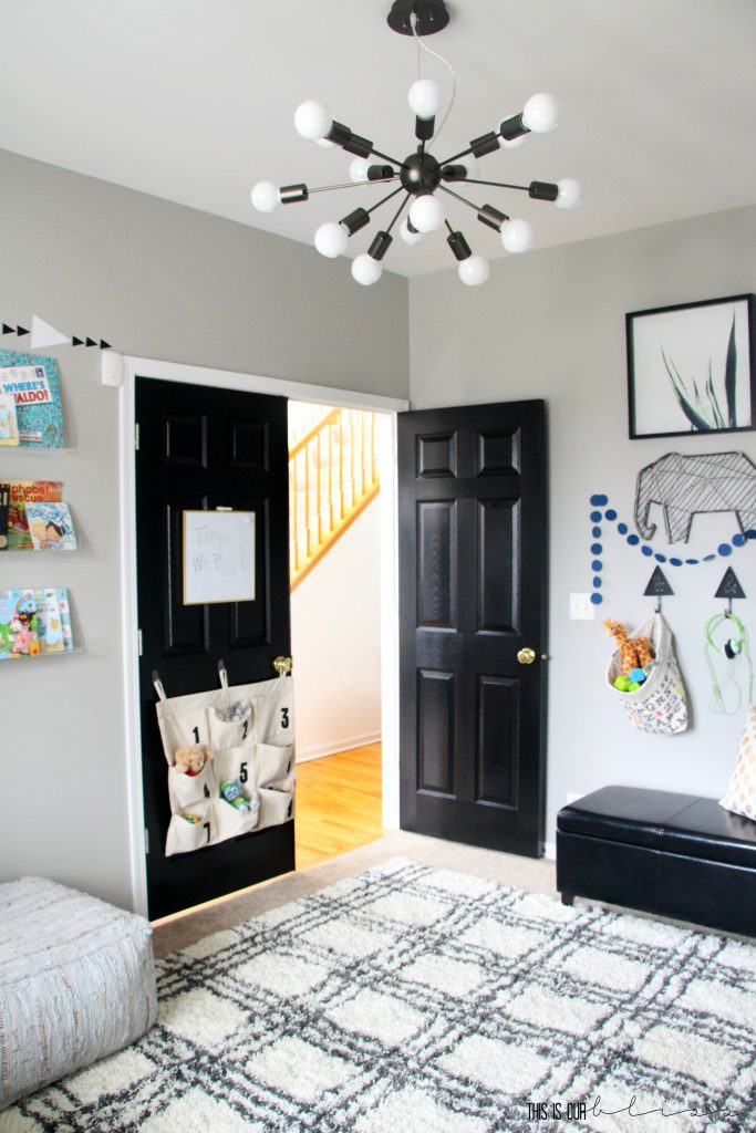
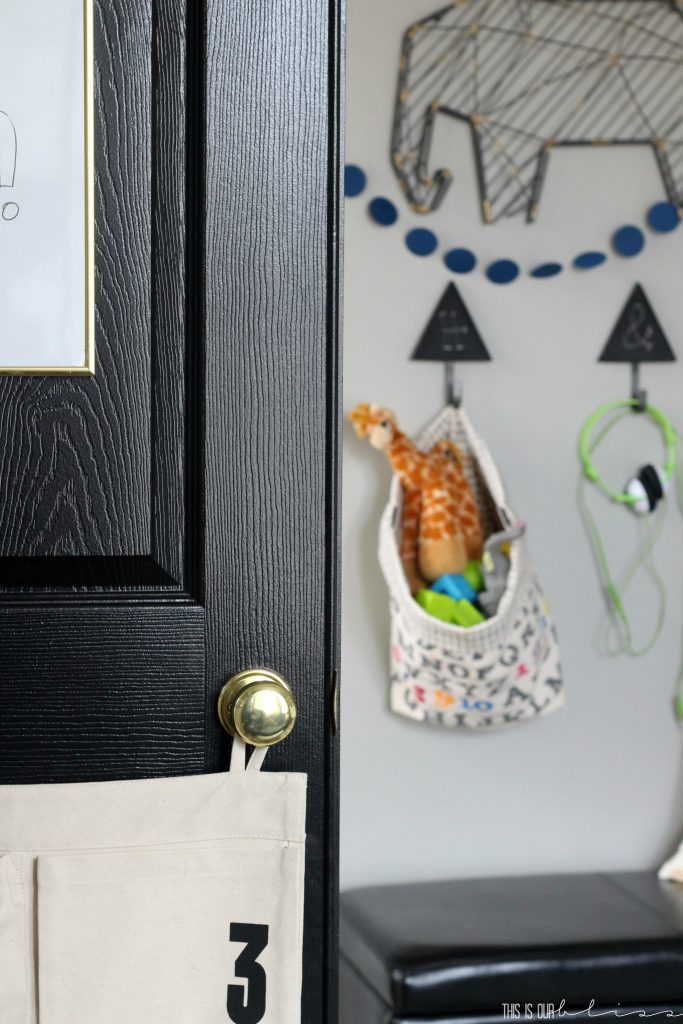
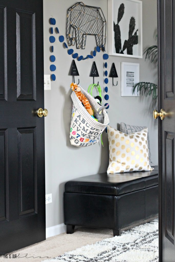
As we work our way back to the doorway, you’ll see I even utilized the door for toy storage. The doorknob holds one side of this canvas keypad storage hanger and a couple of medium-sized command hooks held up the middle and left-side. I hung it low enough so the boys can easily reach in and out for those small toys. Like the ones that aren’t necessarily part of a set 0r that need to be stored all together.
PLAYROOM GALLERY WALL
Back to the main gallery wall where I brought in an old leather storage ottoman that was a hand-me-down from my parents, but it now has a good home plus provides extra seating for kids and adults.
and then a few leftover shots of random nooks. Let’s see what’s left…
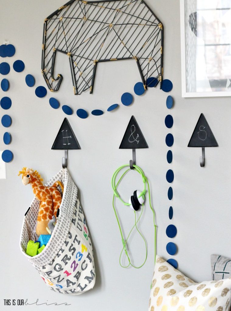
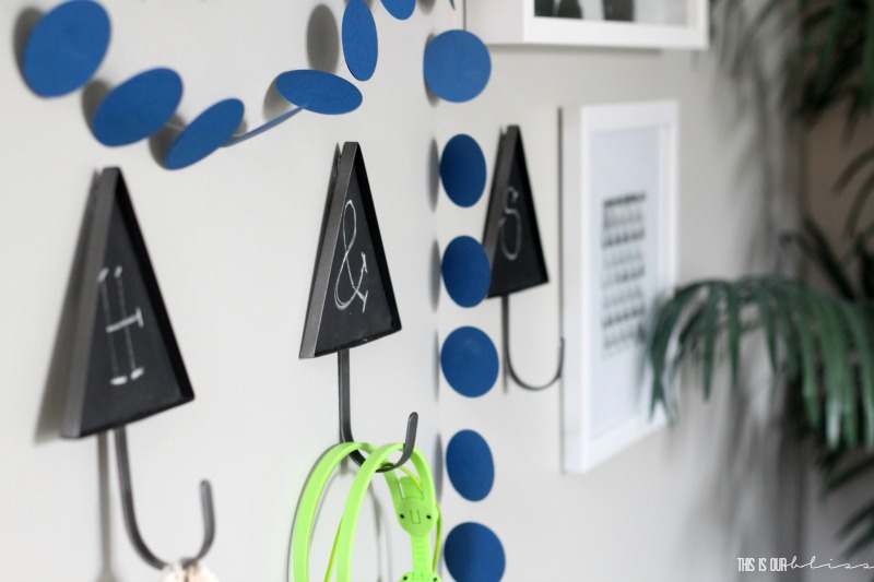
I had that metal elephant hanging in the old house’s basement playroom, so wanted to use some of the pieces we had as well as add in a few things, like these darling triangle chalkboard hooks! The Land of Nod is always an inspiration to me when working on kid spaces because they always look like so much fun. They are fresh, modern and bold! I created this blue circle garland after seeing something similar in one of their catalogs. Add that tutorial to the list!
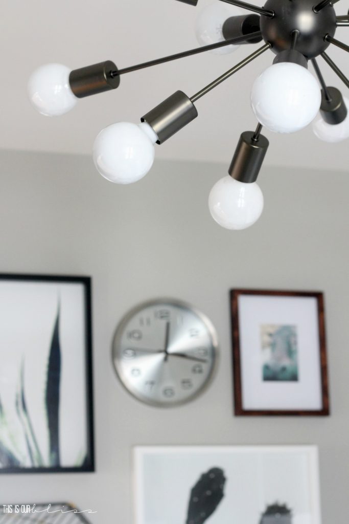
PLAYROOM LIGHT & CABINET PULLS
The gunmetal sputnik chandelier was calling my name from the moment I spotted it! I knew I was going to use a variety of metals in the space, so opted for this dark metal one. I had to fight the urge to go for brass every time!
And I almost forgot to mention the hardware we added to the cabinet doors on the wall unit. I actually had them leftover from a project I never completed in the guest bathroom at our old house. I thought these small acrylic and brass pulls would be perfect in here!
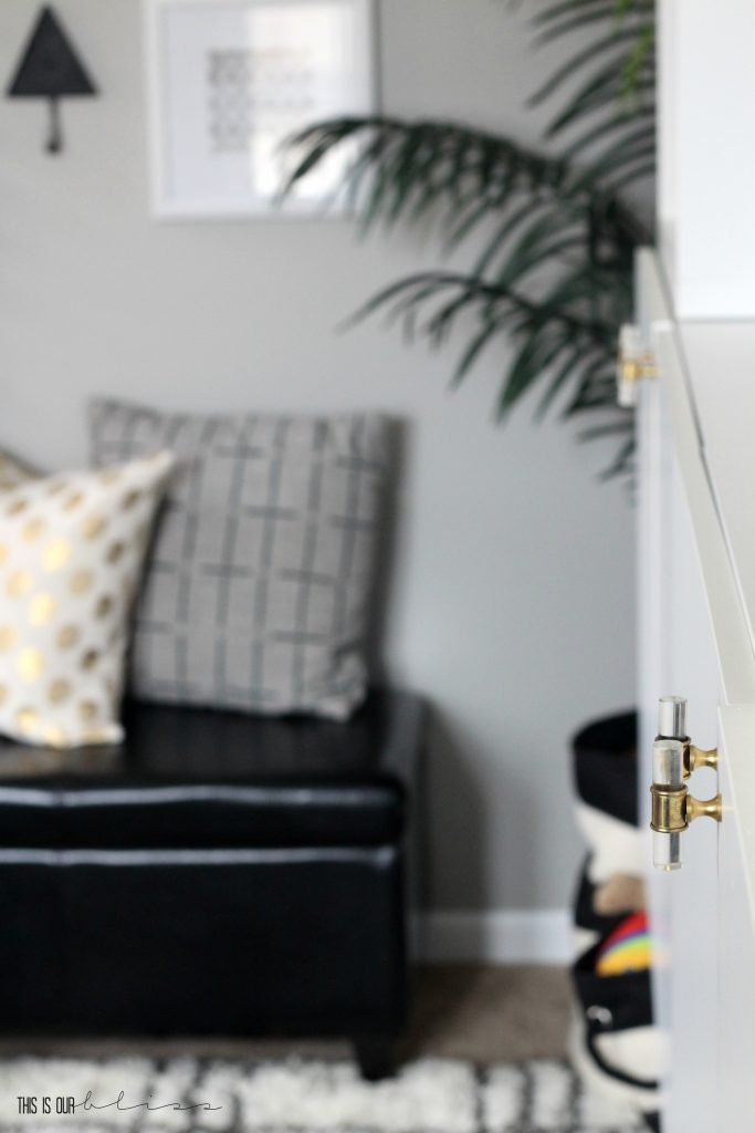
And back to the entrance we have arrived! I love the sleek, glossy black double doors that open up to this space. Like I’ve said before, it’s nice to be able to close them when its a mess in here, but now that the room is refreshed, I like to keep it open!
Thanks so much for stopping by to see our new and improved Stylish and Bold Modern Playroom!
I snapped a couple quick pics of the boys lounging in here yesterday just before the sun went down.
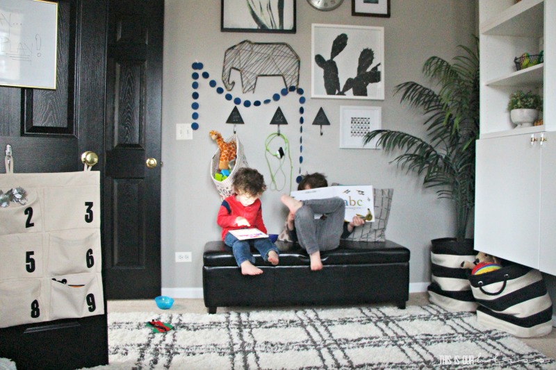
Books, ipads and snacks in their new playroom…what more could 2 little dudes want?!
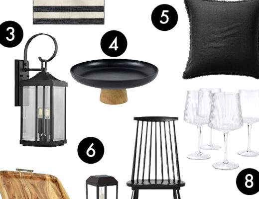
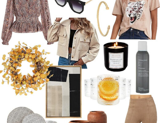
If you are looking for the where-to-buy info for the things you saw in the space, I’ve rounded up some, but unfortunately, not all of the sources so you can easily shop the playroom below! If I couldn’t find something, I did my very best to include something very, very similar!
[*Affiliate links were used below.]
Head on over to these beauties below! Their spaces are INCREDIBLE!

Casa Watkins Living // A Designer At Home // Bigger Than The Three Of Us // Domicile 37 // Fresh Crush // Iris Nacole // Monica Wants It // Pocketful of Posies // Seeking Lavender Lane // Sharon Joyce Interiors // This Is Our Bliss // Up To Date Interiors // Vintage Romance Style
This playroom makeover would not have been possible without the amazing products from our sponsors!

[*AFFILIATE LINKS WERE USED BELOW.]
World Market | Lamps Plus | Wallpaper Boulevard | Velvet Finishes | RugsUSA | Walls Need Love
Now, I’m off to read the reveals from above & get busy working on all of the follow-up posts I owe you!! Have a wonderful day and thanks so much for hanging out over here. I hope to see you back again really soon!






Kathryn Baugher
February 13, 2017 at 5:13 PMThis is the stylish playroom I’ve ever seen! I love how kid appropriate it is but adults could still hang out in there. Beautiful job and so many great details.
Rachael @ This is our Bliss
February 21, 2017 at 2:52 PMThanks, Kathy!! Creating a space for us all to play in together was what I kept in the forefront of the plan. We LOVE it!
The Creative Circle Link Party: Week 102 | Iris Nacole
February 9, 2017 at 8:02 AM[…] How cute/stylish is this kids play space from This Is Our Bliss! I LOVE IT! Makes me want to get… […]
Margo
February 7, 2017 at 8:07 AMI didn’t think it was possible to give a playroom a clean, crisp look, but you did! It’s gorgeous!
Rachael @ This is our Bliss
February 21, 2017 at 2:50 PMThat’s so sweet of you! Thanks, Margo! The boys are still pretty young to have much say in the decor, but pulling together some of their favorite colors and animals into a family-friendly space that can grow with them was my goal. Happy to hear you like it 😉
IrisNacole.com
February 3, 2017 at 3:41 PMThis is the coolest playroom! I love the new storage unit, and all of the decor! Makes me want to get to work in my son’s space, since I’ve been pushing that back on my to-do list for a while now. 🙂
Rachael @ This is our Bliss
February 21, 2017 at 2:48 PMThanks, Iris!! I didn’t plan to move this room up to the top of the project list, but am thrilled to have it done for the boys. For all of us!!
Corinna - ADesignerAtHome
February 1, 2017 at 4:46 PMHoly crap I am massively in love with this space! I NEED that wall unit in my house. It’s incredible. And then the gallery wall- how cute! So many incredible details all over the space. It’s a feast for my eyes!
ashley@biggerthanthethreeofus
February 1, 2017 at 9:12 AMSuch a fun playroom! love the art, bookshelves and accents throughout.
Sharon Joyce Interiors
January 31, 2017 at 5:38 PMSo fun and chic! This room is perfect for kids and grown-ups, too. Your dad did an amazing job with the artwork. Big YES for the black doors–love them so much! Enjoy the new playroom!
Melissa Anderson
January 31, 2017 at 12:03 PMWhat is this paint color? Love.
Rachael @ This is our Bliss
February 1, 2017 at 5:01 PMHi Melissa! It’s Sherwin Williams – Mindful Gray. You can see our entire basement done in this same color in our last house, plus a few of my other fave paint colors here: https://www.thisisourbliss.com/2015/10/26/basement-carpet-paint-sources-tiob-basement-project-update-v/
Thanks for stopping by!
Cassie Bustamante
January 31, 2017 at 10:44 AMlooks sooo good! love the modern look! i have really got to finish ours… it’s like partially done and i don’t love it. it’s got sort of a similar vibe so far!
Rachael @ This is our Bliss
February 1, 2017 at 4:58 PMGosh – Thanks, Cassie!! I do have to say… I considered working on our family room or our powder room, but I’m thrilled I spiffed up the playroom. It truly has become a spot for the whole family! I know yours is going to look FAB when its all done!
Jen @ Fresh Crush
January 31, 2017 at 10:41 AMMost stylish playroom ever! I’d push my bed in there and feel right at home! It’s gorgeous!
Rachael @ This is our Bliss
February 1, 2017 at 3:28 PMAww thanks, Jen! I’m thrilled to have it DONE! We love hanging out in here and I think I’d be perfectly happy crashing in here myself ha! 😉
jessica
January 31, 2017 at 10:27 AMRachael, you are too good! I love this and how sophisticated it looks. I like that although this is a kids room they can grow into it without you having to make major changes. love it!
Rachael @ This is our Bliss
February 1, 2017 at 3:25 PMThanks, girlfriend! Initially, I was nervous that it wouldn’t feel kid-ish enough, but I think it’s a good happy medium for the whole family!!
Stephanie @ Casa Watkins Living
January 31, 2017 at 9:13 AMAmazing Rachael!! What a fun room! Loving all the chic accents. It makes it so kid friendly and still a great place for adults to hangout. Fantastic refresh!! Love those cabinet pulls 😉
Rachael @ This is our Bliss
February 1, 2017 at 3:22 PMThanks, Steph!! I’m so happy to have this room finished in the new house and ALL be able to enjoy it together!! We’ve already had our fair share of dance parties in here! ha. Thanks again for putting on another awesome challenge!!