Decorating your home can be overwhelming. I get it. I’ve totally been there. But the one thing I’ve learned over time, is that it’s nearly impossible to try to classify your decor style and shove it in one tiny little bucket! Why can’t we combine multiple styles in order to invent our own unique mix? Well, that’s what today’s post is all about! It’s another edition of My Home Style hosted by Casa Watkins Living and the focus is to share how we mix, match and coordinate different styles to create our very own. There are 12 bloggers dishing on the decor they love, what styles are represented in their home and how to get the look shown in the photos that we oh-so-love!
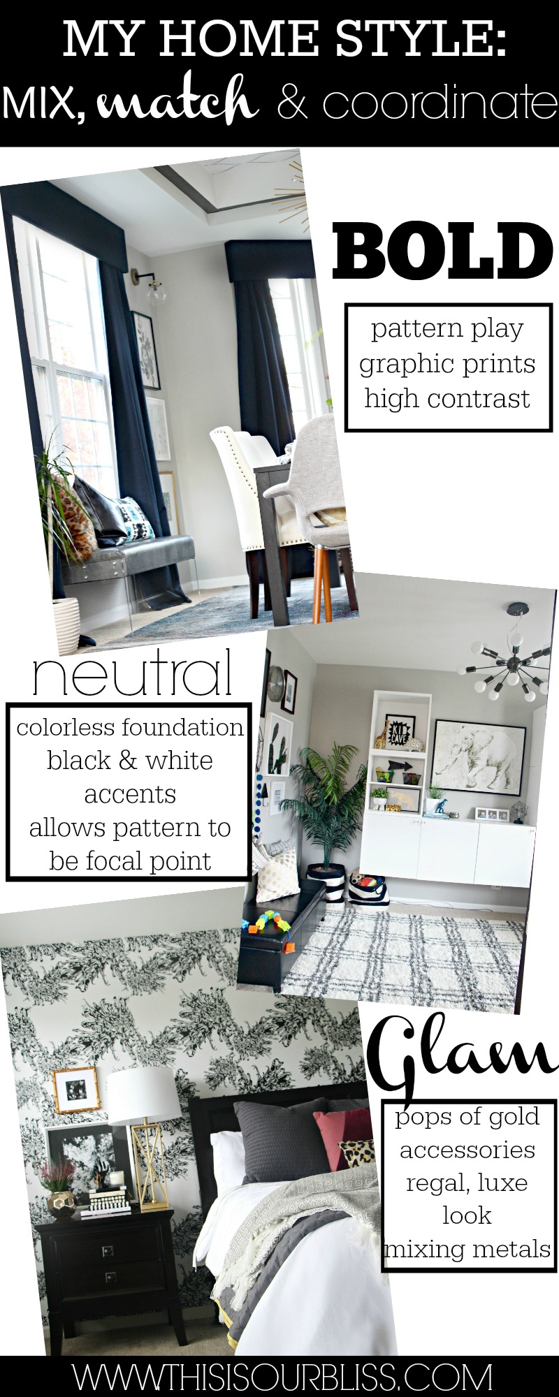
I’ve whittled down my style to Bold, Neutral Glam, so come and take a peek at how I’ve mixed up these styles and how we rock them all in our home!
BOLD
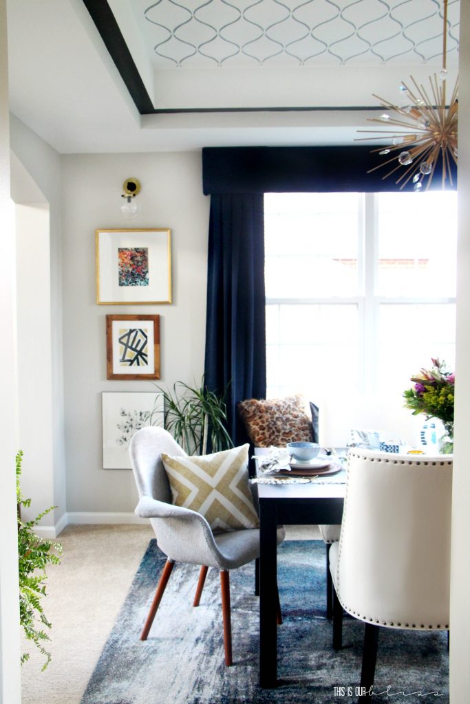
The word bold might mean different things to different people, but in my home you’ll find bold PATTERN! There is no such thing as too many patterns, but there are tips for creating pattern play that is appealing to the eye. You can check out my tips for mixing prints here.
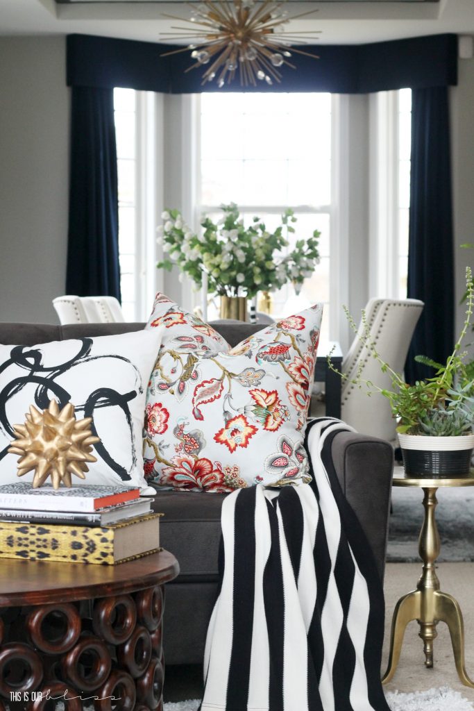
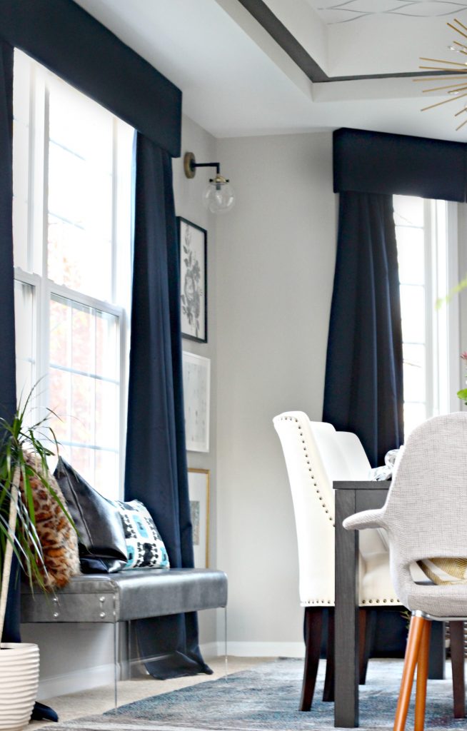
Pattern can be used everywhere! Layering various patterns in your spaces with pillows, rugs, wall art and even on the ceiling, gives your room depth, substance and a certain level of richness. I am definitely a more-is-more kind of decorator, so learning how to balance out the bold patterns can take some time. But with a little practice, I say the more the merrier!! Large prints, small prints, florals & geometrics…they can all work together! There is one print in particular that you’ll see carried throughout our home. I simply can’t help but bring it into each space.
[Dining Room Reveal + Sources]
I’ll give you one clue. It starts with leop and ends with ard 😉
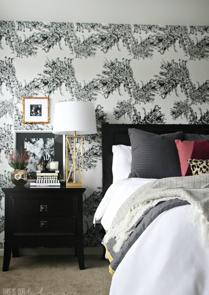
The other way in which bold can be used to describe the style of our home is through the use of high contrasting colors – primarily black and white. I love the classic statement of rich, moody black against crisp and clean white. Something about it just says “Oh yes!” to me!
Here in our master bedroom, you’ll see both bold pattern AND bold black and white.
This space is actually on the verge of a refresh or more like a room completion. I wallpapered the accent wall and then never finished decorating the other 3 sides of the room! Take a peek here to see my design plans and mood board for the bedroom as well as the before photos!
NEUTRAL
I always go back and forth about whether or not to remove this term when describing My Home Style… I mean, color does creep into our home every so often when I want to add a mini pop of color or accent an area seasonally or for a particular holiday. BUT, the truth is I’m always drawn to a neutral palette. For me, starting with a neutral foundation makes it easier to weave different patterns in and out as well as allow your pieces to transition across different styles. Plus, colors and patterns can easily be swapped in and out with seasons and trends. In this post, I share the reasons I love our neutral sofa and then show you how I’m able to style it with so much versatility.
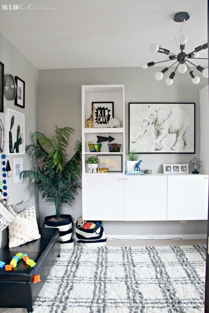
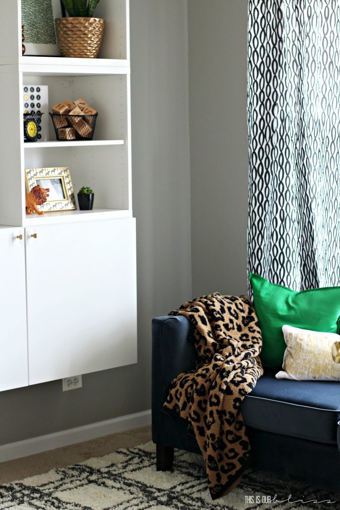
There was this one time though…when I sort of went against this whole “neutral furniture” philosophy and purchased a blue sofa for the playroom. Yes a blue sofa. But let me explain. It’s actually a very deep blue and can sort of look gray! I wanted some pops of blue in the playroom and fell in love with the size and shape of the sofa so in it went and I’m totally treating it like a neutral.
Any ol’ color or pattern will work on it! At least that’s the rule I’ve put into place 😉
However, neutral furniture pieces allow you to get creative and play around with color using smaller, less expensive accessories – pillows, books, art and candles. These items can be taken in and out of a space in just a few minutes and your husband won’t roll his eyes like he would if you were frequently telling him how badly you want to get rid of your colored sofa or pair of chairs. Well, there’s a chance he miiiiight give an eye-roll every now and then if his wife adds another throw pillow to her hoarder’s closet. Not that I know anything about that type of scenario!
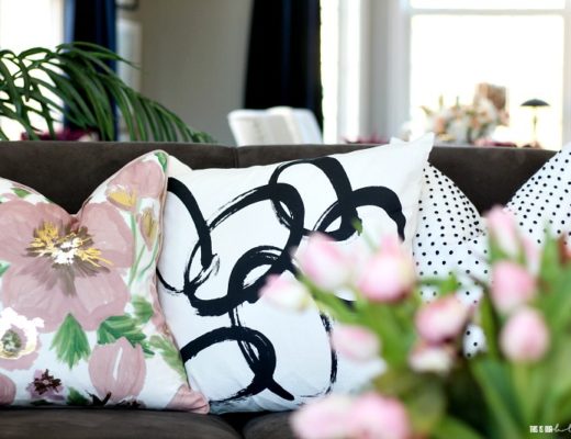
And since I love pattern SO much, effortlessly mixing neutral patterns is easier to do since I only have to pay attention to size and scale of the pattern vs. the color.
But when I *finally* decide to splash some color into the otherwise neutral space…man, doesn’t it just POP?!
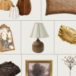
*A tip for using neutral accessories, like pillows for example, is to find ones with texture or unique detail— fringe, tone-on-tone pattern, tassles, poms, leather, fur, etc. This will create visual interest while still maintaining a cohesive, neutral palette.
Here are a few examples:
[*Affiliate links were used below.]
GLAM
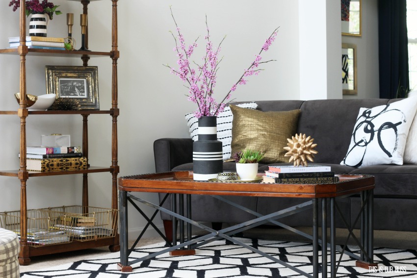
This one is a no-brainer if you’ve been hanging around here long enough. You know that I love to glam up a space with gold decor galore! I love creating little vignettes around the house – on my bar cart, coffee table and nightstand, so these places are where you’ll find all of my little gold treasures, as I like to refer to them as. Some are thrifted, others are clearance finds from Target or the mothership [A.K.A. HomeGoods]. I love achieving a high-end look for less. There is something so satisfying about scoring a bargain when you know the original price or even what a high-end look-a-like goes for.
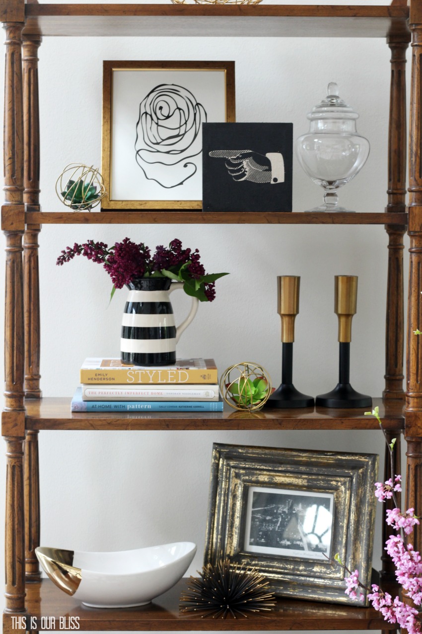
Sometimes I have to stop myself from putting in that very last piece of brass on the shelf. But sometimes, I pause and then add it anyways! The use of metallic decor instantly elevates the luxe factor in a space. Gold is definitely my favorite right now, but mixing brass, nickel, copper and iron is definitely where it’s at. There are no rules when it comes to mixing your metals. Use them ALL together for a chic, collected look!
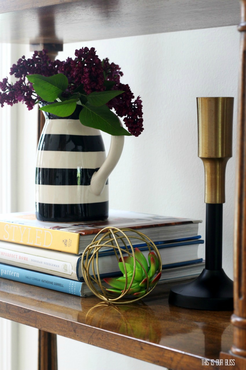
Want to create a faux metal look? Spray-paint will become your BFF. At least it’s mine! [Check out my DIY faux succulent-filled gold orbs here.]
Since I do typically use a neutral palette in the base of the room, the metallics sort of act as the accent color and really pop giving your space an instant glam vibe!
While I’m talking about metals in a glam sense, what I love about them is they easily transition across the full style spectrum – from vintage to farmhouse to traditional to eclectic to modern and everything in between. Metallics add an edgy elegance [do those even work together? You know what I mean, though, right?!] to the space and that is one look that I can fully appreciate!
Throughout the My Home Style series, I’ve continued to label my personal decor style as Bold Neutral Glam. Like the time I took it to the extreme and didn’t add a single ounce of color when decorating the Living Room & Dining Room for Christmas!
The characteristics bold, neutral glam still hold true, but I also want to toss Eclectic into the mix because well, I love the MIX! If you weren’t able to tell from the photos above, elements of traditional, vintage, contemporary and modern decor can all be found throughout our home. The timeless elegance in a traditional pattern paired with a funky thrifted vintage piece that just had to come home with me right alongside a modern geometric art print! The mixing, matching and coordinating of styles in each room of your home is what makes it unique to you and your family! While I tend to agree that your style should be reflected in each room in order to give your home a cohesive look, I really love when certain styles stand out a bit more than others in one space versus another. The four of us living under this roof have different personalities with certain, similar interests and characteristics, but depending on the day, some traits shine brighter stronger than others. That’s how I believe our home should feel. Each room should feel like us, but why not mix it up to keep things interesting?!
The style of your home can and WILL evolve over time and that’s okay. In fact, I think it shows growth. If you have a passion for decorating or styling, by doing it over and over you learn to perfect your craft and it just keeps getting better and better! You learn about what you love and what you hate. You decide color is for you or color is for the birds. You get creative and you try new things. And that right there is the beauty in decorating. It’s a form of self-expression, but above all, it is creating a space that our families feel comfortable and loved in. So mix it up, break the rules, buy what you like, DIY what you want and don’t worry about picking one style and sticking with it.
Mix it up. It’s more fun that way!
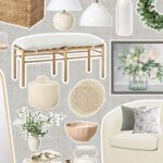
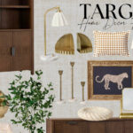
Take a peek below for some of my favorite key decor elements in our home that give it the bold neutral glam look & vibe…
[*Affiliate links were used below.]
Now, head on over to Willow Street Interiors and then work your way through all of these amazing collections of style. Each and every one unique. I promise you’ll pick up some excellent pointers for how to mix. match and coordinate along the way!
Wednesday Home Styles
Casa Watkins Living
Up To Date Interiors
Domicile 37
A Designer At Home
Cassie Bustamante
Haneen’s Haven
Thursday Home Styles
This Is Our Bliss
Willow Street Interiors
Iris Nacole
Blue i Style
Oscar Bravo Home
PMQ For Two




![The Easiest [and Cutest] Football Snack Mix for Game Day w/ a Chicago Bears Touch The Easiest [and Cutest] football Snack Mix for Game Day w/ a chicago bears touch - This is our Bliss #footballsnackmix #chicagobears](https://thisisourbliss.com/wp-content/uploads/2026/01/savingPNG-150x150.jpg)




Kathryn Baugher
May 22, 2017 at 4:17 PMI love that you use neutral palettes but your spaces are full of interest, chicness, and small bits of color. Your style looks so high end and your creativity and DIYs always impress me! Love, love, love.
Ariel
May 19, 2017 at 9:38 AMYou definitely nailed your styles! I can always spot subtle influences from all three in your work, great job friend!
Rachael @ This is our Bliss
May 21, 2017 at 9:57 PMThanks, Ariel! I’m working on increasing my use of color…maybe neutral will be a thing of the past in my house lol
laura @ willow street interiors
May 18, 2017 at 5:43 PMHi Rachael! Your home is so rich and textural and inspiring! I love your use of pattern and contrast. It’s just beyond beautiful!
Rachael @ This is our Bliss
May 21, 2017 at 9:56 PMThank you, Laura! Sometimes I tell myself to try to scale back on the amount contrast and number of patterns in a space, but then I think, “Nope. I just CAN’T!” It’s simply what I love 😉
Oscar @OscarBravoHome
May 18, 2017 at 3:48 PMI’m a lover of contrast so obvs I love the black and white! I’m also loving the blue sofa in the playroom paired with the green and leopard print (leopard print is a neutral in my book lol). Love your bold use of pattern and especially on the ceiling . What a great idea!
Rachael @ This is our Bliss
May 21, 2017 at 9:52 PMThanks, Oscar!! I couldn’t agree more…leopard will forever and always be a neutral!
Stephanie @ Casa Watkins Living
May 18, 2017 at 9:18 AMSo gorgeous! I love your take on glam. You have a big appreciation for patterns and mix them beautifully!
Rachael @ This is our Bliss
May 18, 2017 at 10:53 AMThanks, Steph!! I love your series…it has really forced me to take a magnifying glass to the inside of our home and what pieces make it up. It’s nice to be able to finally attach some traits to describe everything involved!!
IrisNacole.com
May 18, 2017 at 8:42 AMAh, you home is SO gorgeous, Rachael! I wish I could be as bold as you with color! It creates such a rich looking space. It’s perfect!
Rachael @ This is our Bliss
May 18, 2017 at 10:51 AMYou’re the sweetest, Iris! Thank you! I used to be afraid of color, but have slowly started playing around with it and pattern…well I’ve always been obsessed with the mixing!
Cassie Bustamante
May 18, 2017 at 8:11 AMi always love your use of high contrast and bold prints! your home is so gorgeous… it’s sophisticated but also so fun!
Rachael @ This is our Bliss
May 18, 2017 at 10:50 AMThanks, Cassie! The more prints, the happier I am ha!!