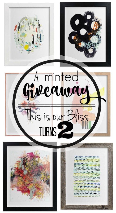
*This post is sponsored by Minted. however all thoughts, opinions and images are my own. Thank you for supporting the brands that help make This is our Bliss possible.
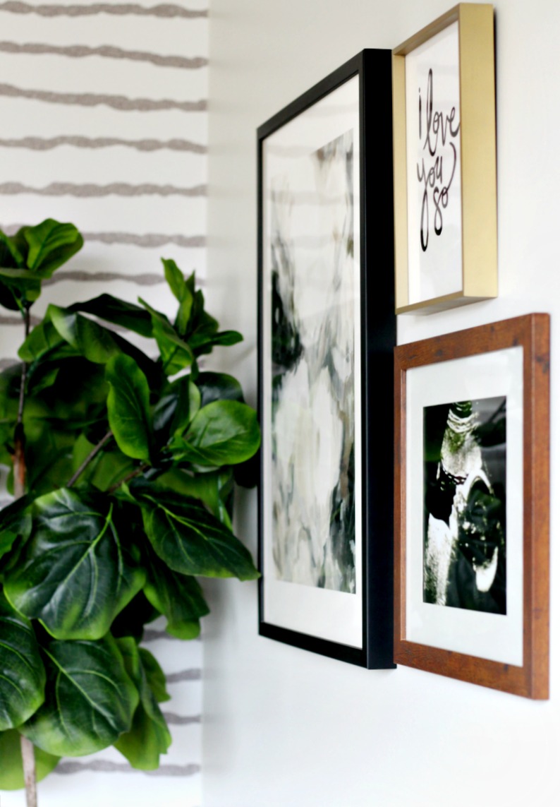
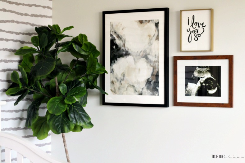
Ok, this whole 7 days left until the reveal situation has me feeling all the feels – nervous, excited, anxious and downright giddy about the thought of the Sophisticated Neutral Nursery being COMPLETE and of course, a little one joining our family! Today, I’m here with my Week 5 update of the Spring 2018 One Room Challenge and I’m sharing a peek at the Sweet and Simple Nursery Gallery Wall.
If you are stopping by for the first time, then welcome! I decided to jump in and tackle our soon-to-be 3rd little one’s nursery as a Guest Participant in the ORC hosted by Linda of Calling it Home. The timing of the challenge made perfect sense to me because I will have the nursery DONE more than a whole month before baby makes his or her arrival [yes, its going to be a surprise]! Blog deadlines tend to get me kicked into high gear around this house, so why not check the nursery off the list ahead of schedule? I’m thinking my hands are going to be slightly full with a few other things post-baby…I didn’t want the nursery to be one of them!
The room has come such a long way and ever since the paint and wallpaper went up in Week 3, I’ve been itching to grab a hammer and nails and get to work on this sweet and simple gallery wall.
[*Affiliate links are used in this post.]
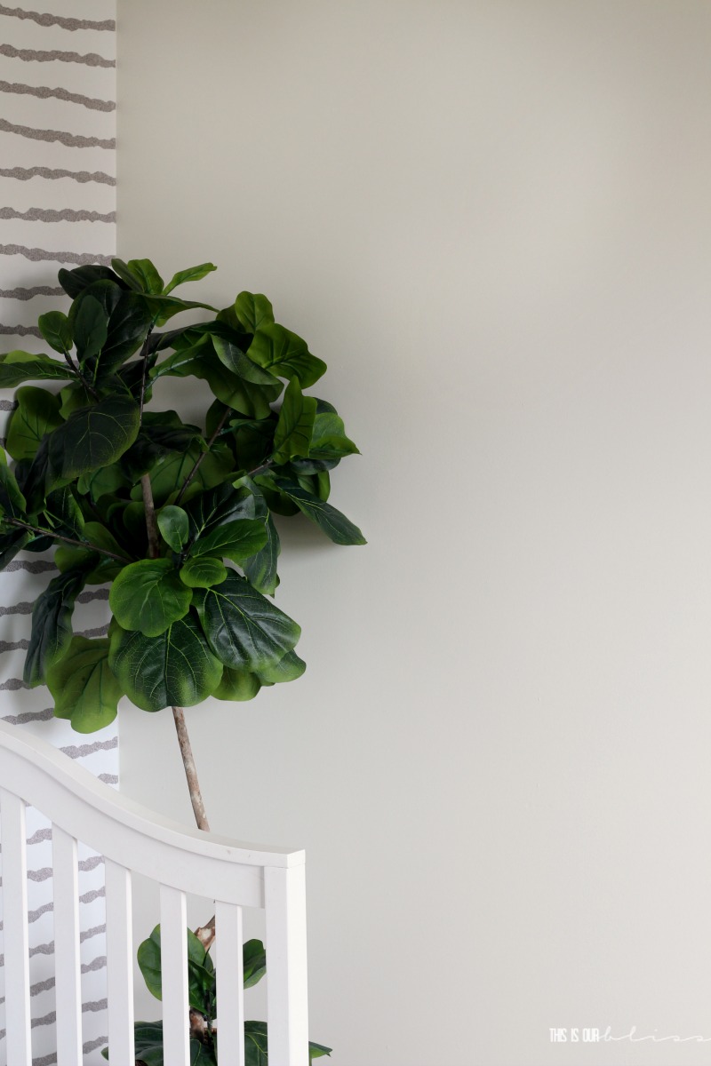
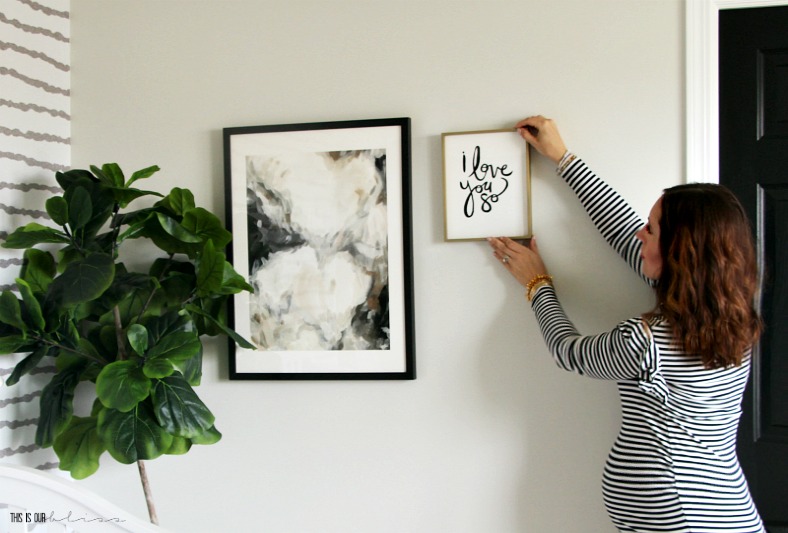
Months ago when I created the nursery mood board, I knew a small grouping of Minted art was exactly what one of the walls would be calling for! Initially, I thought I’d hang the gallery wall over the crib, but once the wallpaper was up, I decided to shift my art vision to the right. It’s the perfect sized wall and the pieces look great against the creamy light wall color [Sherwin Williams Nuance] and are still close enough to the patterned wallpaper.
HOW I CHOSE MY PIECES
Since I wanted a grouping with an odd number, I chose one piece to represent each of these three categories:
- Abstract
- Word Art / Typography
- Photograph
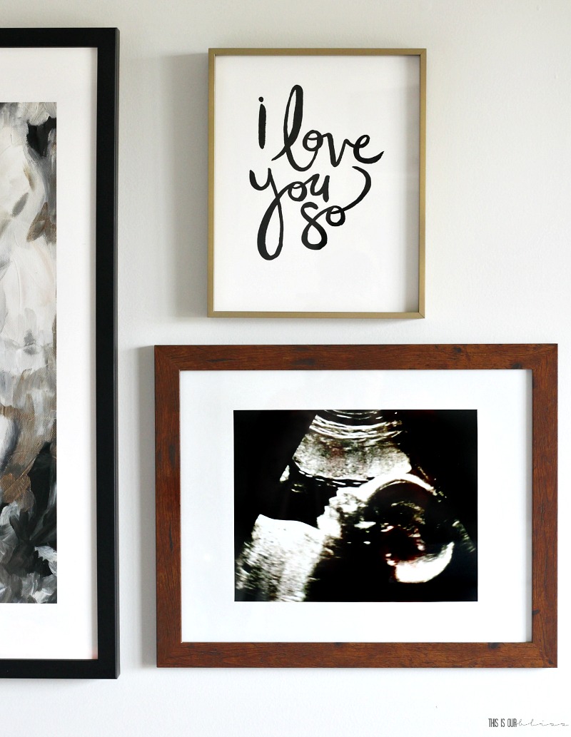
From there, I browsed hundreds of beautiful art prints on Minted’s site and landed on these two — “I love you so” art print and the “Mesmerize” art print. I feel they’ll work for a baby boy or girl…cute enough to be used in a nursery, but sophisticated enough to be grow with the baby as he or she gets older. The abstract print could really work in any room in the house down the road. Bonus!
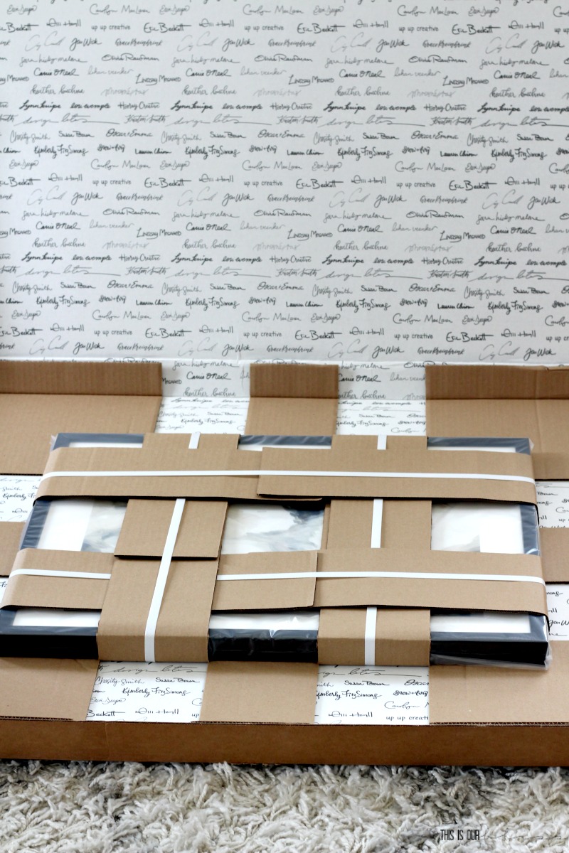
The prints arrived in special packaging and even the inside of the box looks like a work of art!
And after our 28 week appointment a couple weeks back and going home with the sweetest ultrasound image of our baby’s profile, I instantly knew that that would serve as the photo in my grouping. You can read my 28 week Bumpdate here!
Although the Minted pieces are truly beautiful, I’m pretty sure the ultrasound picture is what makes the wall so sweet. Don’t you agree?!
Just the slightest glimpse of this wall as I pass by walking down the hall is enough to make my heart go pitter-patter and my stomach flutter!
This corner is already my favorite and not because it’s the only one complete, but because I’m so in love with what’s on the walls!
I’ll be working my way around the room tying up loose ends including bookcase shelf styling, hanging the curtain rod and curtains, laying the rug down and putting the finishing touches on the DIY nursery closet! You can see all of the closet progress I shared in my Week 4 update here. It’s now time to sprinkle more pattern, texture and [neutral] color throughout the room with all the remaining accessories and then it will be ready to photograph for the reveal next week – EEEK!
Here’s one last look at what we’ll be wrapping up over the next week…
SOPHISTICATED NEUTRAL NURSERY PUNCH LIST:
paint the wallsdecide on a feature wall treatmentremove rainbow ceiling fanremove heart wall sconceinstall new ceiling lightremove old curtain rod & striped panelsbuy new curtain rod– it arrived today!- hang new curtain panels
replace blinds with cordless, blackout pleated shades– they were installed this week!remove wire shelving in closetand do complete closet makeover – closet makeover is underway!determine changing area / dresser situationswap out rocker / glider with the one from thebiggest’s nurseryrearrange horizontal bookcase to a vertical position- get [new] rug – it arrived yesterday!
- style and decorate the space with accessories fit for a little one
That’s it for week 5 today! Thanks so much for stopping by to take a peek! If you’ve missed any of the other posts in the Spring 2018 One Room Challenge, then you can get caught up below:
WEEK 1 | WEEK 2 | WEEK 3 | WEEK 4 | WEEK 5 | WEEK 6
Thank you to these generous sponsors for their partnership in the Spring 2018 ORC and especially Minted for partnering with me on this post. And thanks to all of you readers for supporting the brands that help make This is our Bliss possible!
Lamps Plus | Minted | Tempaper | RugsUSA | Tonic Living
See you right back here nest week on May 9th for the FULL REVEAL!!









Diane Rath
May 9, 2018 at 10:09 PMI love this gallery wall but i think my absolute favorite part of this post is seeing your little bump!
Sophisticated Neutral Nursery Reveal | This is our Bliss
May 9, 2018 at 4:32 PM[…] the sweet & simple gallery wall. It truly makes my heart flutter. I selected two art prints from Minted and then added the […]
Dannyelle
May 7, 2018 at 6:51 PMYou’re little gallery wall is so lovely. I love the mix of frames and art you picked. So great.
Ruthie
May 7, 2018 at 3:35 PMI’m so excited to see the final reveal! I love the artwork! I love you so is so sweet!
Susanne
May 6, 2018 at 8:19 PMSuch a lovely gallery wall, I just love the “I love you so” with your ultra sound, such a wonderful touch to this nursery. I can’t wait to see the final reveal!!
Kristen
May 6, 2018 at 11:04 AMI love what you pulled in for the gallery wall, especially the sweet ultrasound! So gorgeous and personal!
Brittany Goldwyn
May 5, 2018 at 3:55 PMBeautiful, and the faux plant is a good idea. I have probably only watered the two plants in Ramona’s room three times since she’s been alive and she’s now over 5 months LOL.
Rachael @ This is our Bliss
May 9, 2018 at 3:45 PMThanks! I figured a faux one would be best for me based on previous experience ha! Plus this one was the perfect skinny size for this corner 🙂
Mila
May 4, 2018 at 11:59 AMYour art choices are so cute. Also your color choices. It looks like a calm and beautiful room
Rachael @ This is our Bliss
May 9, 2018 at 3:45 PMThanks, Mila! That’s really what I was aiming for!!
Lindi
May 3, 2018 at 6:37 PMLOVE it! Love the mix of patterns and text, and the mix of frames. Beautiful job!
Rachael @ This is our Bliss
May 9, 2018 at 3:46 PMThanks so much, Lindi! Black, white gold and wood just works so well together!!
jewel
May 3, 2018 at 2:36 PMThe art looks so fab!!! I love it!
Rachael @ This is our Bliss
May 9, 2018 at 3:47 PMThanks, girl! It’s such a small wall and I wanted to keep it halfway simple 😉
Emy
May 3, 2018 at 8:27 AMThis is such a sweet gallery wall!
Rachael @ This is our Bliss
May 9, 2018 at 3:47 PMThanks, Emy! I love peeking in at it!!
Jessica Devlin
May 3, 2018 at 7:02 AMI love the neutral tones. That mixed gallery wall is fantastic!
Rachael @ This is our Bliss
May 9, 2018 at 3:50 PMThank you, Jessica! I wanted to keep things light and airy in here, but still bring in a punch of black sprinkled throughout!!