Happy first day of February, friends! I’m excited for the start of a new month — Anyone else? Why is it that January can feel so blah?! Myself included! There’s nothing better than a fresh start and a fresh room to enjoy in our home. I’m so glad you’re here because it’s Dining Room Reveal Day!
I made it!
If you’ve been following along, then you’ll know I’ve spent the last month getting the Dining Room in our new home to the finish line of the New Year, New Room Refresh Challenge. An enormous “thank you” goes out to Stephanie of Casa Watkins Living for inviting me to join the Challenge again this year. She’s worked tremendously hard keep us all in line and organized on the back-end as we worked to refresh a space in our home!
To get caught up on this year’s challenge, you can check out the posts below. All NYNR Refresh Challenge posts can be found here. This is my 5th time participating!
week 1: Dining Room Design & Plans // week 2: Stylish Buffets & Sideboards for Your Dining Room // week 3: Dining Room Progress // week 4: How to Update Your Furniture for Under $50 // week 5: The Dining Room Reveal
I’m so glad you’re here today to see how far the Dining Room has come over the last several weeks. It goes without saying that the finished product is a labor of love, with countless blood, sweat & tears shed along the way.
There’s such an indescribable feeling I get when I finish a room. It’s a big undertaking to refresh a room in 30 days, but then also the pressure to get it photo-ready. I might not be perfect, but it’s exactly how I envisioned it from the start – so for me, that’s always a win.
Ok, let’s get on with this reveal!
DINING ROOM REVEAL
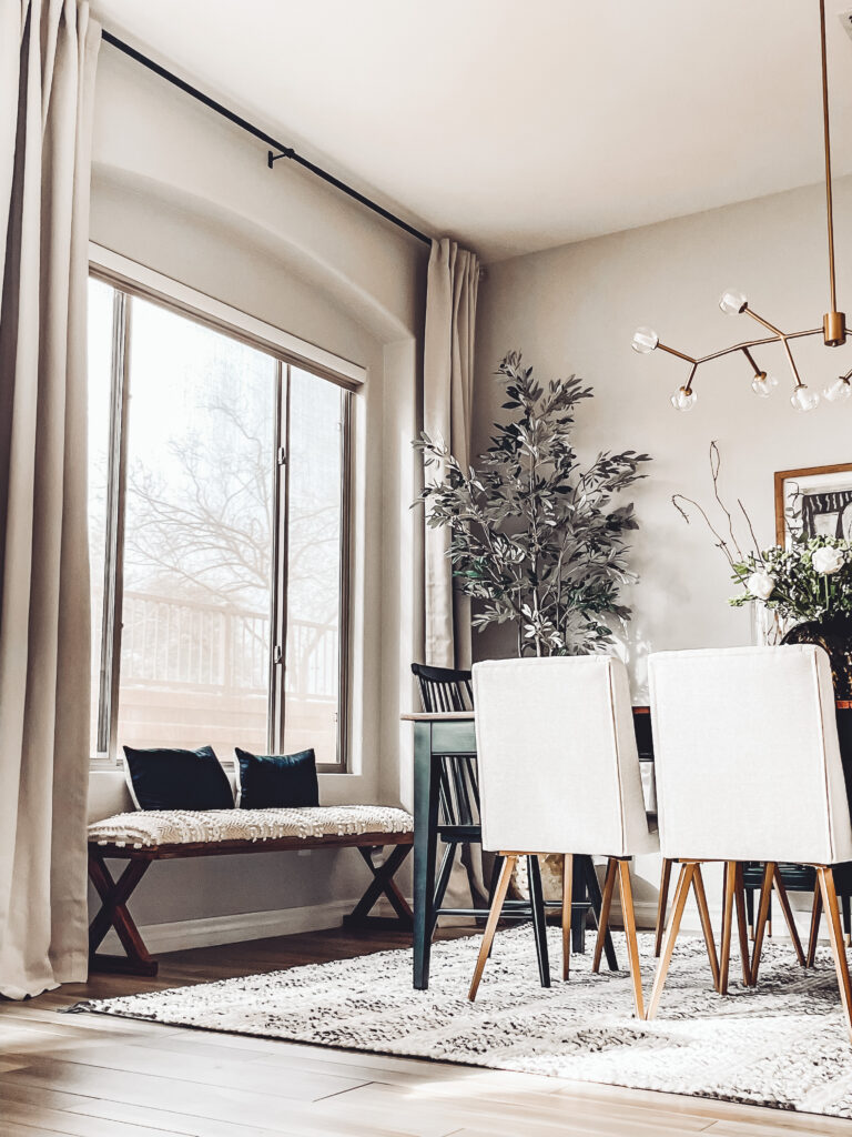
This is officially the 2nd Room Reveal in our new house [but technically the 3rd room to be completed since the first project was a 2-room combo – see our Kitchen + Family Room Reveal here 😉].
We moved from Illinois to Arizona last July and while I knew the Dining Room is one of those “nice to have spaces”, I was particularly excited to spruce it up because its the first space you step into when you enter our home.
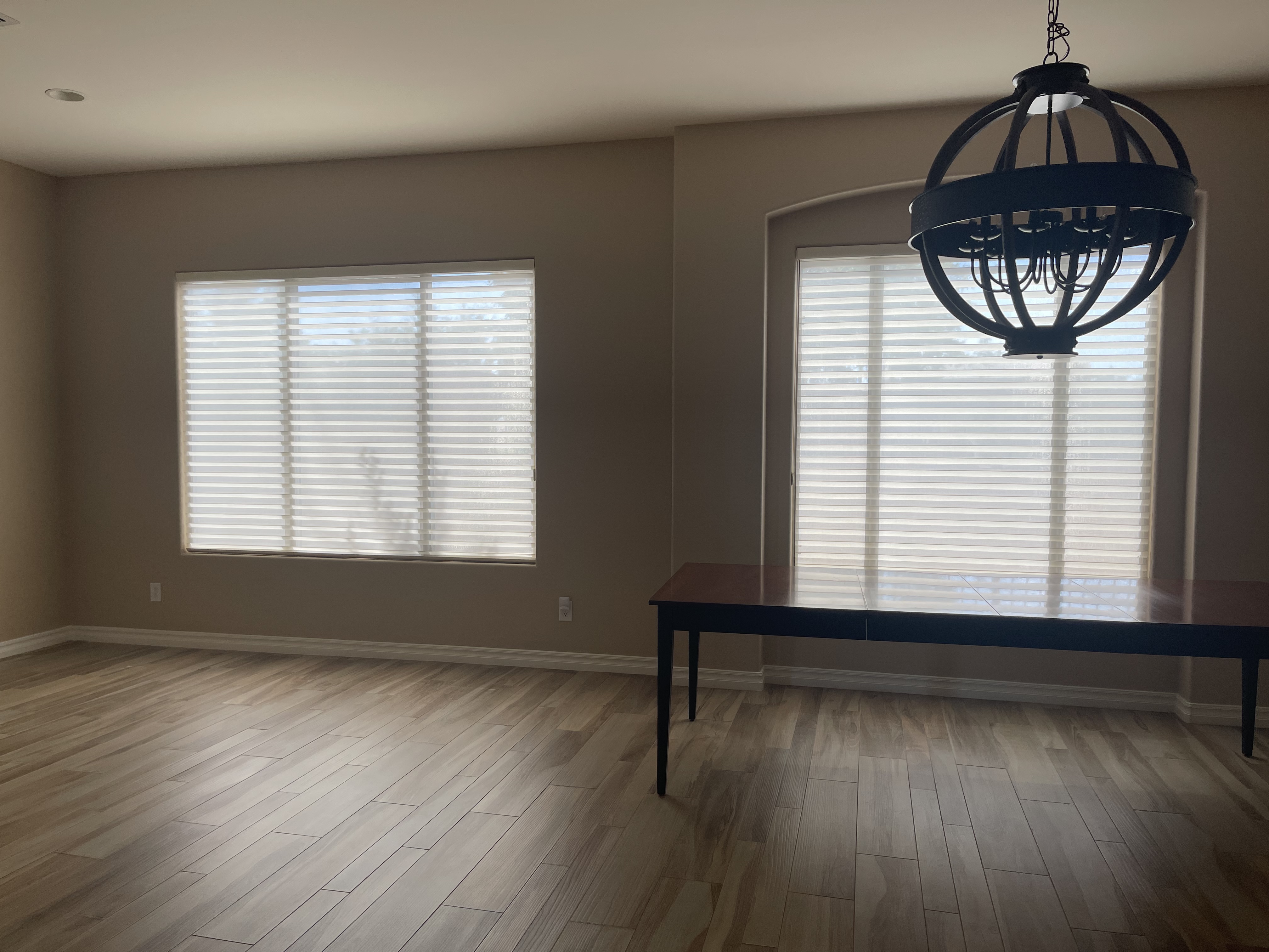
The Living Room and Dining Room share a wall and they’re completely open to one another. We set up our formal Living Room with furniture we had from our last house, but the Dining Room was completely empty aside from the table our sellers left us.
In case you need a refresher, I’ll show you how it looked when we moved in and then a quick peek back at the design I created…
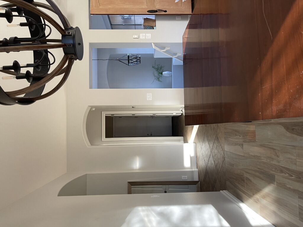
DINING ROOM: THE BEFORE
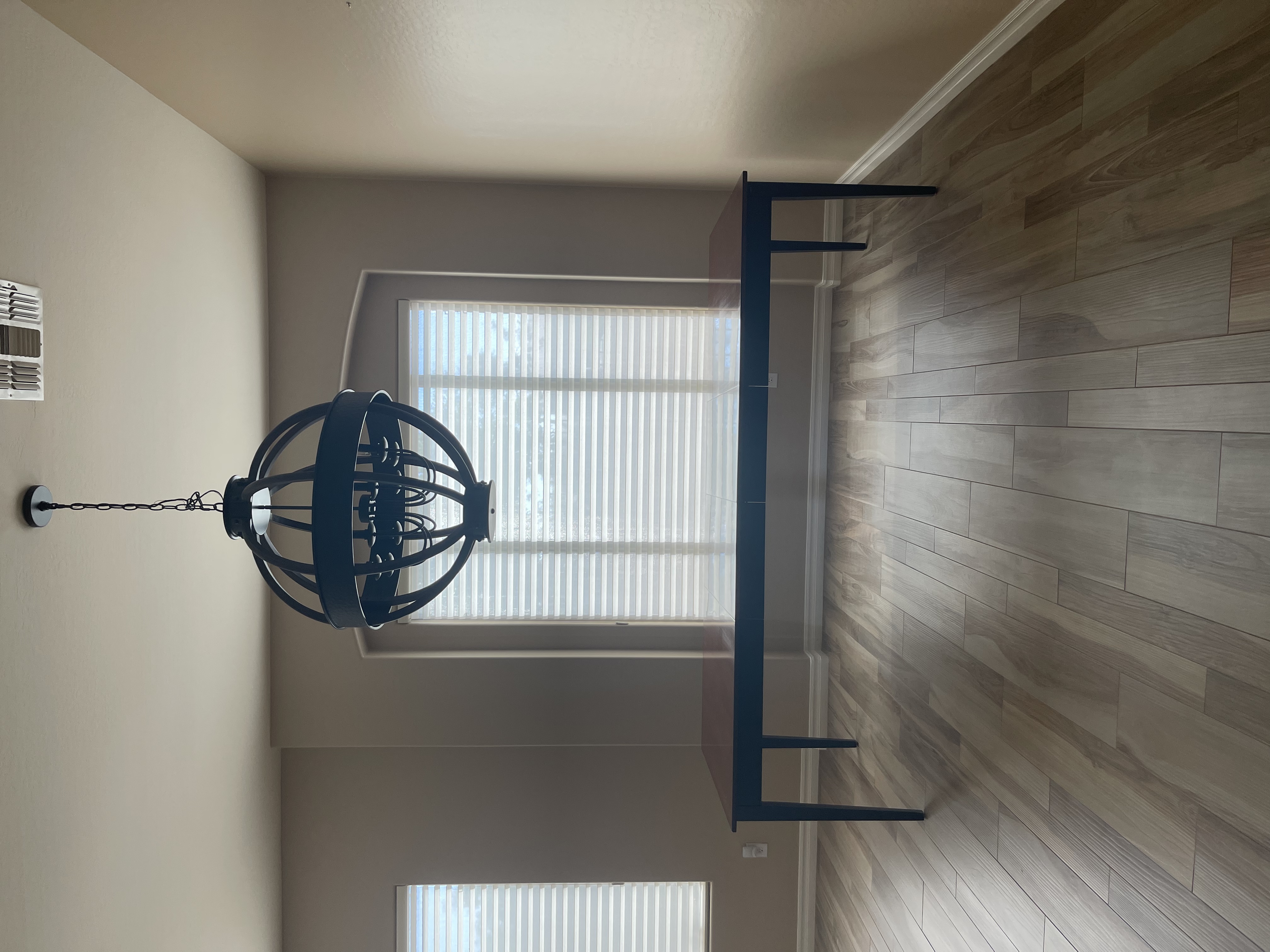
We painted last August and it pretty much sat this way until January when I dove into the project.
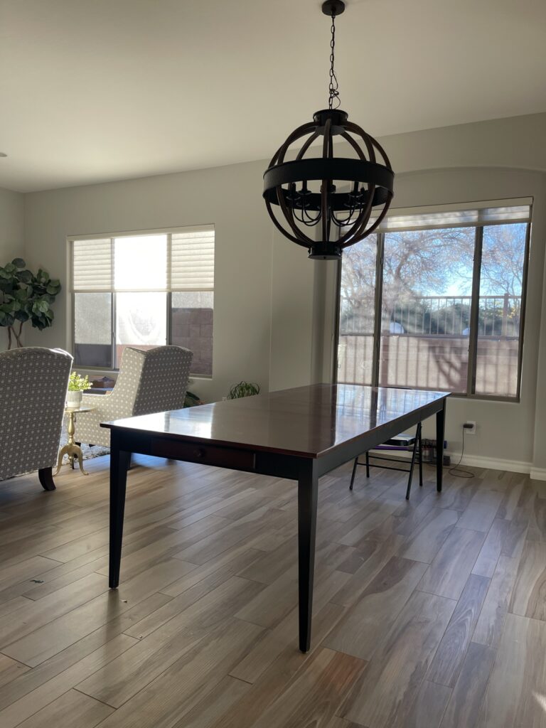
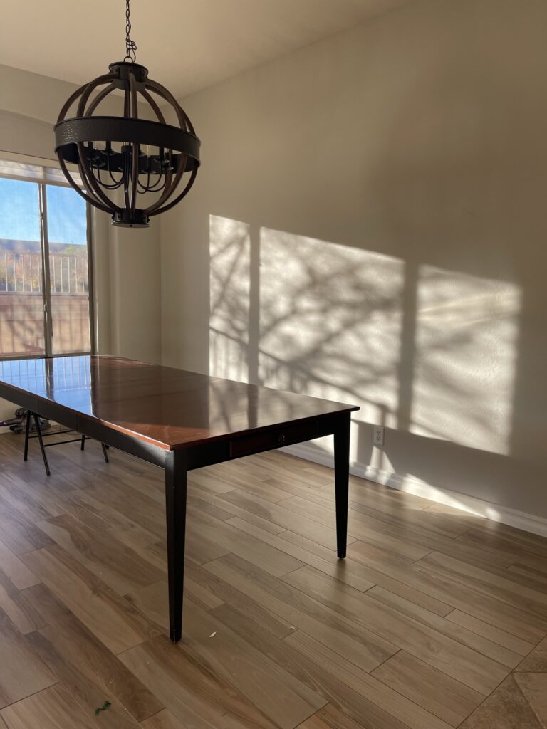
See the rest of the before photos here
We did bring chairs out for a couple meals throughout the holidays and it served as a great wrapping paper station as well 😉
DINING ROOM DESIGN PLANS:
This is the design I dreamt up at the beginning of January and often referred back to it if I ever struggled with a design decision. I wanted contemporary style, an elegant feel, but a relaxed & casual vibe as well. We love to entertain, but we do have 3 little boys after all. I know they’ll be in and out of this space as much as we are!
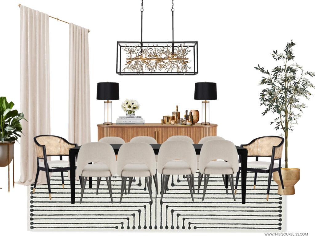
And now for the after photos… come on in and take a peek inside. I can’t wait to show you.
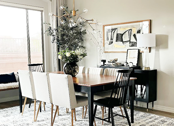
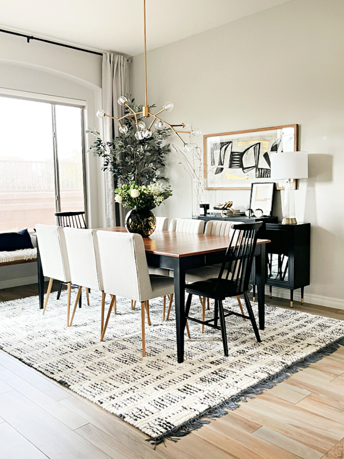
THE DINING ROOM AFTER:
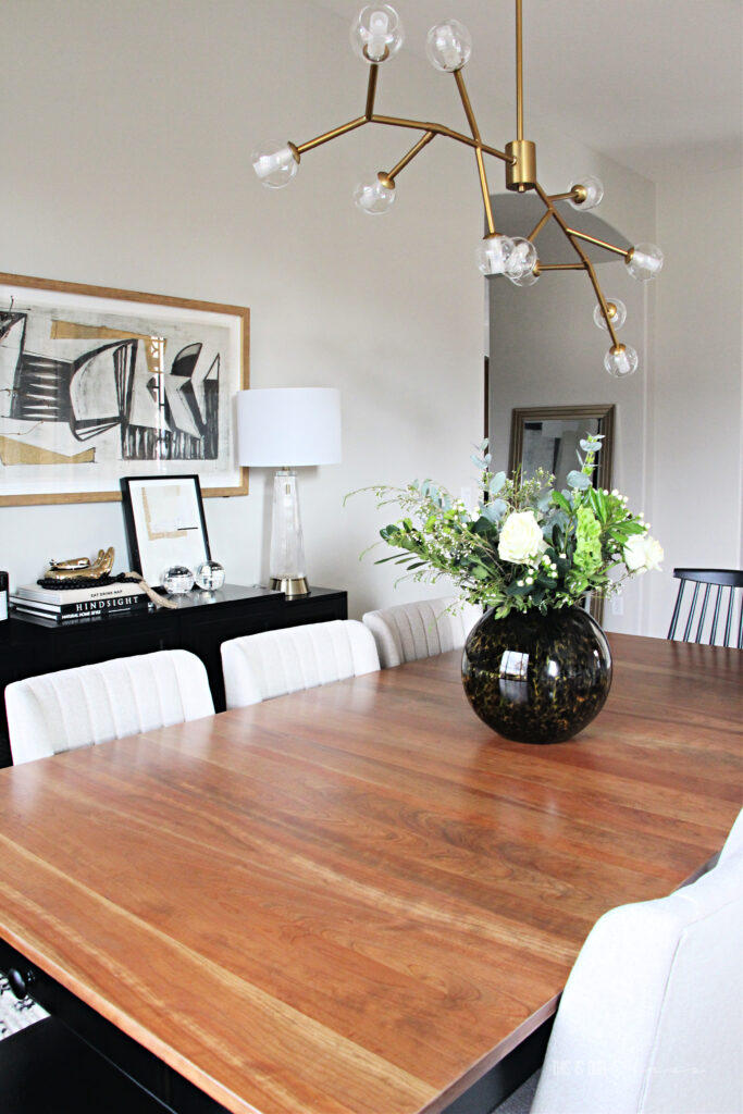
THE TABLE
My Dad and I ended up refinishing the old Dining Room table and I could not be more in love with how it turned out. We faced our fair share of roadblocks along the way, but the finished product is absolutely beautiful. I couldn’t have done it without his help. In fact, I wasn’t going to do anything with the table at all, until one day he stopped by and I was explaining the challenge to him. He asked me what I thought about refinishing the top and I said, “are you offering?!”
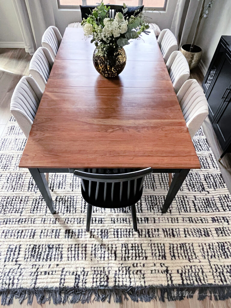
We worked for several days sanding staining and re-sanding and staining the table top.
This project was by far the most labor-intensive aspect of the entire room, but the reward was worth it all!
I’ll go into more detail about the table in a full blog including the process and our struggles, but for now, just admire it 😉
THE CHAIRS
I struck out with the first set of chairs I ordered, but lucked out with these! I love the color, channel tufting, legs & size. They look great against the “new” table and I hope to be able to grab 2 more when they’re back in stock. My order for the 7th & 8th chairs were cancelled, so I took one of the leaves out for pictures.
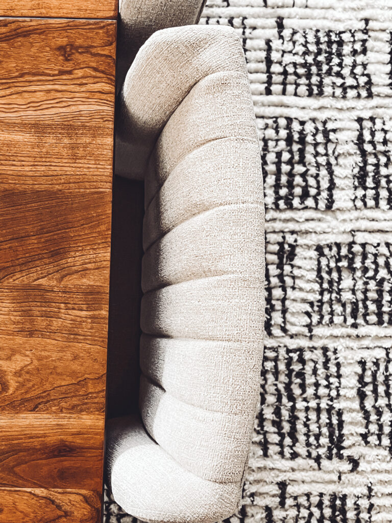
I was going to photograph the room with the 6 chairs, but happened to be at Target yesterday and spotted these simple black wooden chairs.
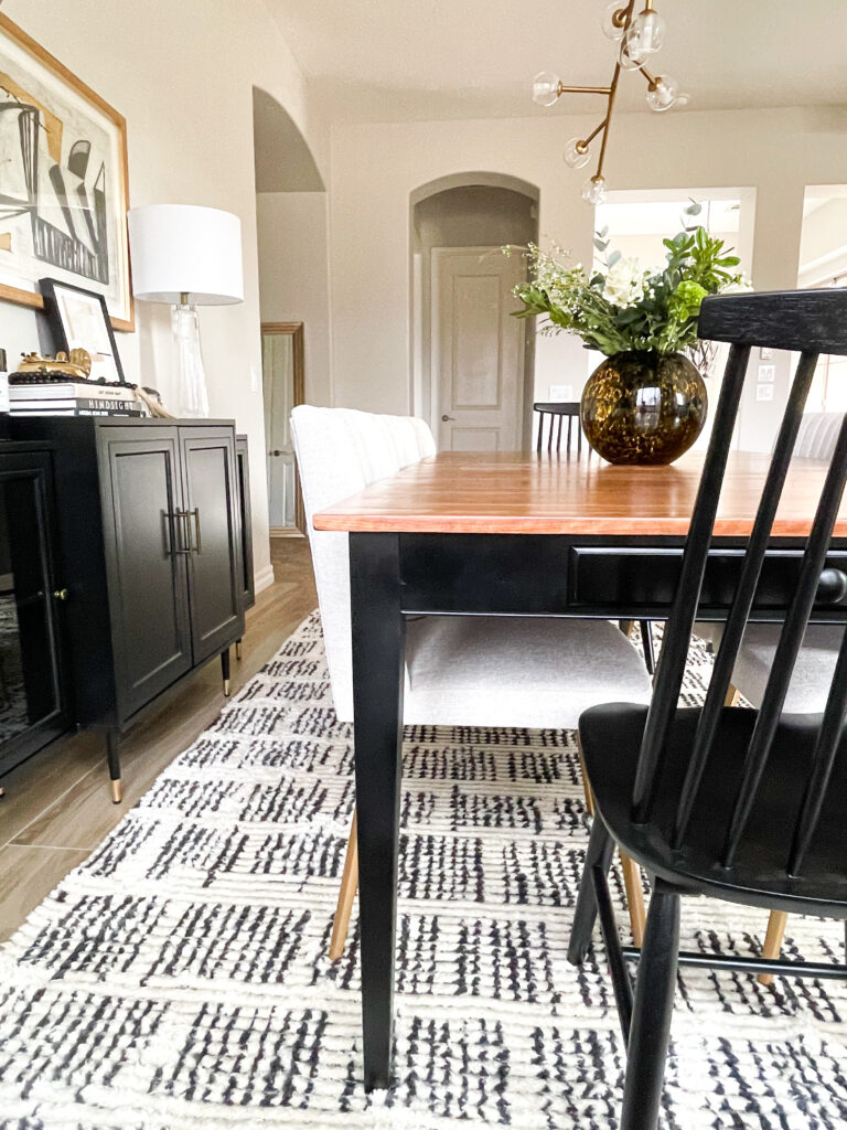
Of course, there was only one in stock, but discovered another location had 4 of them. I quickly placed an online order and picked them up right before I finished taking photos! They are a great height for the ends of the table and I love how they help balance out all of the light upholstery of the chairs and curtain panels.
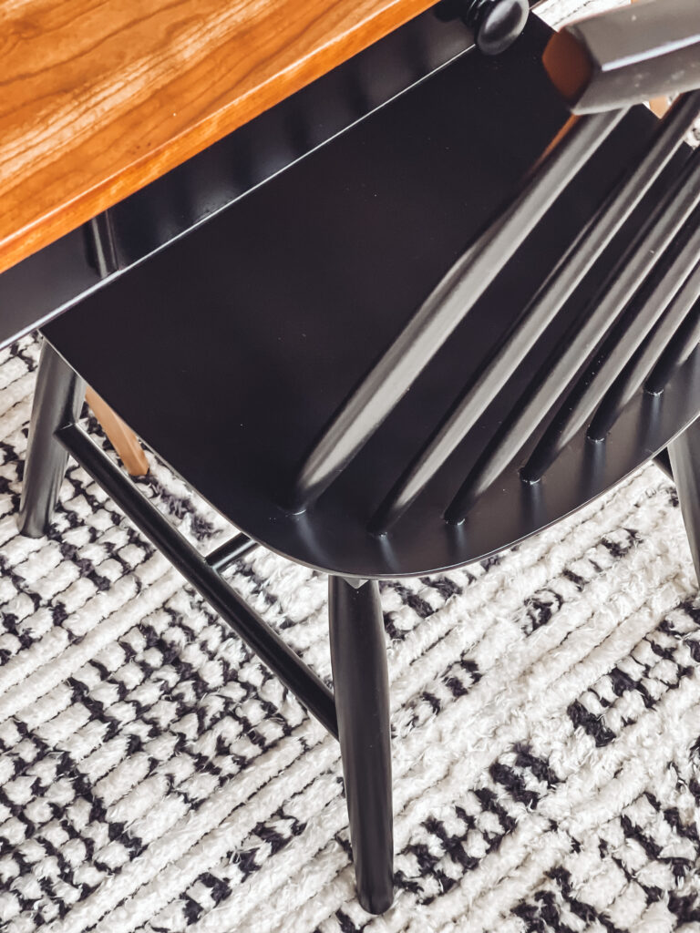
I figured I couldn’t go wrong with a classic black chair. It’s absolutely timeless.
I knew I wanted different chairs for the host & hostess seats and this way I wouldn’t have to worry about competing fabrics if I would have done an upholstered chair.
This one is gorgeous and under $100!
THE RUG
Allll the heart emoji eyes for this beauty. Our new rug is so incredibly soft and the detail and texture is even more incredible in person than online. The pattern is actually a mix of dark charcoal and ivory which is a nice alternative to black. Its a slightly softer look.
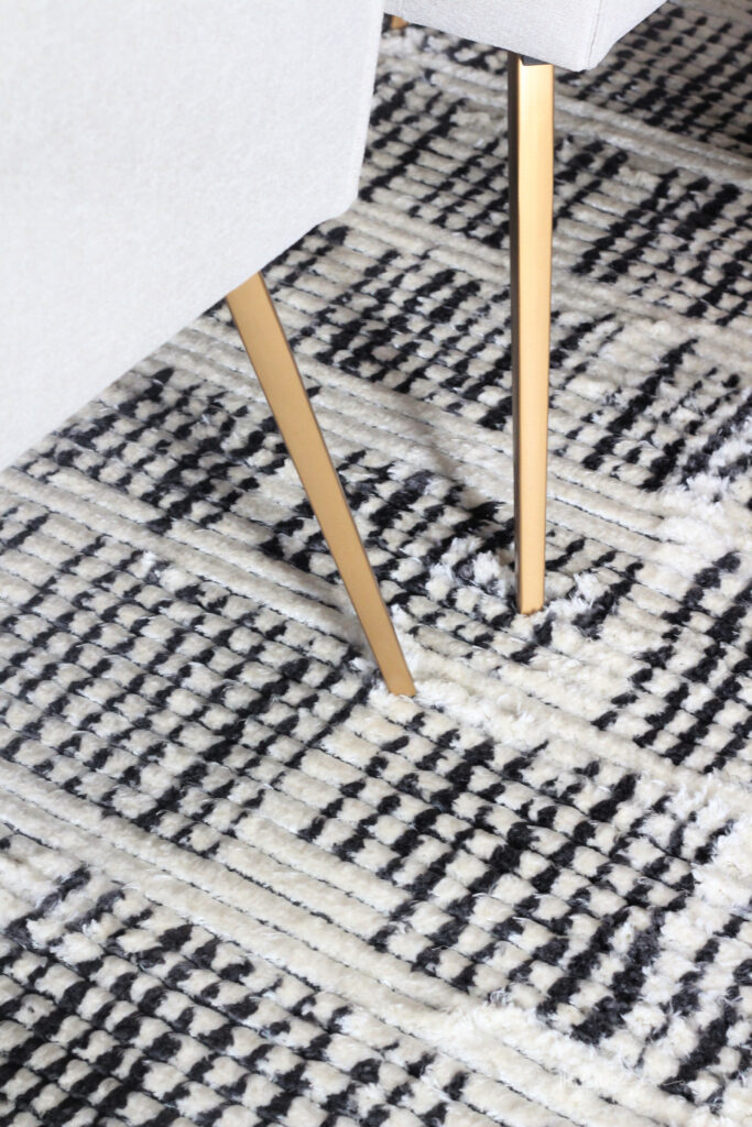
Loloi has the most stunning collection of rugs and there were several of them I couldn’t decide between. Many texts when out to friends and family as a cry for help in my decision-making process. I’m thrilled I pulled the trigger on this one!
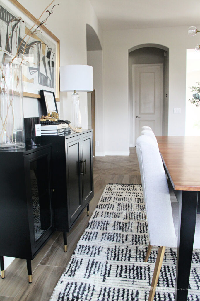
It’s an 8′ x 10′ but comes in a variety of sizes. I can’t say enough great things about it.
THE LIGHT
ohhhh and this light.
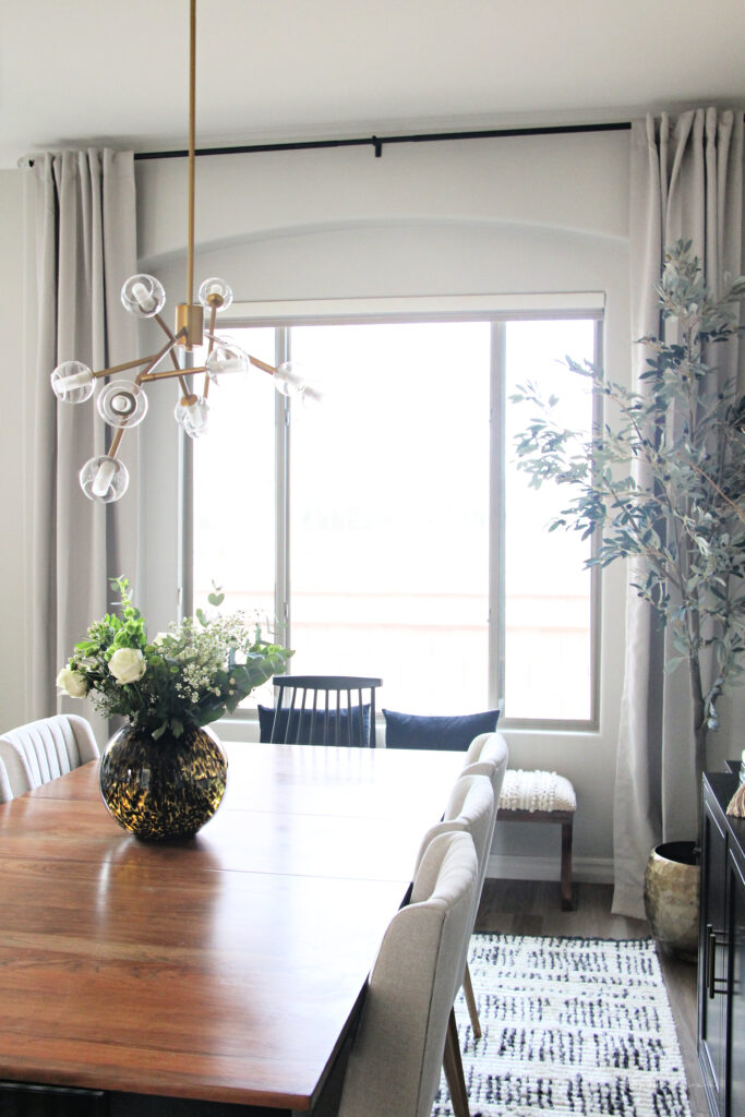
I have to admit, I was a little nervous with this one. I loved the style online, but wasn’t sure it would translate to my space. It is quite long [40″] and the arms can be adjusted. However the body of the light is fixed at an angle, so I questioned if I would like the asymmetric design in here. Well, the verdict is in and I’m head over heels for it.
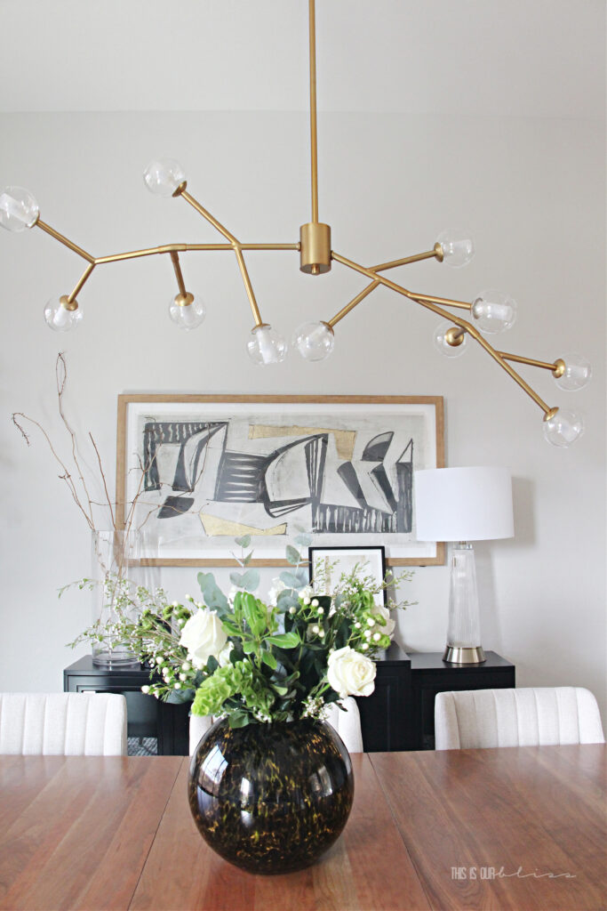
Its elegant, but funky and the sleek and slim profile is such a welcomed change from the large clunky light that was hanging here before. It really does open the space up to have something more light and airy hanging up.
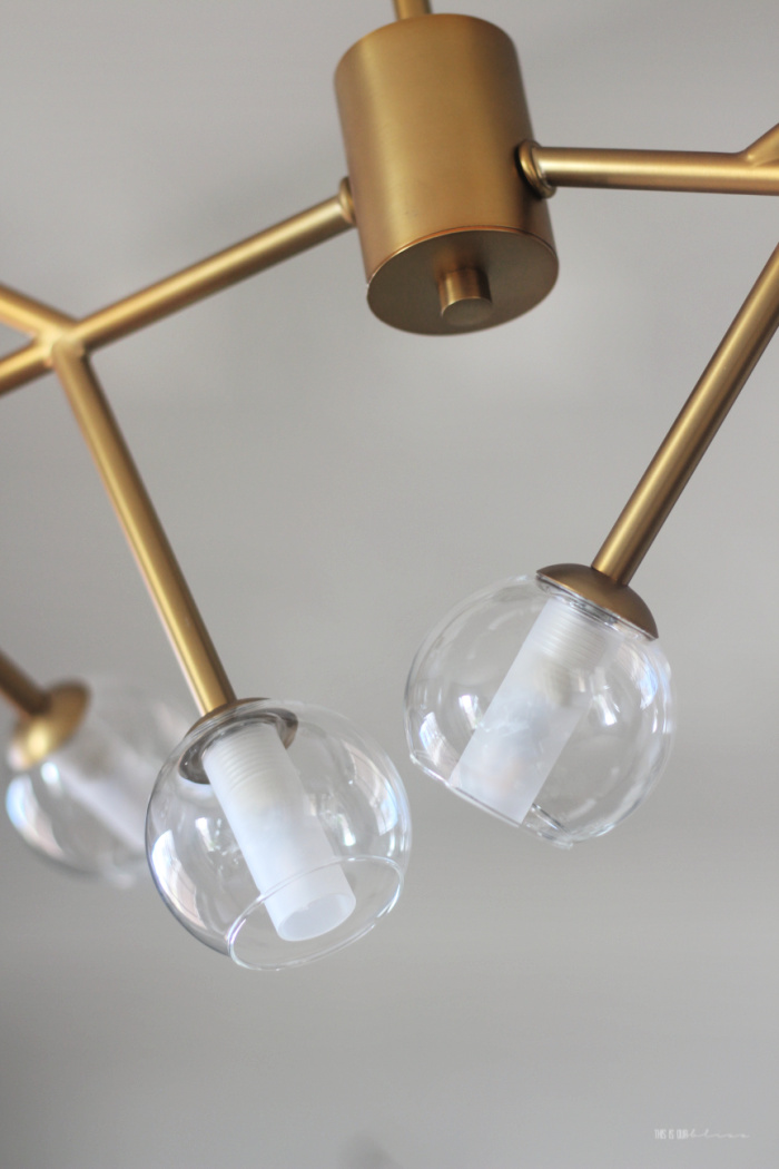
There are 11 LED bulbs under these glass globes with a gorgeous gold frame. This same light also comes in an 18 bulb option if you have a larger space you want to fill.
THE BUFFET
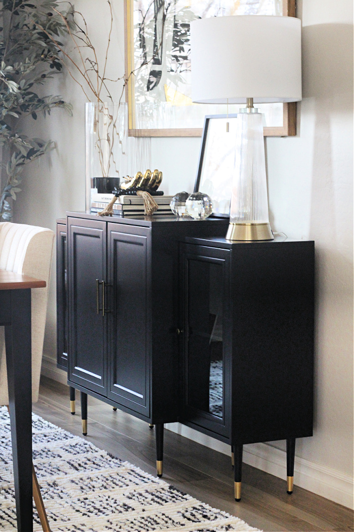
You got to see a sneak peek of this piece of furniture when I shared a round-up of buffets and sideboards. As well as when I shared how I gave our new buffet a modern update for under $50. It looks like it was made for this room now. The style & design of this buffet are exactly what I was going for.
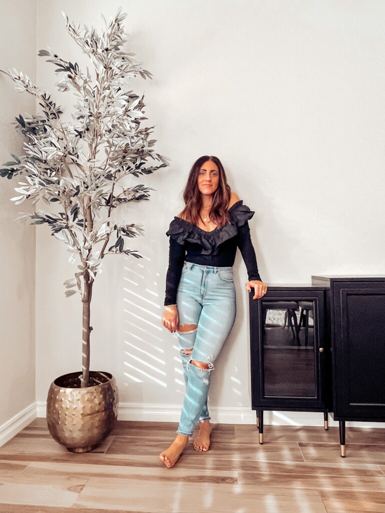

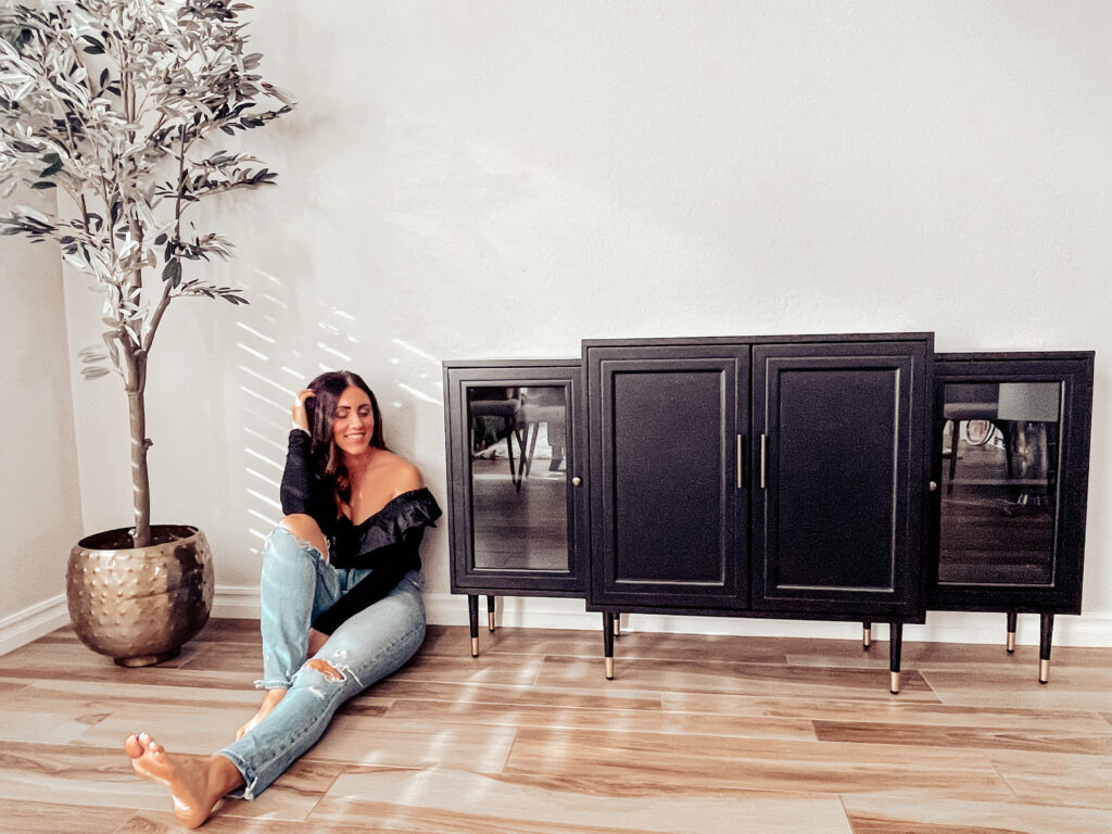

You can get your own set of new furniture legs and put them on a piece of your own. Just search for various sizes and styles – there are a ton of options out there. I went with a touch of gold, of course.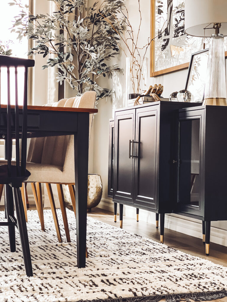
I actually didn’t even take the time to style the inside of the buffet behind the glass doors. I had every intention of adding a few serving bowls, platters or even our China before the reveal, but I ran out of time! You really have to prioritize your to-do list when you’ve only got a month to work.

Styling the top was a lot of fun and luckily I was able to pull it together with a few last-minute HomeGoods trips. There really are so many treasures inside. You just have to take the time to look for them. Frequent trips definitely help. New finds every time!
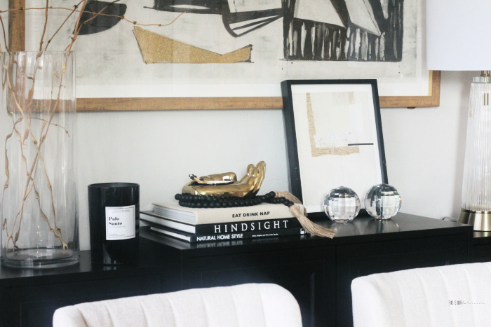

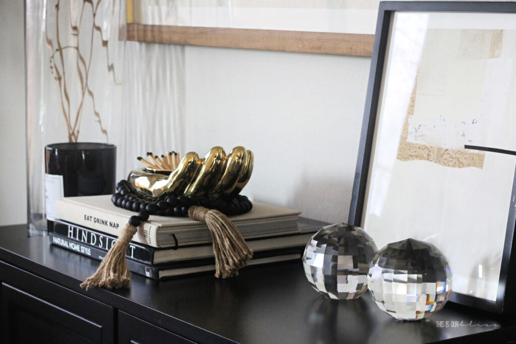


Unfortunately I can’t link my items from HG, but if there’s something you love and can’t find the source within the post or at the bottom, message me and I’ll do my best to find something similar. I’m happy to help if I can!
THE CURTAINS
These were the deal of the century in my book. I hunted and hunted for affordable, quality 10′ panels for weeks, before stumbling upon this set. They were a fraction of the cost of the others I tried. And when I opened them all up and tested them in the space, these were my favorite! The color is “Alabaster” and what I love most about them is how they blend right in with the walls.
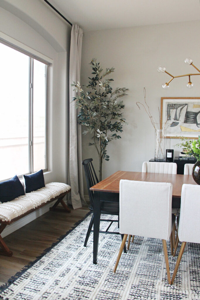


Typically, I crave contrast, but this tone-on-tone look really elevates the look and feel of the space.
The second the curtains were hung, it instantly felt more elegant in here.

I ended up creating my own curtain rod & finial combo when I ordered these rods and added these seeded glass globes to the ends! They are so lovely in person. The glass sparkles and shines in the light. The perfect way to incorporate a touch of glam without being over-the-top. The pair of finials was under $20.
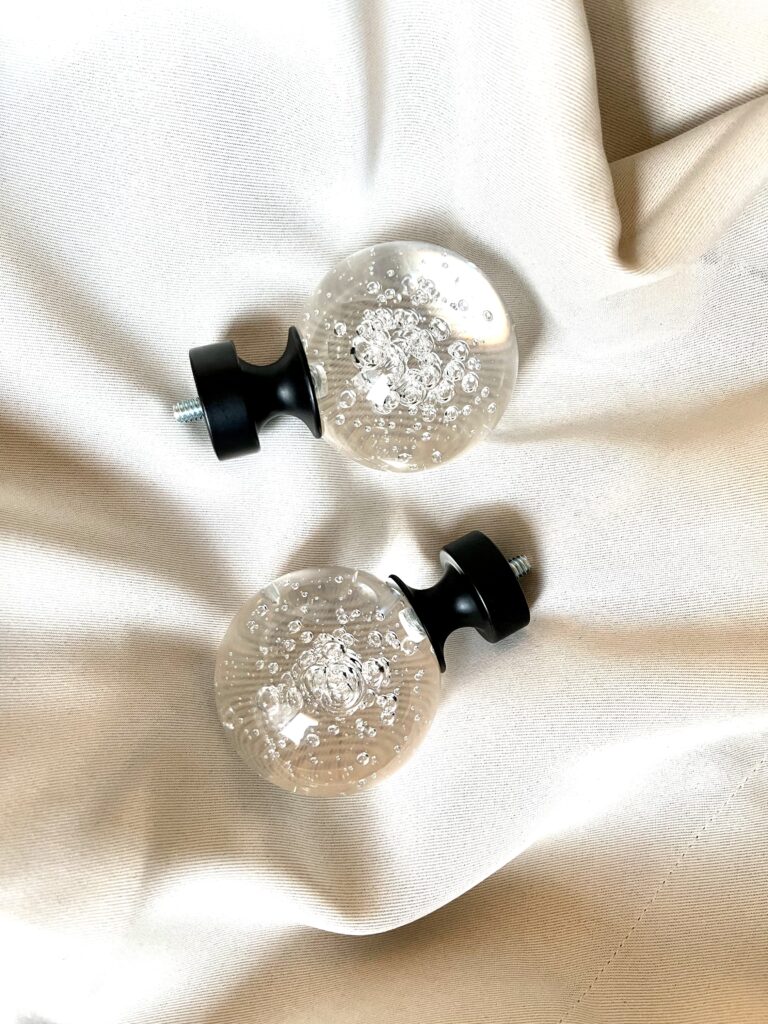



I might do a blog post sharing the high-low comparison of another curtain rod I ordered. I couldn’t justify spending almost 3 times more per rod, so I created my own look for less!
THE BENCH
A last minute HomeGoods find! I really wasn’t sure what I wanted to do under the window in the little inset, but I knew a bench was an option. We had one under the window in our last Dining Room and it was great to be able to pull up for extra seating when we added in the leaf. That was one element that caught the eye of Good Housekeeping and they ended up featuring the space highlighting the use of the bench in the article!
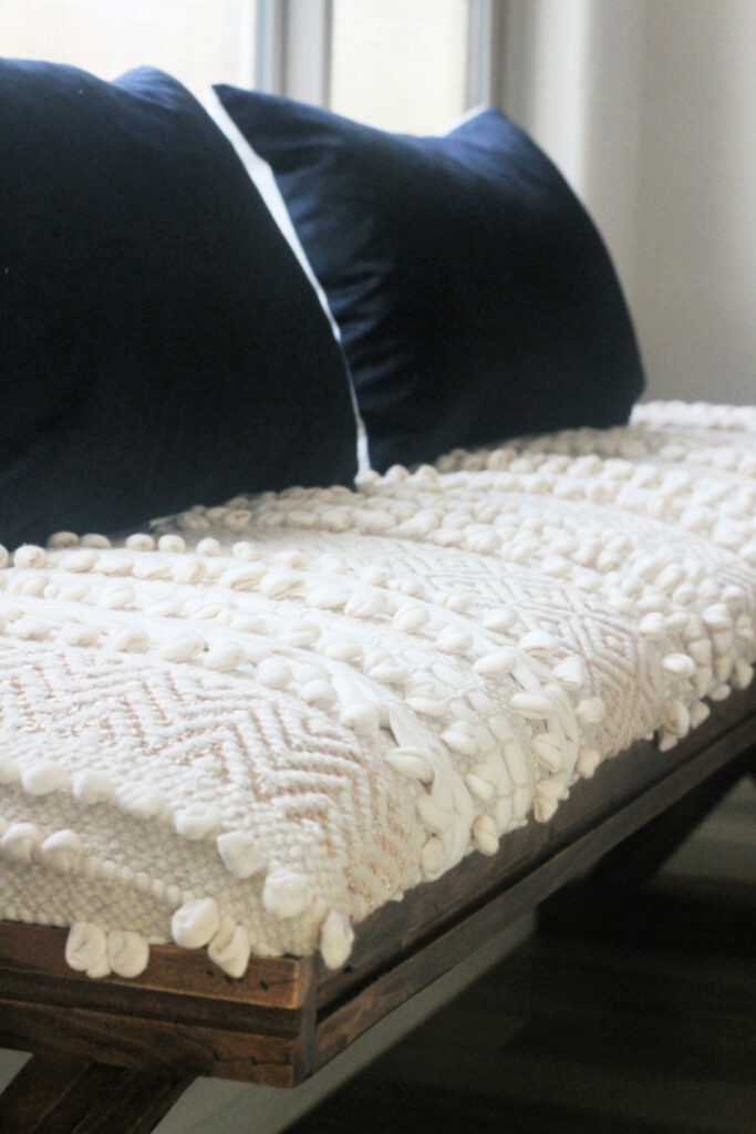

At first I was hesitant to go with a bench with such a boho vibe, but it grew on me. The texture really is amazing. This one and this one are options if you’re looking for a similar look.
A pair of solid black lumbar pillows give the bench a bold contrast and breaks up all the creams & whites of the bench, walls & curtains.
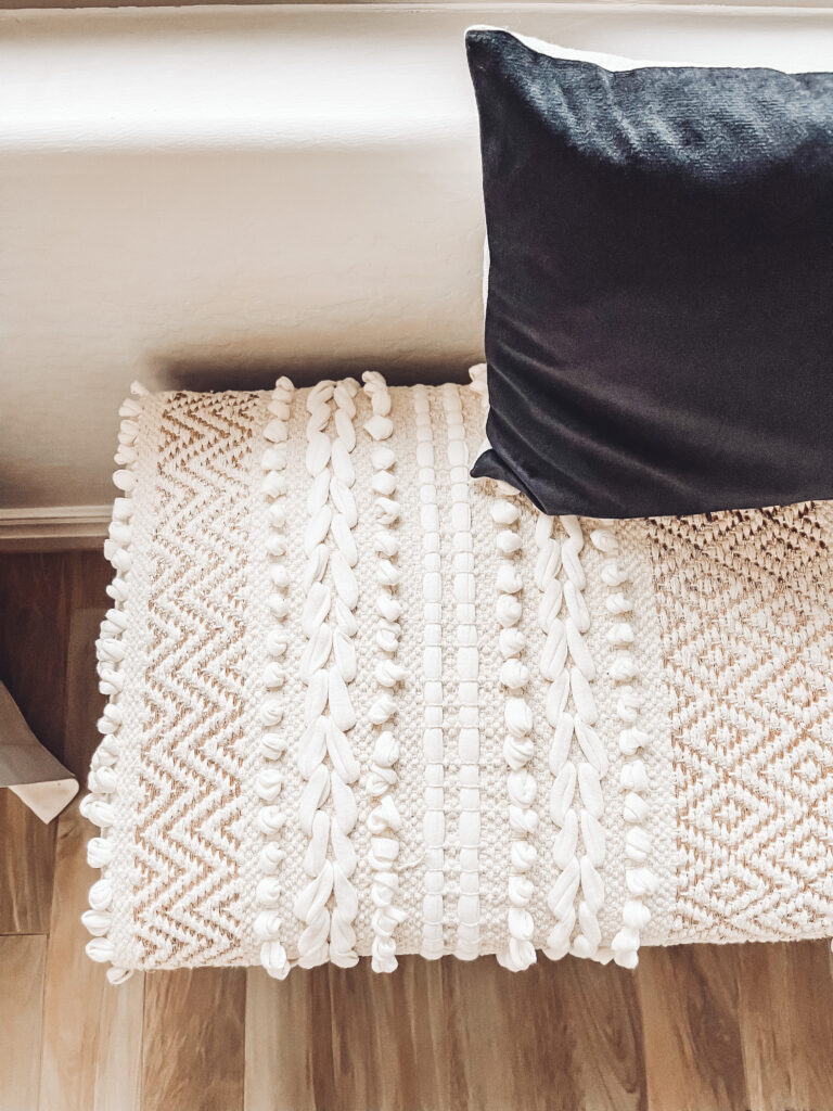

I’m pleased with how the bench works in here!


THE ART
I toyed with the idea of a gallery wall of framed art and photos in here, but ultimately decided that this one piece would be just enough. Its truly a statement piece on its own. I have a tendency to want to fill empty space, but I told myself less is more.
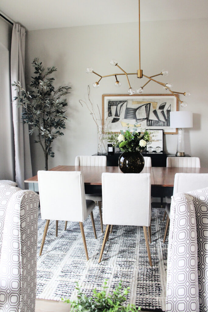

I’m still giddy that I found this piece for under $100 but was channeling inspiration from several art pieces from Restoration Hardware that would have set me back a few thousand.
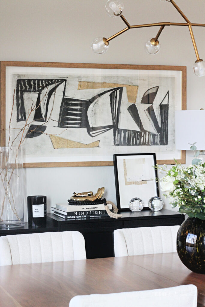

Read more about the art & inspo here.
MISCELLANEOUS ACCESSORIES
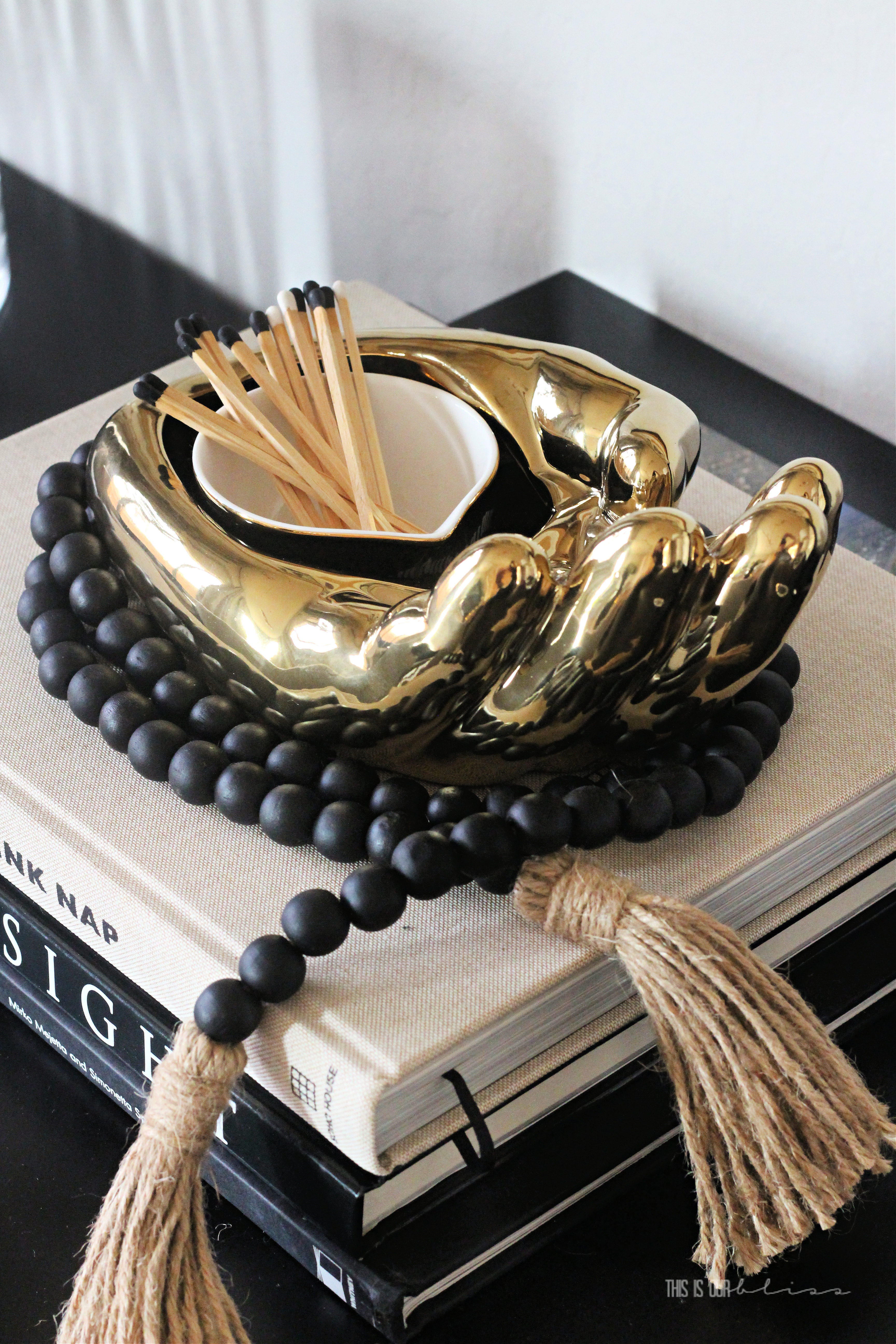
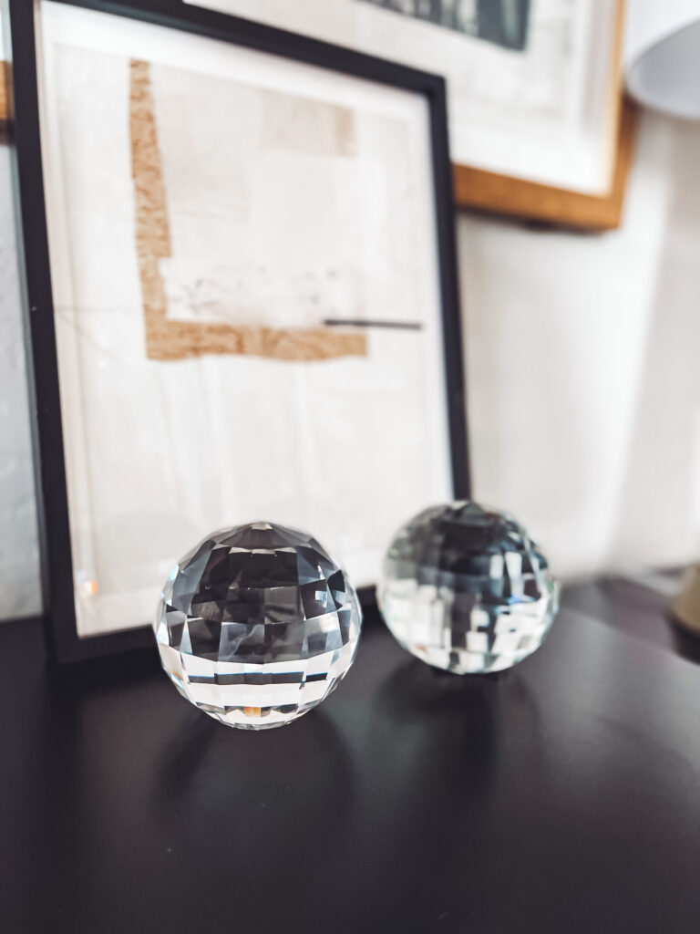
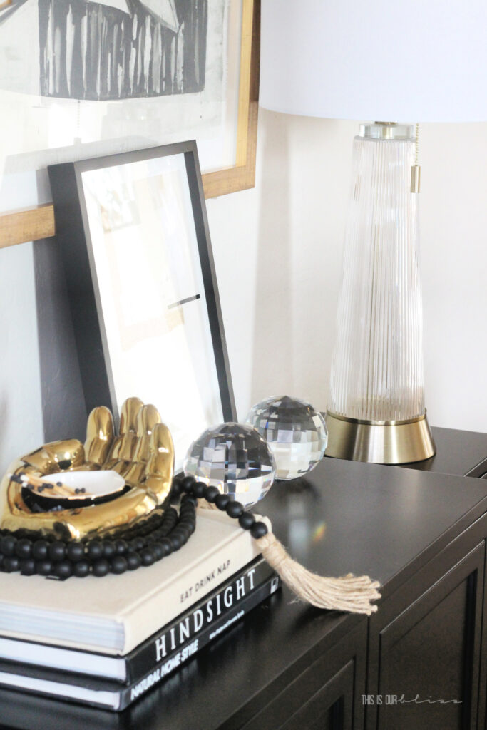
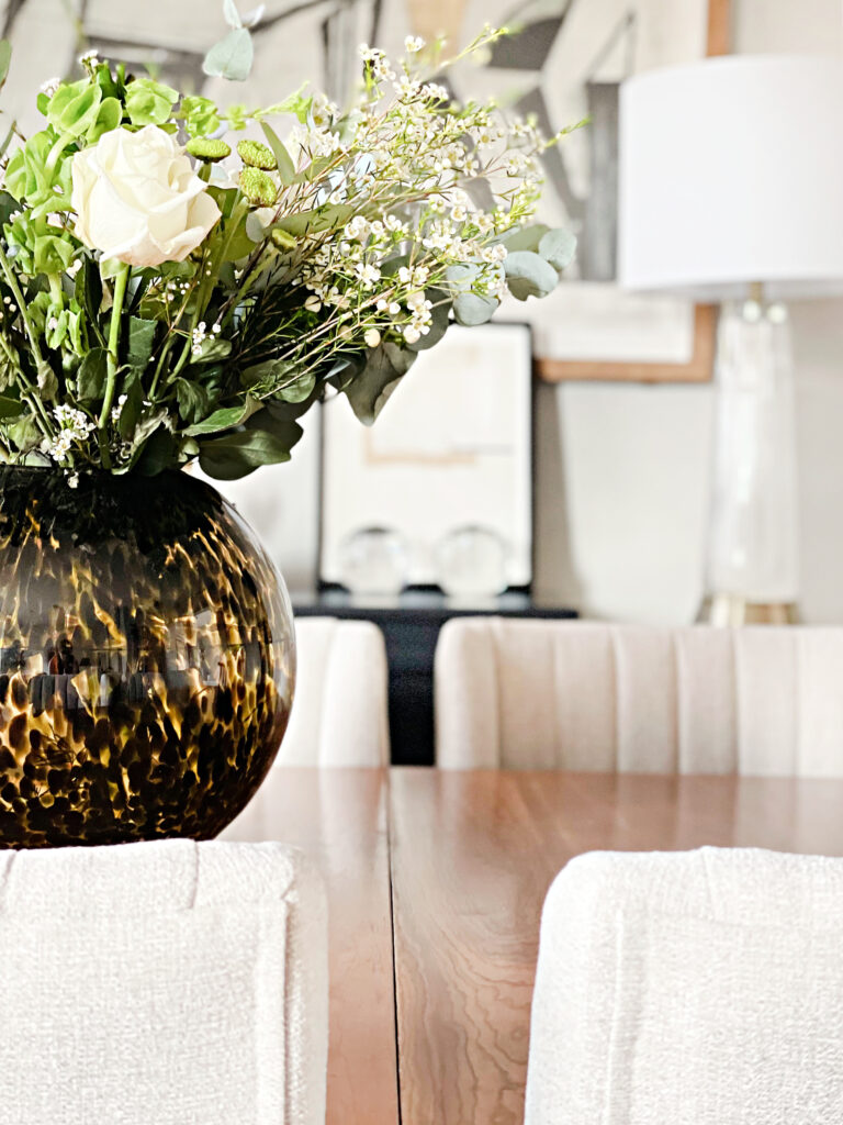
A glass vase with twigs from my backyard, a stack of coffee table books and a funky gold open hand object filled with matchsticks and this black bead garland make up the left side of the buffet. While an old Minted art piece [from Simon’s Bathroom Reveal last year], a couple of crystal balls and a lamp from the closet come together to fill the right side.

Two of those books were thrifted from Goodwill. I always peel back the jacket to see what color the spine is. I lucked out with a couple of black & white finds, so I used them to add some visual interest and height to the buffet. The HINDSIGHT book is all about Phoenix architecture and design.
My first true Arizona book to add to my collection!
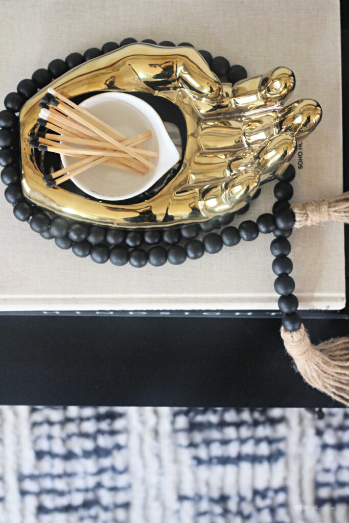

I loved the personality this unique hand bowl brought to the buffet. It was under $15 at HomeGoods, but this Jonathon Adler version will set you back around $450. Another look for less!
And my beloved faux olive tree snuck in here to finish off the space as well. I originally bought it for the skinny corner in the Family Room, but it was just what the corner of the dining room was missing so I borrowed it. I’ll figure something else out for either space or maybe I’ll just end up buying a second one!
And that’s about it, you guys!
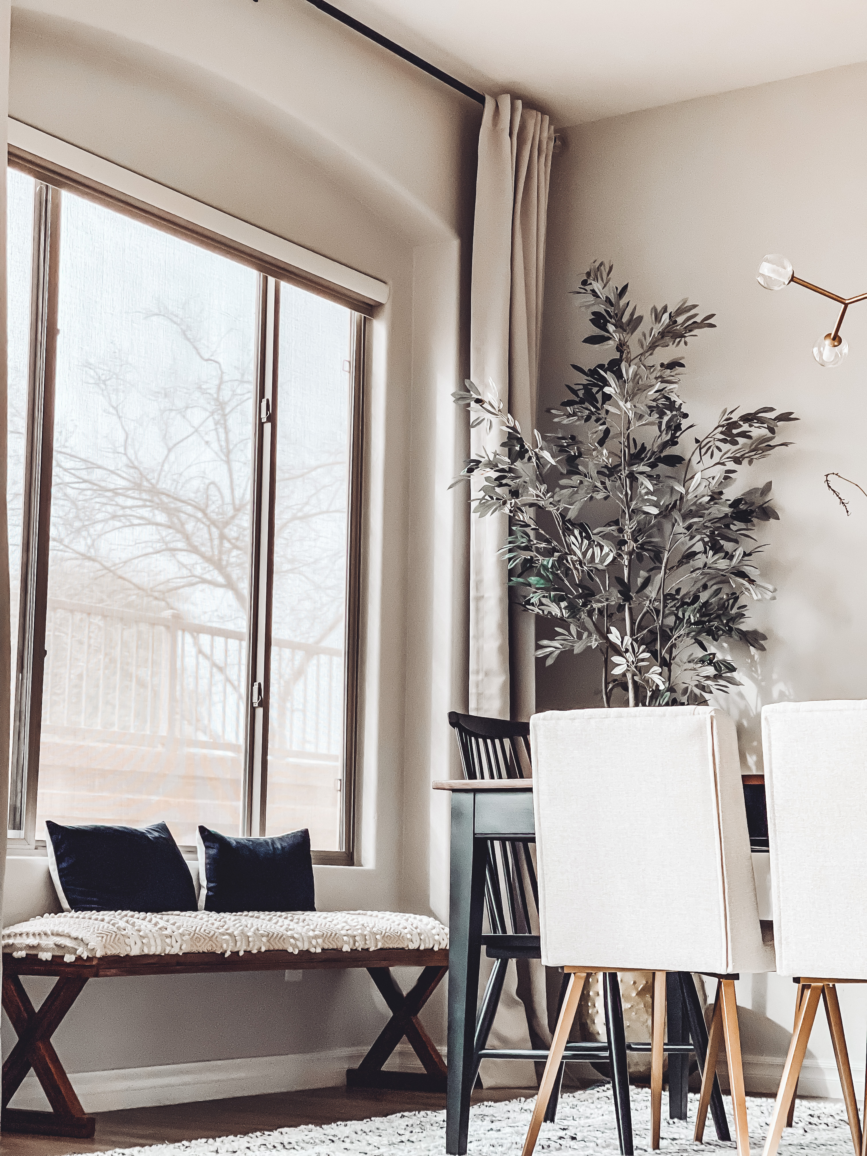
The space is not overly large, but with the tall ceilings and open-concept format, it really does feel spacious. I am pinching myself that I have a finished Dining Room already and what a bonus that it’s done so early in the year! Done in plenty of time to host Thanksgiving 😉 We hope to plan a dinner party something this Spring to be able to relax and enjoy the space soon!
I hope you enjoyed the tour of the new Dining Room, now be sure to stop by and see my friend’s spaces! Only a handful of us were able to share our Reveals today given so many product and shipping delays. If they didn’t share their reveal, then they share a progress update or a DIY tutorial. Be sure to head down and see!
I’ll leave you with a few more photos and then one last look at the final punch list!


DINING ROOM PROJECT TO-DO LIST:
swap out light fixturehang curtain rods & panelsadd dining chairsadd a buffet to the main wallstyle buffetdetermine wall art / mirror for the walladd a rug- Miscellaneous purchases / DIY projects:
Refinish Dining Room tableswap out the legs on the buffet
You can shop the items in our Dining Room by clicking the shoppable images below:


Casa Watkins Living // Delineate Your Dwelling // Domicile 37 // House by Hoff // Iris Nacole // JZ Holmes // Live Pretty On A Penny // Love Your Abode // My Eclectic Nest // Our Fifth House // This Is Our Bliss // Up To Date Interiors
A sincere thank you to my sponsors, Signature Hardware & Loloi Rugs for providing me with such beautiful, quality pieces. I wouldn’t be able to complete these challenges without their help. And thanks to you for supporting the brands that help make This is our Bliss possible.
For more Dining Room ideas & inspo, click here and for all of the posts in my past NYNR Refresh Challenges, go here!
2020 // Shared Boys’ Bathroom 2019 // Big Boy Room 2018 // Kitchen Refresh 2017 // Playroom Makeover 2016 // Master Bedroom Update Have a great day!







Kathy
February 14, 2022 at 1:13 PMI bet it feels so good to have another room done in your new house! It’s really beautiful!
Gentry Blackwood
February 2, 2022 at 5:28 AMLooks gorgeous! I loved following along on this challenge!
Rachael @ This is our Bliss
February 17, 2022 at 2:26 PMThank you so much! I appreciate your note! It is always fun taking on these room challenges!
Sue
February 1, 2022 at 11:35 PMI love, love, love everything! So fun to watch it all come together little by little since now we are only a few miles apart!! You and your dad make a great team 🙂
So proud of you!
Love you! Mom
Rachael @ This is our Bliss
February 17, 2022 at 2:24 PMThank you! Yes, I agree we’re a great team! So happy to have you both so close 😉
Primary Bedroom Makeover - JZHolmes Lifestyle
February 1, 2022 at 4:50 PM[…] // JZ Holmes // Live Pretty On A Penny // Love Your Abode // My Eclectic Nest // Our Fifth House // This Is Our Bliss // Up To Date […]
Heather Metzler
February 1, 2022 at 11:34 AMSO good! Bravo! Love how it turned out.
Rachael @ This is our Bliss
February 17, 2022 at 2:25 PMThank you, thank you!! It feels amazing to have another room checked off the new house list!!