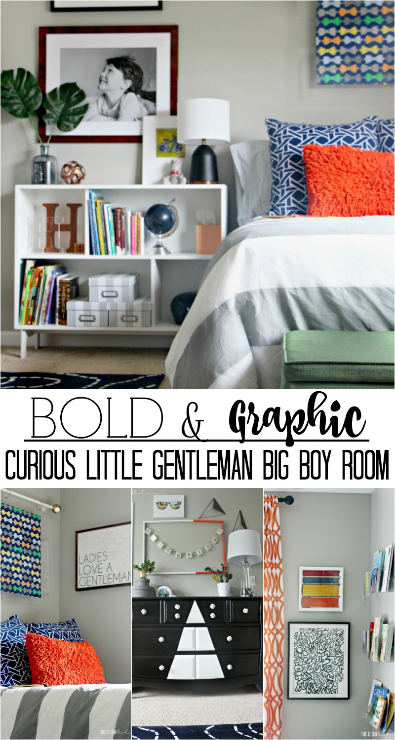
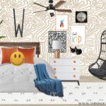
It pains me to even call it a big boy room. But it is and he is. He is four going on fourteen and I can’t slow him down. I can, however, only allow his bedroom space to age little-by-little. Today, I’m so excited to finally share our biggest’s new room. The space I coined the Curious Little Gentleman Big Boy Room when I first designed it here. My inspiration and design evolved into a bright, bold and graphic space that isn’t “too” grown-up, but rather, has qualities that teeter between toddler and a growing, changing, curious & inquisitive little man space.
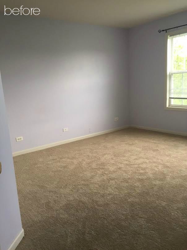
Let’s rewind back to June when we first moved into the new house…
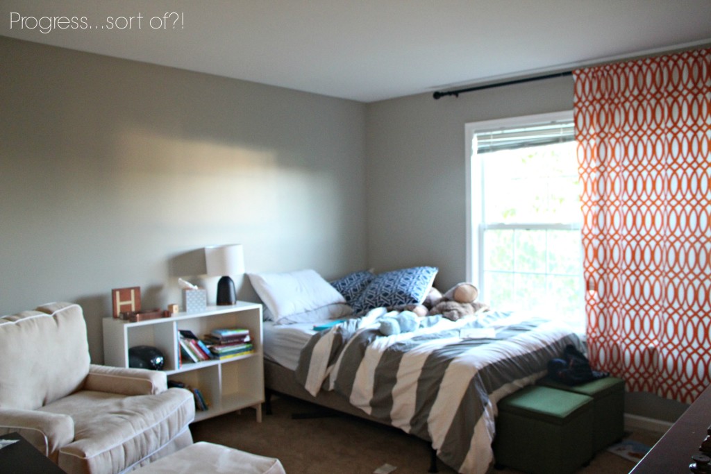
and then my tragically awful “progress” pic. Don’t ask what happened to my ability to take a decent photo.
And now… why don’t you come on in and have a look around at the FINISHED space!
I’ve shared snippets and sneak peeks on instagram and hopefully you’ve stayed up-to-date with the progress posts I’ve shared over the last month or so. If not, head here for the mood board, here for the next update and here for the most recent update including the gallery wall!
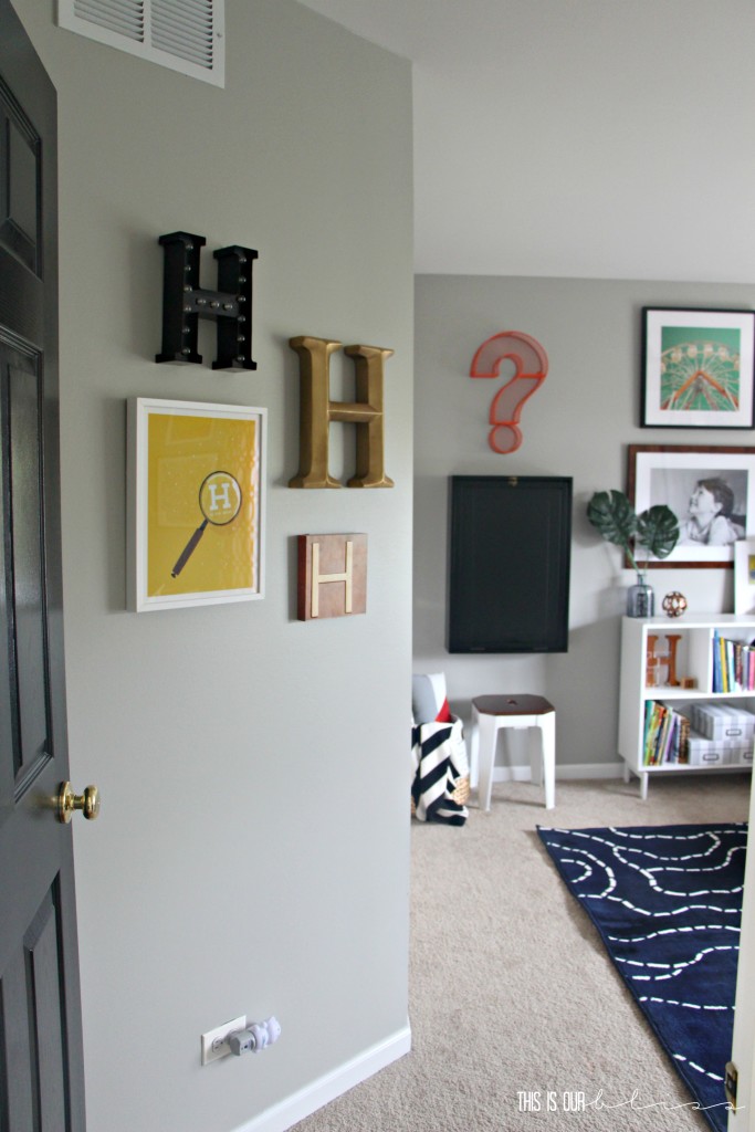
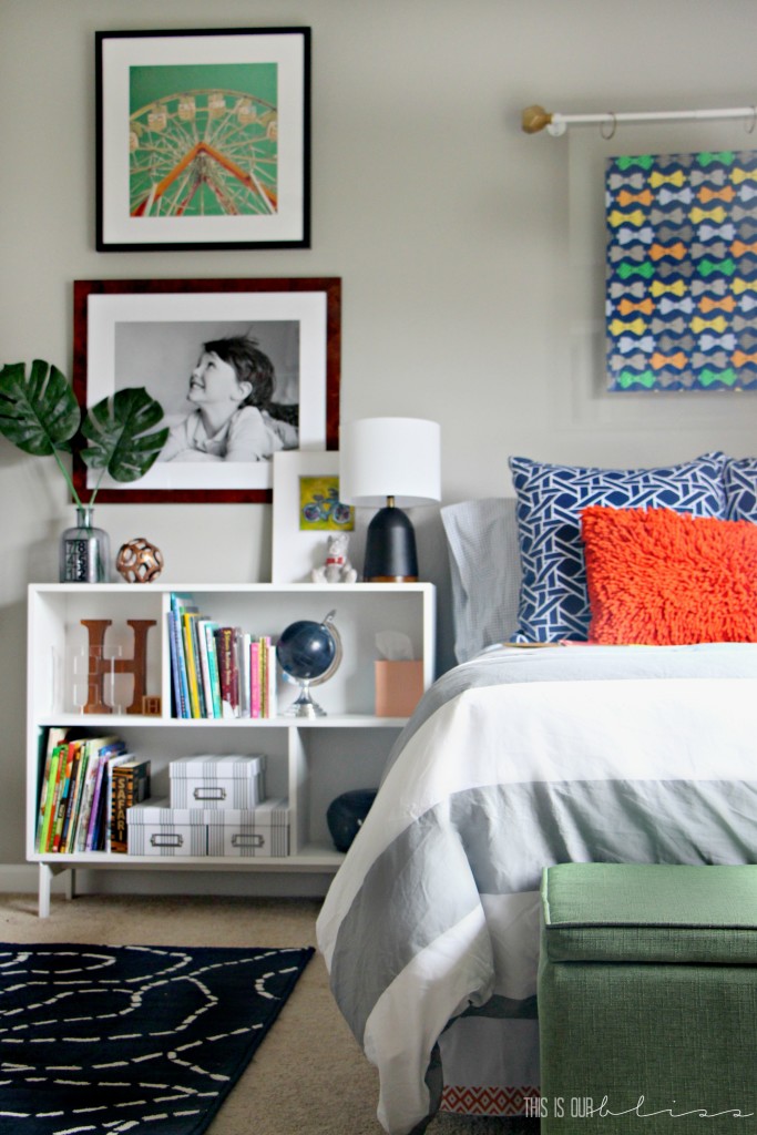
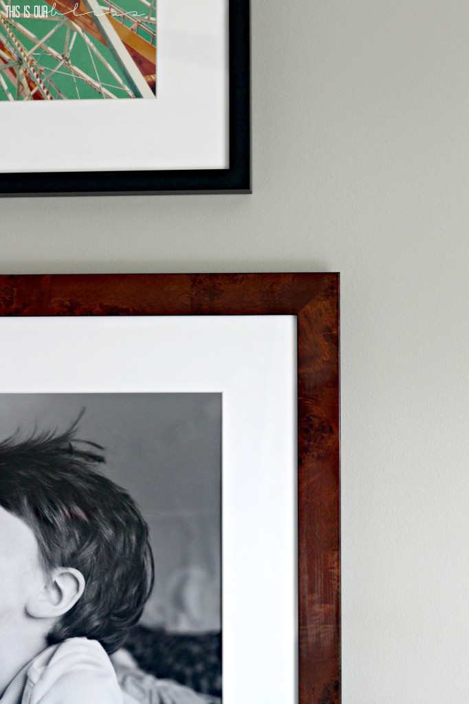
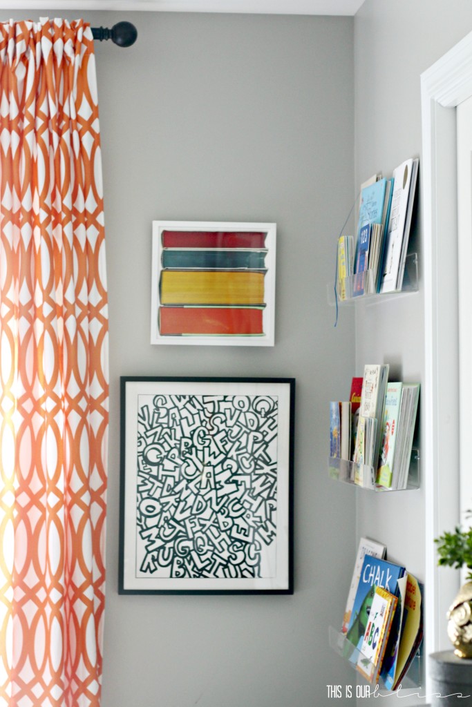
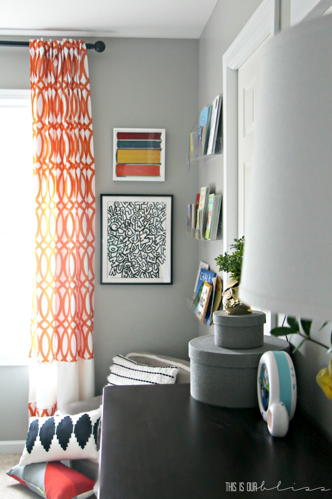
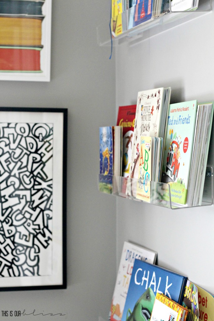
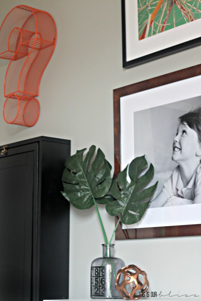
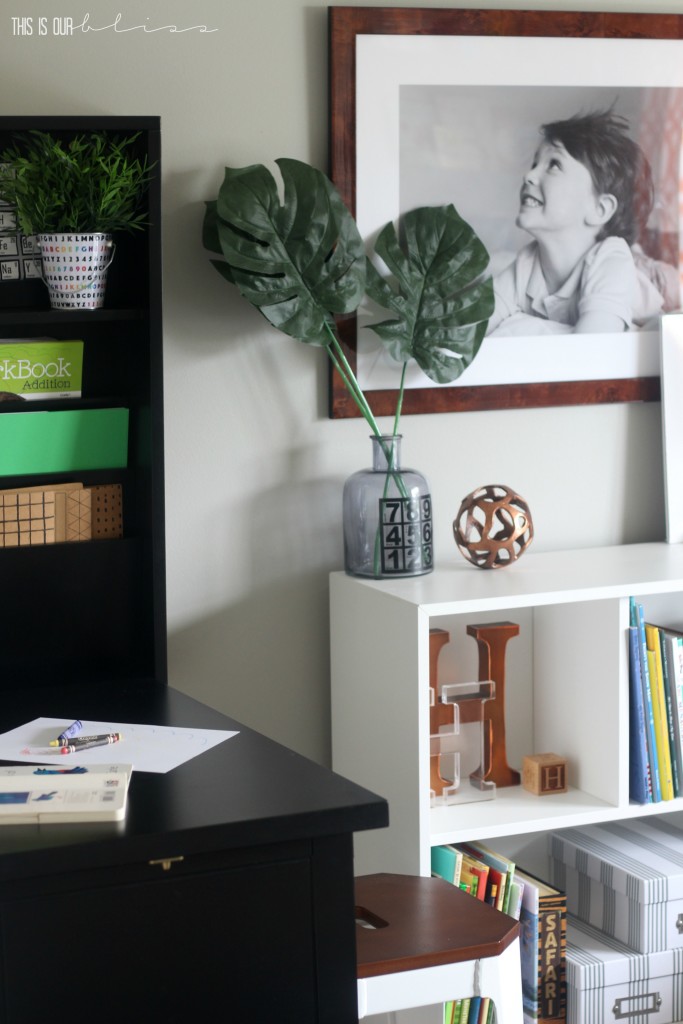
I never met a wall full of frames I didn’t like. Truthfully, if I could fill every square inch of every wall in our home with frames and not look like a crazy person, I would. That eclectic gallery wall vibe has always had my heart and in this space, I wanted to fill the wall with pieces that were true to the Biggest… things he loves! Reading, writing, counting, you name it… So I chose several pieces that incorporated letters [the book corner art, the “H wall, scrabble letter frame, etc.] books [the book art & floating bookshelves] a couple pieces of art that reminded me of adventure & curiosity [the ferris wheel piece and the sunglasses art] as well as the large framed portrait of him. That photo is playful and fun and I just love how his hair is wild & crazy, but he has that sweet little smile on his handsome little face. I just had to order that one in a BIG size!
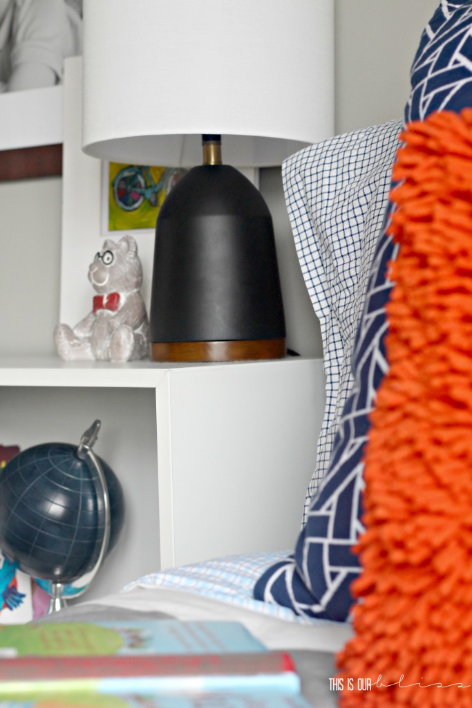
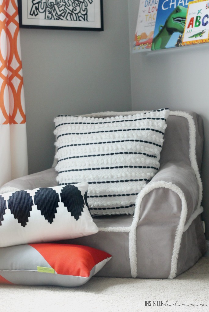
I call this the book corner because it’s not a full-out reading nook like we had in our last house, but there was just enough space to the right of his window and the left of his bathroom door to create a spot for him to sit and read his books. He does enjoy reading in bed, too, mainly because he’s now in a full-sized bed and has the ability to reach over and turn his nearby lamp on and off. He feels very grown-up with his very own “reading light” on his bedside table since mom and dad each have one in their room. Kids. Ha!
The 2 art prints are from the kid’s wall art collection at minted and I have a 3rd piece near the door when you walk in. Huge minted fan. Huge! They have gobs and gobs of gorgeous art and their assortment of children’s art prints is just as great!
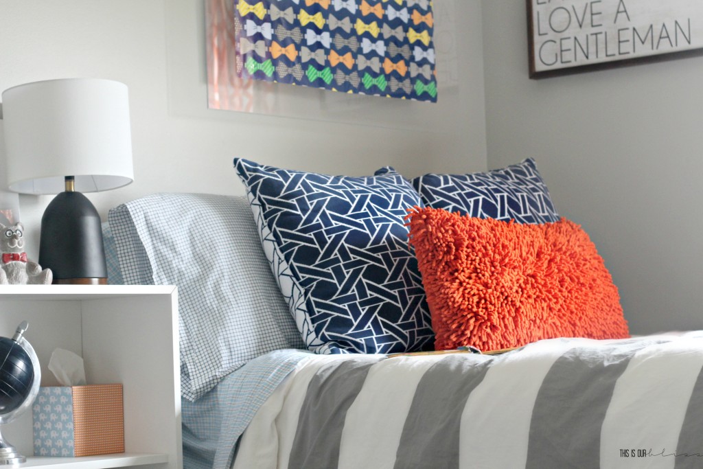
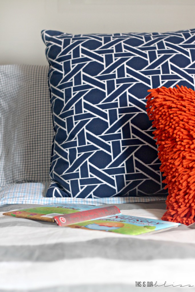
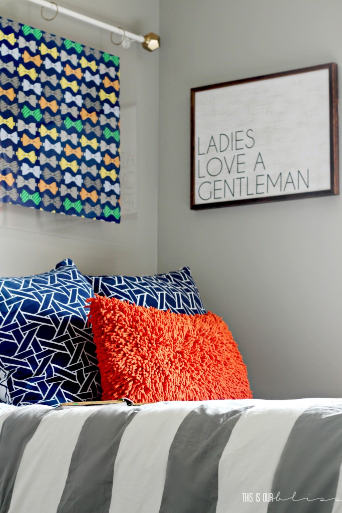
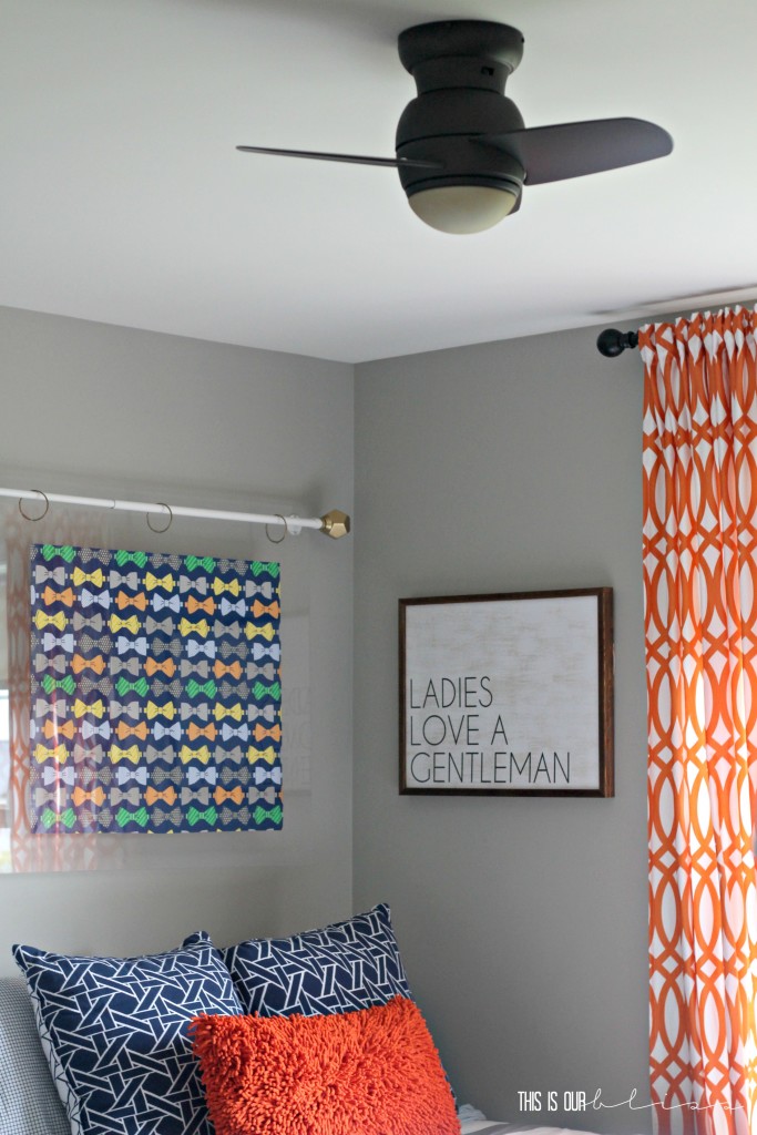
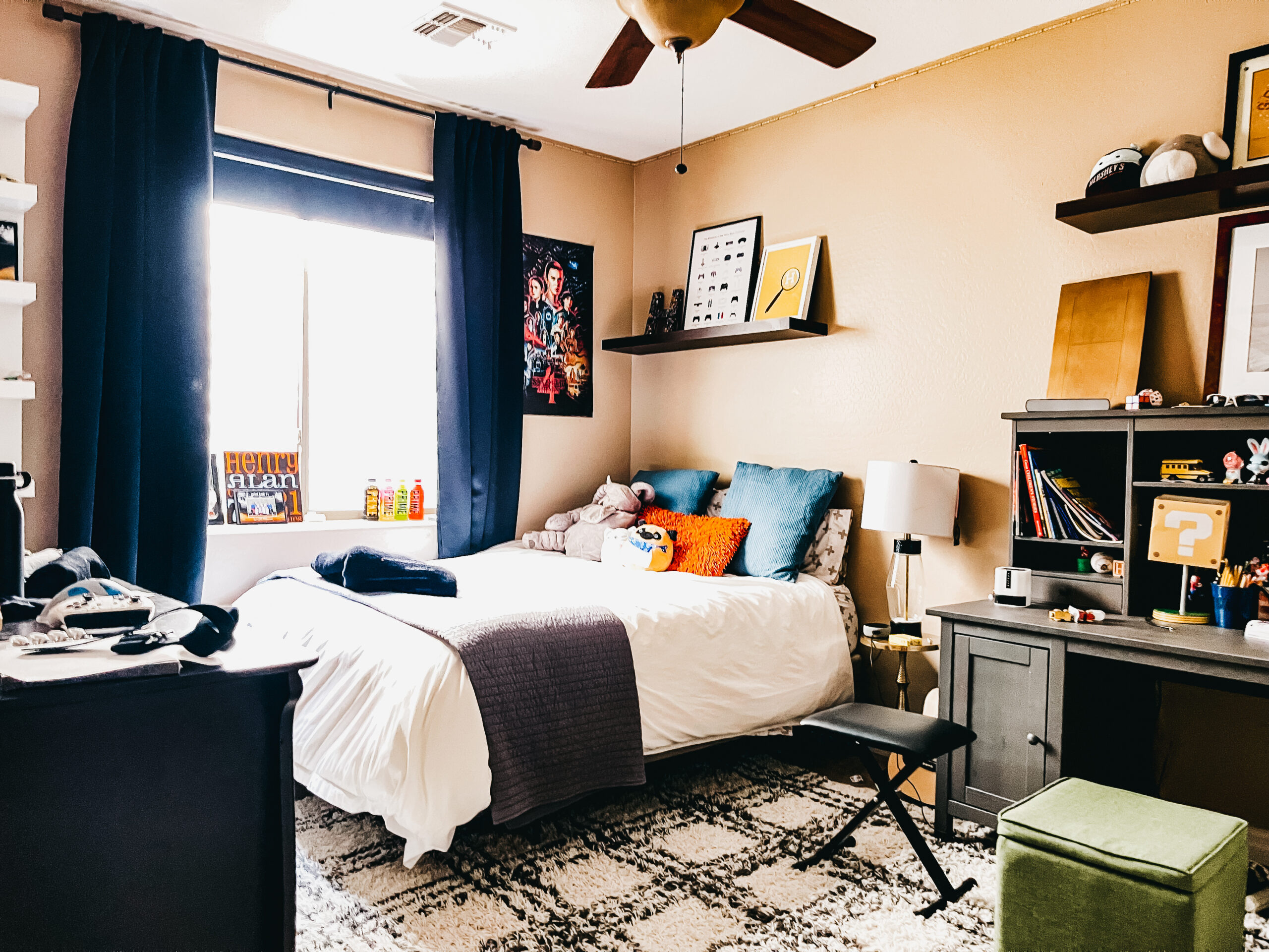
The area around the bed is quite a sight for pattern between the rug (which was used in the littlest’s nursery in the old house), curtains (used in H’s nursery in the old house), duvet cover, pillows and art, but I wouldn’t have it any other way! I opted for solid green ottomans, perfect for storing straggler toys and book overflow, at the foot of his bed as well as a solid orange fringe pillow to help offset some of the pattern play. But like I said, I love to mix and match prints. And in a kid’s space, there are definitely zero rules when it comes to that type of thing. Am I right?! If you ARE looking for a few tips for mixing prints, you can check mine out here!
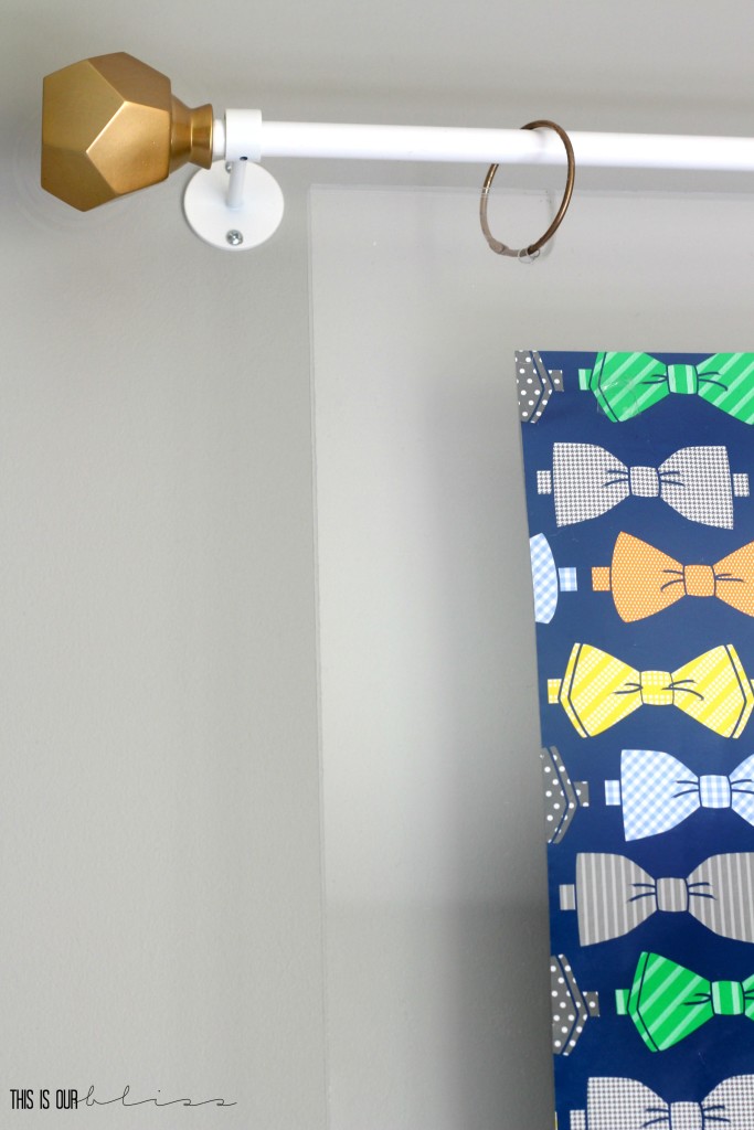
Above the bed I created a floating acrylic frame to hold up the bow-tie “art” I found months ago that actually jump-started the entire design & theme of the room! I couldn’t settle on a headboard for the life of me and ultimately decided I didn’t want one. Instead the bow-tie piece serves as a focal point above the bed and ties in all the surrounding colors of the room. I’ll be sharing a DIY tutorial for the piece soon!
Across the room…
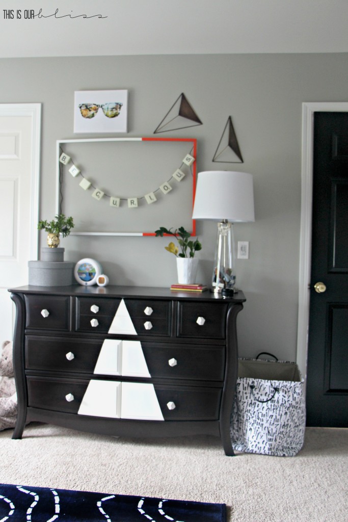
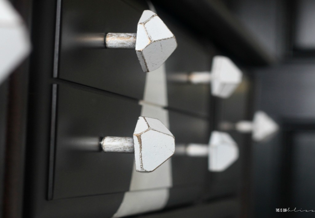
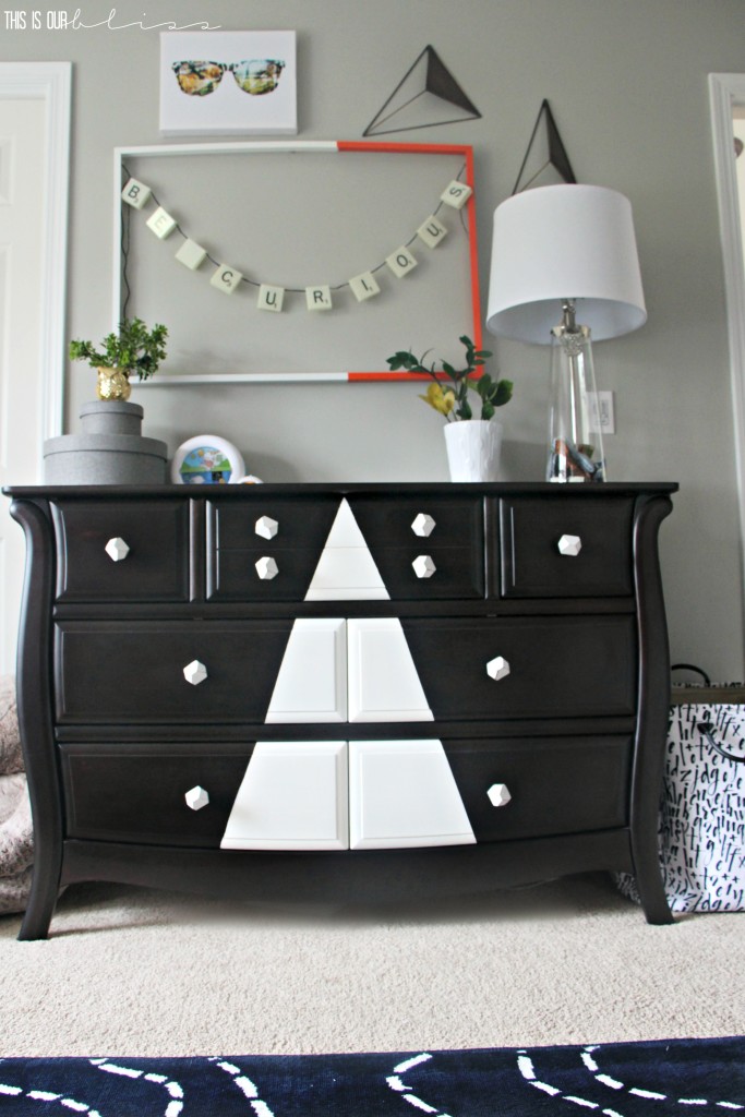
…sits his dresser [which I made-over with some paint and new knobs]…
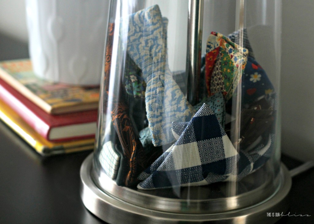
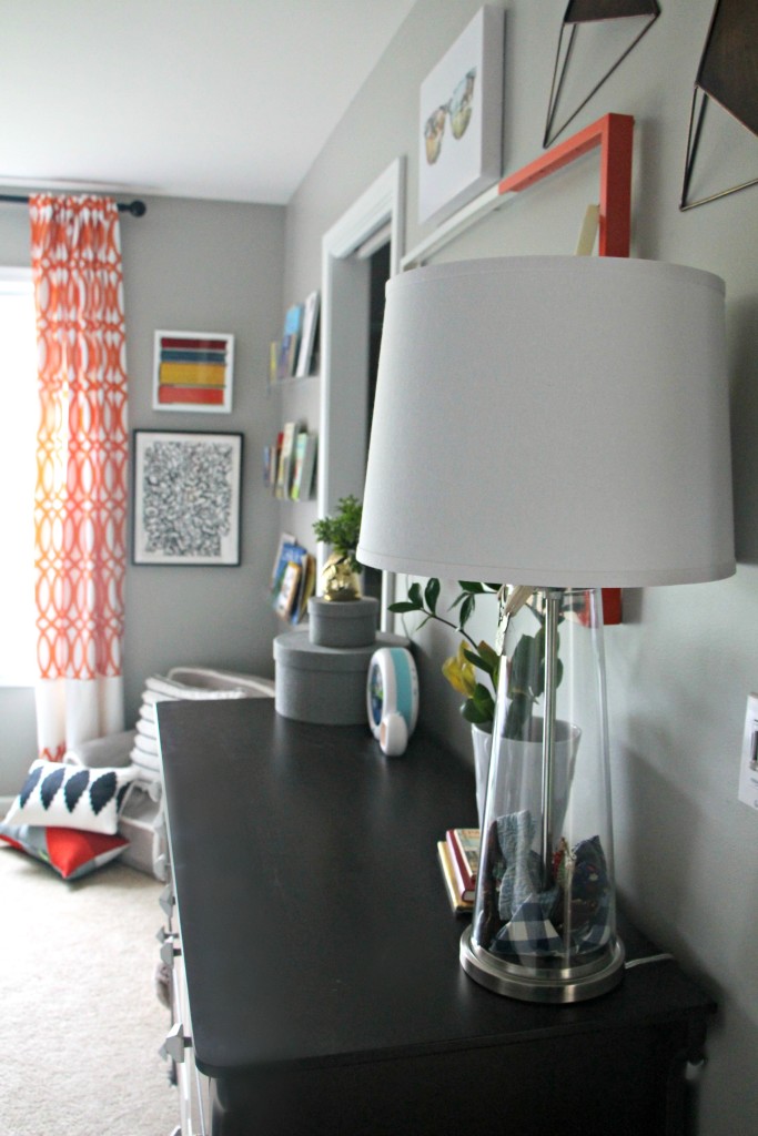
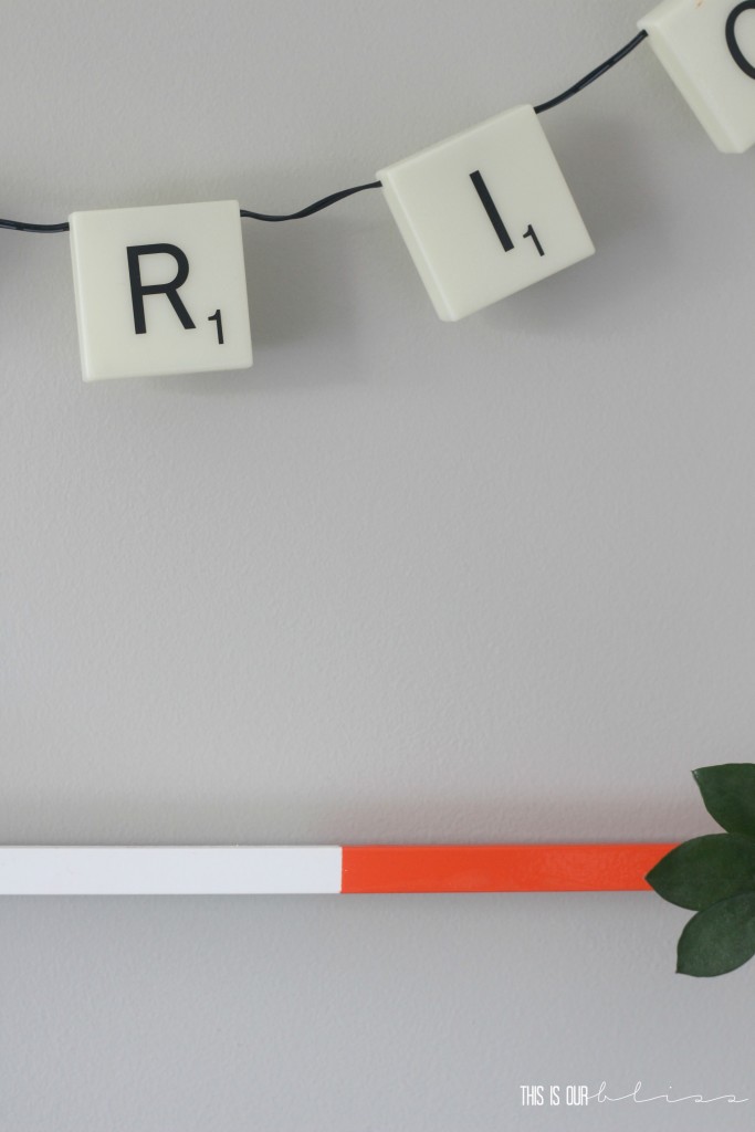
…a quirky scrabble letter frame I DIY’d that reads “BE CURIOUS”, a couple metal triangles and one of my new fave items is the clear lamp that I filled with bow-ties from my father-in-law as well as a few others I ordered from Etsy and ebay. The lamp actually comes as a set of 2, so now I need to craft up another “filler” idea! Nothing says old fashioned gentleman like some vintage bow ties.
Can’t you just picture how dapper young boys used to look all dressed up in their knickers and bow-ties? Love it!
And next to the lamp are a couple old books that used to be my grandmother’s. She gifted them to the Biggest on his 3rd birthday for the “Books & BBQ theme”. Each guest was to bring their favorite childhood book or their child’s current favorite book, so I’ve had these tucked away until I figured out what to do with them. I decided it was best to keep them up on the dresser instead of mixing them in with the books on his bedside table bookshelf. Not that he can’t reach them, but since they are up on the dresser, he knows they are special from his Great Grandma Nancy.
Ok. I know I said my fave item was the fillable lamp, but I may have lied. Honestly, I can’t get over this one particular find in the room. Did you notice the big black rectangular box on the left-side of the gallery wall? Did you wonder what it was?! Well, let me show you…
So cool, right?! I think I’m even more obsessed with this desk today than I was when I first was hunting for it! It is the most perfect space-saving, incognito work space for a little boy or ANYONE for that matter. It is pure GENIUS!! There is plenty of room to store supplies inside and ample flat surface area when it’s folded down. Plus, it folds up and down with ease.
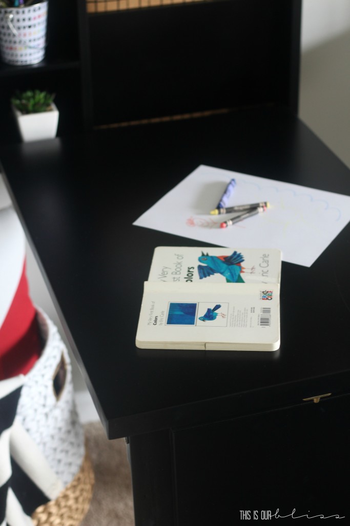
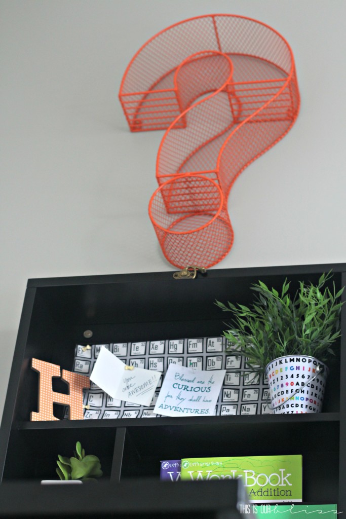
Having a room without much available and functional wall space for furniture pieces — a closet wall, a wall with 2 doors [main door & bathroom door] and then a window wall — this desk was the perfect solution and fit right next to the bed and bedside table. And it still looks classy hanging on the wall while it’s all folded up, too! Win Win!
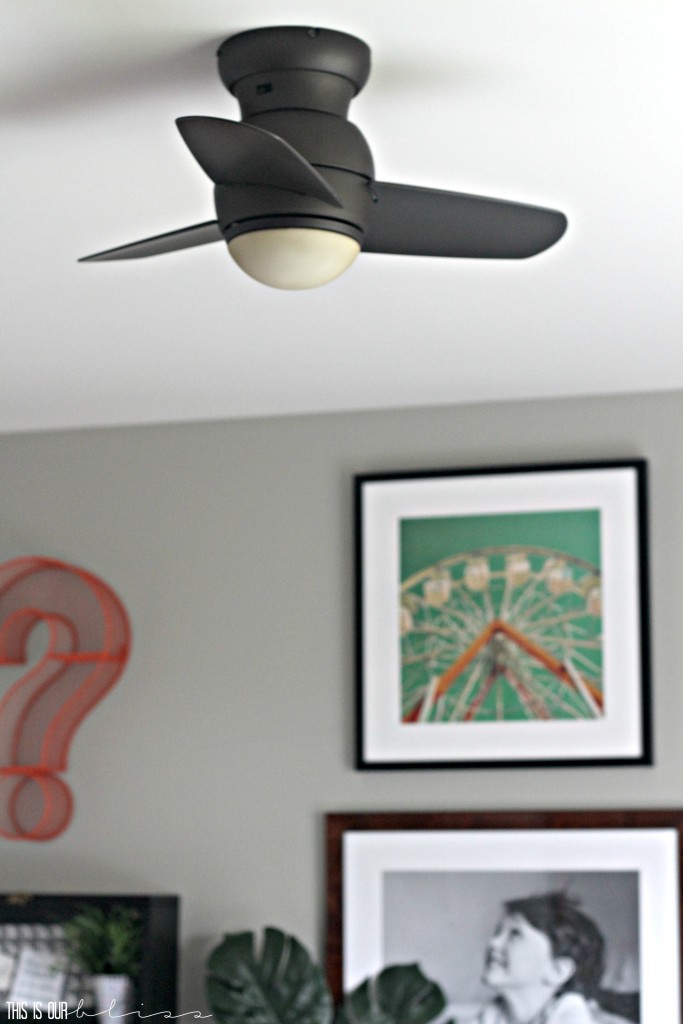
This fan! I have to rave for a second on how spectacular this mini fan is. We have TERRIBLE airflow circulation in this room and there wasn’t any sort of a light fixture in this room when we moved in. We wanted something tight to the ceiling with a low profile and we found it!
It’s so cute and this thing can put out some serious air. It was a great decision to have it installed!
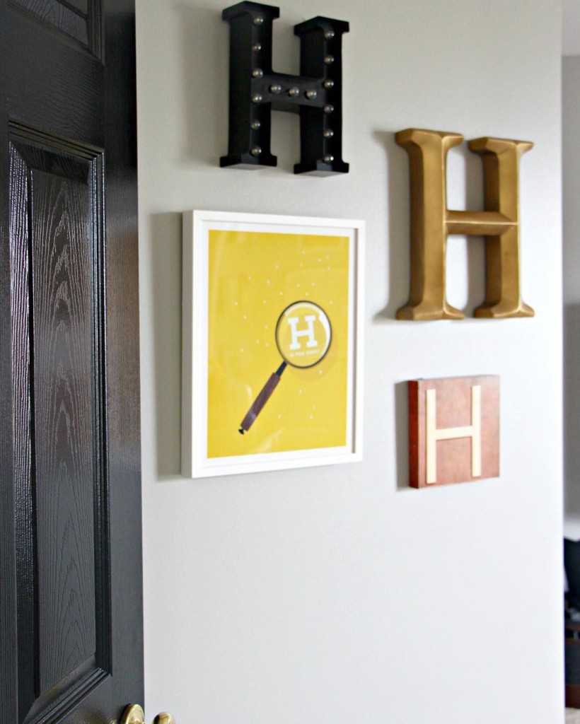
Finally, as you head back out to the doorway, you’ll find a small collection of “H’s”. The idea came to me when I spotted this darling personalized magnifying glass print and then realized I had the orange H art from his old room. After finding the gold one on clearance at Hobby Lobby for 6 bucks and the marquee H [it even has an auto setting where it comes on at the same time each night and stays on for 4 hours! We all think this is pretty cool ;)] on clearance at Target for $9, I decided to group them together on this small angled wall right near the door.
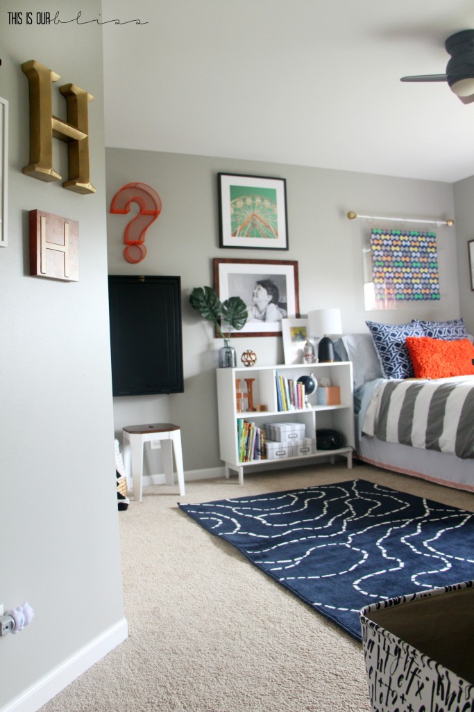
I’m thrilled with where the space landed and the Biggest loves it too. He has told me numerous times how much he loves his room and even thanks me randomly for certain things in there. When I ask him what his favorite part is, he says, “Simon’s carpet.” aka Simon’s old rug! I guess its the brotherly way to look at it. He thinks he scored a pretty sweet deal getting something of his brother’s, but of course he probably wouldn’t want to return the favor!
I hope you enjoyed peeking inside our Curious Little Gentleman’s new digs!

ROOM SOURCES
duvet cover [West Elm several years ago, similar here]
blue + white euro pillows storage ottoman | Word Art | white frames | ABC art | stacked books art | drop-down desk
orange shag pillow
light blue plaid sheets
navy blue crosshatch check pillowcases
“Ladies Love A Gentleman” wall art
gold geometric finials + white rod [holding acrylic frame]
curtains
acrylic bookshelves [my other favorite item!]
book art
black + white alphabet art
gray corner chair
black + white textured pillow [HomeGoods]
black + white rectangle pillow [Target, similar here]
colored geometric pillow [Target last year]
green storage cubes
rug
ceiling fan
dresser knobs [Hobby Lobby, similar here]
clear fillable lamp
gray round stacked boxes
scrabble letters + frame
metal triangle wall decor
ferris wheel art [Hobby Lobby + custom frame]
large photo custom framed in Jambi frame
metal “?” wall piece [Michaels + spray-painted with this]
desk
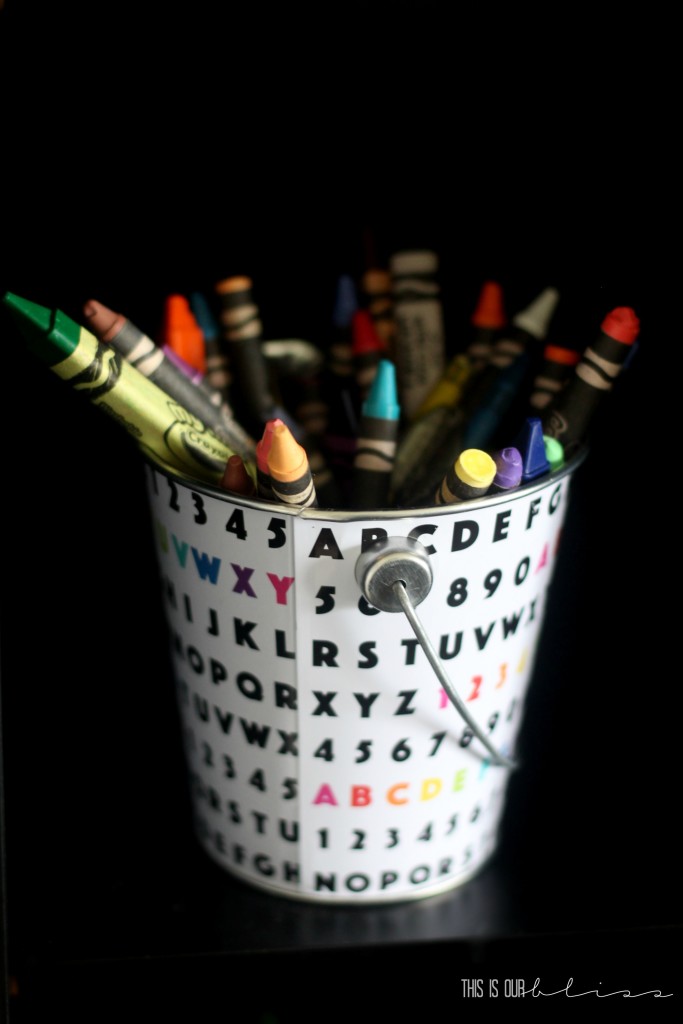
alphabet tin buckets [Target $1 spot, colored cans here]
faux plant
faux succulents
black + white striped throw
gray number vase [thrifted]
bedside table lamp
nightstand / bookcase
gray + white striped storage boxes
Marquee “H” [Target clearance item, similar here]
Magnifying glass “H” art print
gold “H”[Hobby Lobby clearance item, smaller version here]
DIY PROJECTS [tutorials coming soon!]
Acrylic floating frame
Custom bedskirt
Modern Dresser Makeover
Scrabble Letter Light Frame
WALL COLOR
Sherwin Williams Mindful Gray
DOOR COLOR
Sherwin Williams Tricorn Black
Don’t forget to pin for later!
In other news around here, you can check out my One Room Challenge progress [week 1 & week 2] and then I’ll be back tomorrow with a week 3 update! Thursday is a fun post where a group of us swapped thrift store gear and ended up with a madeover gem! You don’t want to miss what’s coming this week!
So, what do you think of the biggest’s big [but not too big ;)] boy room?
I’d love to hear from you!
Have a fabulous day, friends!
*Thank you to Lamps Plus, Minted & Framebridge who were all kind enough to partner with me on this very special project. They provided product to me, but all opinions, thoughts, images and outright swooning are my own!





Stephanie @ Casa Watkins Living
October 25, 2016 at 5:47 PMAHHHMAZING!!!!!!!!! I love every bit of it. Cute touches with the bows in the lamp and the floating art print/headboard is super cute!!
Kristi
October 19, 2016 at 6:39 AMLove love love it!! But you know you are not allowed in my house anymore…needs way too much work. Oh, ok, just the living room cuz of the bonus score of some great used furniture. Love reading your posts!!
Rachael @ This is our Bliss
October 25, 2016 at 3:04 PMOh stop!! Your house always looks awesome!! Thanks for always reading – you’re the best! xo
Mary Christoph
October 18, 2016 at 5:51 PMLove it! You are so talented!!
Rachael @ This is our Bliss
October 25, 2016 at 3:03 PMThanks, Mary! I appreciate you being such a great and supportive reader!!
Cassie Bustamante
October 18, 2016 at 4:22 PMit’s beautiful, rachael! i love the bold colors and graphics, the book ledges, and everything!!!! i pinned it!
Rachael @ This is our Bliss
October 18, 2016 at 4:51 PMThank you, Cassie! I had so much fun working on this space even though I hate that he’s not still in a crib lol You’re so sweet – thanks!!